BMWBLOG gets a new look. After months of development and planning, BMWBLOG 3.0 is now live and brings lots of changes.
Nearly five years ago, BMWBLOG launched as a website that acts as a single-point of BMW news. With the help of a great team, years later BMWBLOG grew to a level that very few of us imagined at the beginning of our journey. From just a few articles a month to over 3,000 posts now every year, BMWBLOG delivers the most comprehensive BMW content, starting with test drives and spy photos, and ending with editorials, exclusive interviews and driving events. MINI and Rolls Royce brands are represented as well in our coverage.
With the increase of unique and exclusive content, we soon ran into an issue: inability to keep some of these great articles in front of our readers’ eyes. Shortly after being published, many of these articles would move to the second or even third page of the site, therefore becoming more challenging to discover them.
And this is why BMWBLOG 3.0 comes online.
More content just a click away
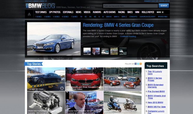
Our goal was to keep the web design framework close to what you have been accustomed to, including the top section that features the most interesting stories. This section is manually edited by our team.
But since we believe in the power of community, we decided to add another layer of top stories, this time operated by our readers. “Top Stories” section displays the most interesting articles based on your interaction with that content, from comments to page views and other unique metrics. Crowdsourcing is something we strongly believe in and by allowing the Top Stories to display the stories you find most interesting, we are moving the editorial process into your hands.
At the top, we have also selected some of the most popular categories that will allow you to drill through the content with a single click.
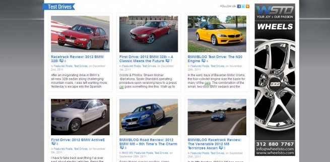
The front page also displays more Latest News, in a more compact design, with our Test Drives and Videos sections inserted between posts, another way for us to point to what we believe is interesting and exciting content.
The sidebar is a combination of social media widgets and other manually selected content that will resurrect some our older stories. Facebook plays an important role in the “new media world” and now you can simply share these articles with your friends, again, through a single click.
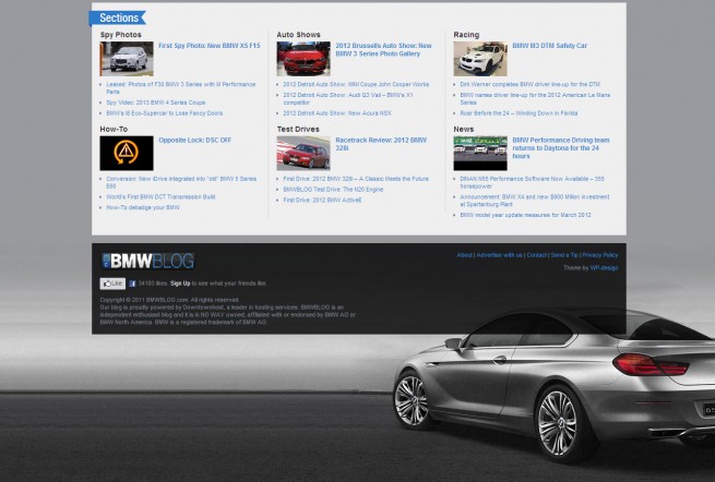
At the bottom of the page, we included content sections that spark interest among our readers, another approach to keep content relevant and always available.
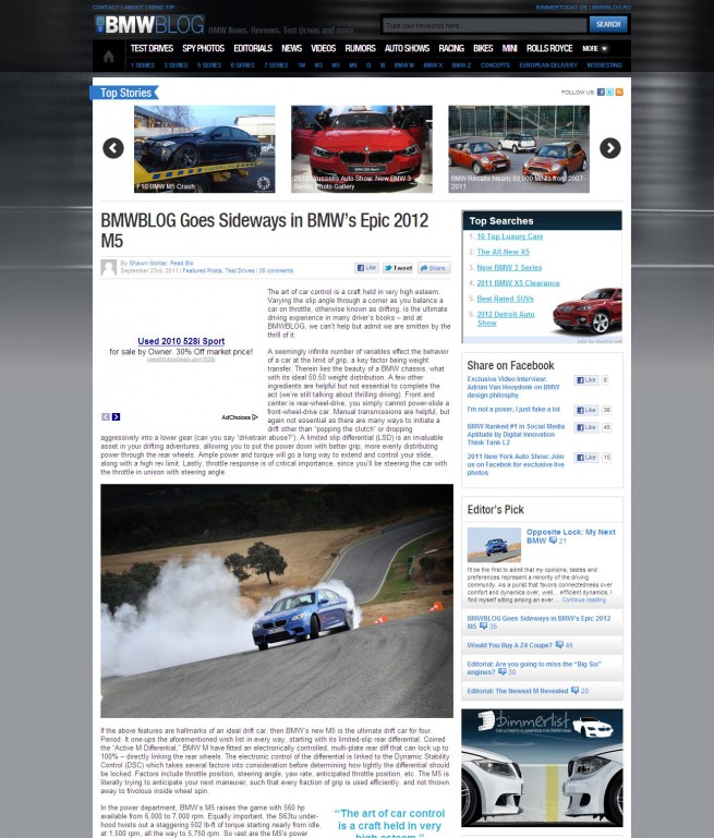
Inside the articles, we included a Top Stories carousel that gives you ability to jump into one of the most popular stories at any time, from any page. At the end of every article, related content is being expanded into two different sections with the single goal of tying similar articles to the main story.
Category pages are also revamped with a new format that allows for quick scan through articles.
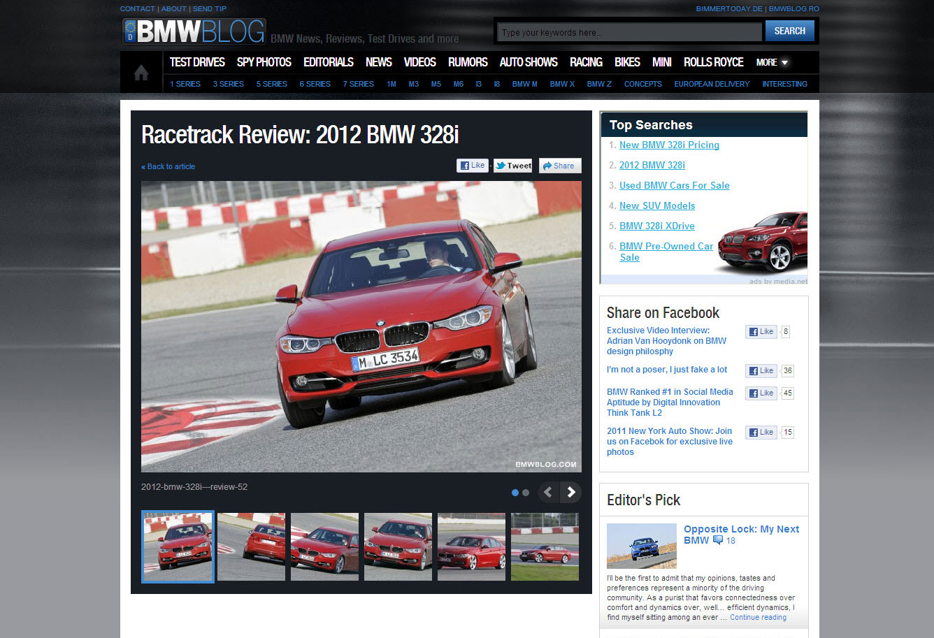
Photo browsing. Easier than ever
One of the most popular requests we have received last year revolved around the development of a new photo gallery. With tens of thousands of photos uploaded to the website every year, our readers were looking for an easier and faster way to enjoy the beautiful galleries. Our development team delivered a simple, intuitive and modern photo browser that we hope will make enhance the photo experience.
Just a quick note on this: if you are looking for the large version of the photos, simply click on them and you will have the opportunity to browse through them at full scale as well.
Last but not least, our cool logo gets a facelift as well, maintaining the same idea as five years ago but with a modern approach.
We hope you will enjoy our new design and we encourage you to provide feedback and submit bugs you might find.


