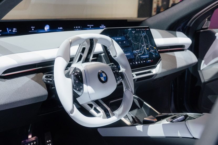
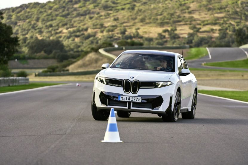
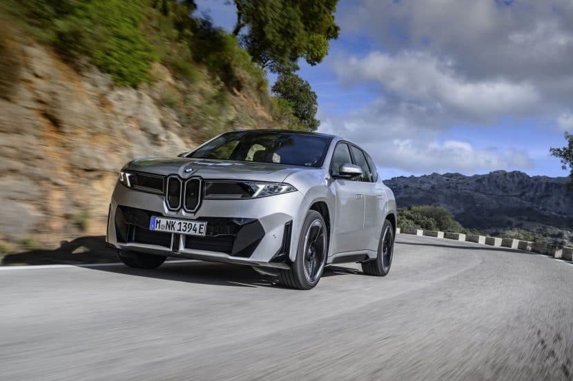
The BMW Vision Neue Klasse X is the second showing of the upcoming new family of electric cars in Munich. After the sedan Vision Neue Klasse debuted last fall, it was now time for the Bavarians to highlight the future of their popular SUV lineup. The BMW Vision Neue Klasse X not only previews the upcoming 2026 BMW iX3, but also an entire suite of crossovers which will share several design elements. Essentially, the Neue Klasse X is a design canvas for other products which even though might not look identical, they will unmistakably be part of the same family.
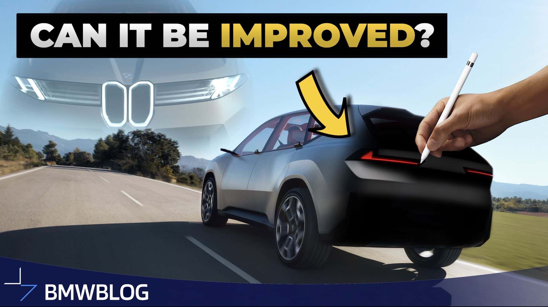
Of course, every new BMW preview brings a lot of comments, on both sides of the aisle. There are, naturally, plenty of keyboard warriors, or Youtubers, who think they could have done a better job. Well, today, we’re one of them, but before we delve into that, a couple of caveats. Fist of all, we’re not car designers, or no near of being one. What we are instead are BMW aficionados that know a thing or two about the brand. Secondly, it’s a lot easier to Photoshop a car than to put into production. There are a lot more constraints when you physically need to build a car, in either concept or production form. So naturally, we have more freedom in expressing the character of a car.
What We Changed
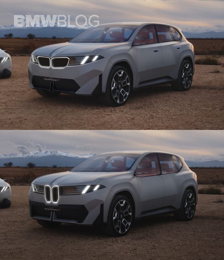
In redesigning the Vision Neue Klasse X, we didn’t want to change the design form and language, but instead, apply small changes, as an alternative to the original. So let’s start at the front. We initiated changes by toning down the contrasting black graphic on the bumper. This element, mostly aesthetic, was minimized to allow the body color to be more prominent and reshape it into a trapezoid. This not only simplifies the bumper but also gives the illusion of added height to the car. Additionally, we took cues from the new X2, painting the bisected air splitter black for a subtler look that blends with the bumper design.
We then addressed the ‘kidney transplant,’ opting for a mix of traditional shapes within the new design ethos. Given the trend of larger grilles in BMW models, we enlarged the pill-shaped kidneys, realigned them horizontally, and framed them with a chamfer to catch light from the headlights and the grilles themselves. On the side, we accentuated the shoulder line for added character, raising the lower greenhouse frame and adding a perpendicular surface without compromising the fenders’ shape or the brand’s ‘monolithic’ style. The shoulder line smoothly transitions around the Hoffmeister kink, avoiding a disruptive cut through the rear fender.
More Changes In The Rear
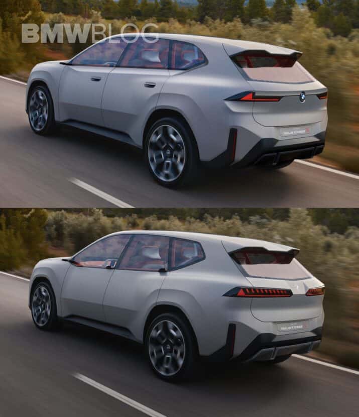
Rear changes, though subtler, include narrower taillights to enhance the vehicle’s width and a nod to the brand’s L-shaped light signature. We introduced a curved feature below the taillights for light play and a resemblance to the classic X5, ensuring personality even when the LEDs are off. The rear bumper’s vertical reflectors and number plate placement remain to retain the sporty look, but the diffuser was refined for a less ornate, more harmonious appearance with the front design. We incorporated horizontal lines to link the taillights, reflecting the E83 X3 and E53 X5 models, and finally, reinstated BMW’s traditional colored roundel, replacing the monochrome logo.
This overview captures the essence of the redesign without overwhelming detail, striking a balance between innovation and homage. So now it’s your turn to let us know which design you like better? The original or this slight variation? Of course, you can see how we made these changes in the video below.


