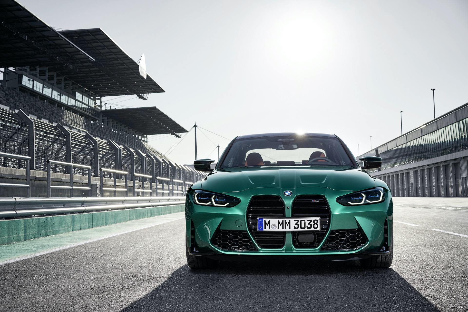
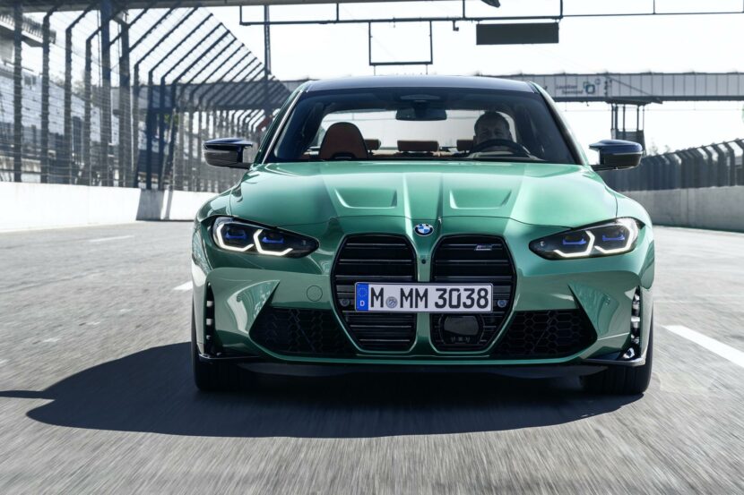
I guess BMW has to be happy that we’re all still talking about its new grille design. Most of what’s being said isn’t actually any good but the fact that nobody can stop talking about it is something. No such thing as bad publicity, right? Either way, the new BMW M3 (and M4) grille is just about the most controversial design that the Bavarians have ever created and that’s caused many graphic artists to try and “fix” it. Usually that fix is as simple as removing the grille entirely and fitting the M3 with the same front end as grille as the M8. However, this new render proves that BMW can actually keep this new grille design but just tweak it a bit and it would look a helluva lot better.
This new render from Car Scoops is actually quite interesting. It points out two issues with the grille that really hurt the design and if you fix those two things you end up with a much better looking grille, without having to shrink its size. So BMW might want to take a look at this render for some LCI inspiration, because something like this would allow BMW to have its cake and eat it, too.
For starters, the render artist at Car Scoops realize that most car grilles do not extend above the top of the headlights, for good reason. However, the M3’s does by a considerable margin and it makes the grille look too upright. So the grille gets a bit of a haircut, shortening it by an inch or two and keeping the top of the grille in line with the top of the headlights, which makes the grille far more cohesive.
Secondly, the artist noticed that the chunky horizontal grille slates only increase the gaping effect of the grille, as they create a lot of negative space inside of it. So those slats were replaced by a mesh that matches the rest of the intake grilles on the front of the car. While that mesh is a big departure from BMW’s traditional vertical grille slats, so too is putting a grille the size of a large dog on the front of a car.
The end result is a front end design that’s far better suited to the BMW M3, while still maintaining the gist of BMW’s new design language. So it looks more cohesive, hurts the eyes less and still gives BMW the obnoxiously over-sized grille it wants. There are still issues, obviously, like the hood shut-line in the middle of nowhere and the lack of a good spot for a front license plate, but this render fixes the two biggest issues with the M3’s grille design without changing it massively.
[Source: Car Scoops]


