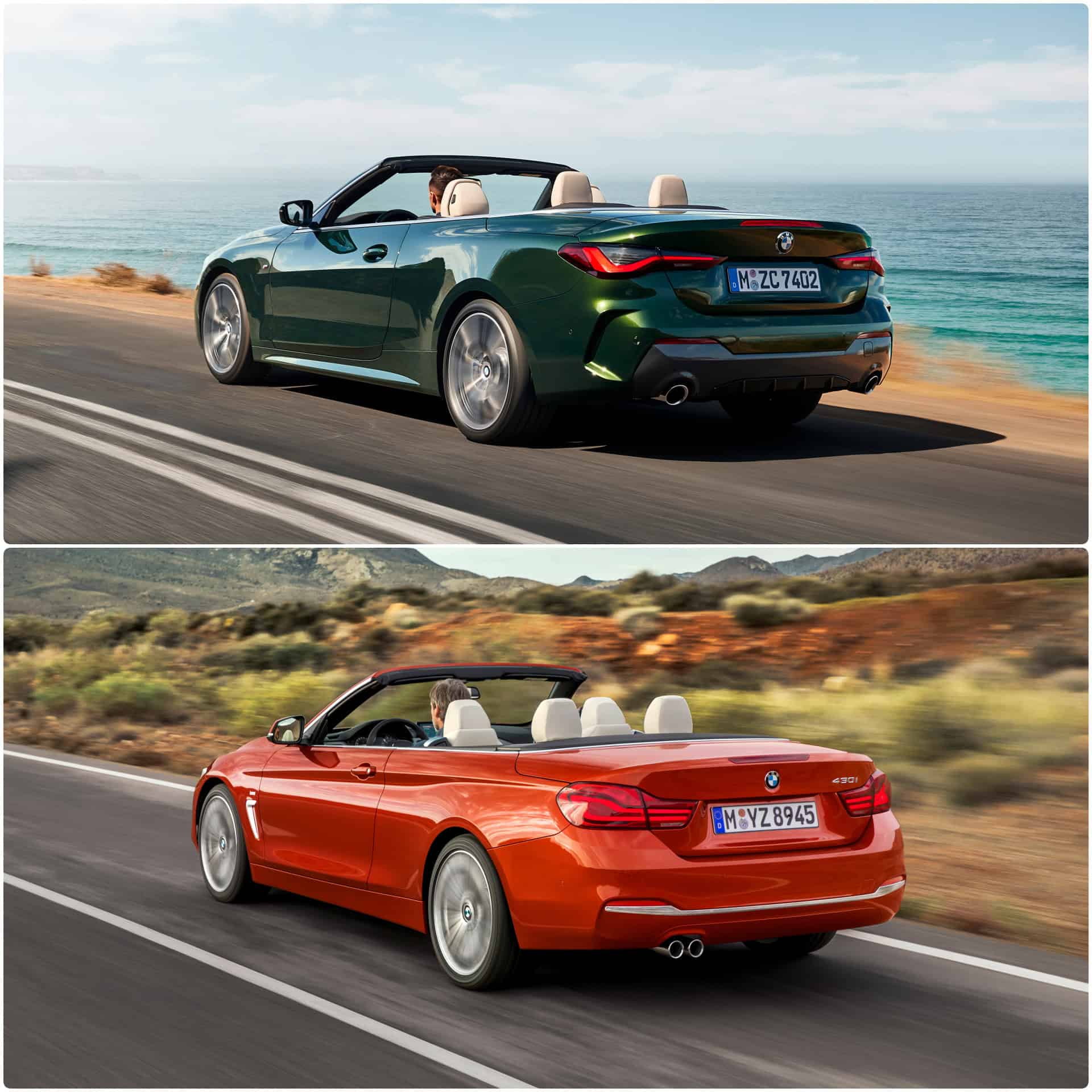
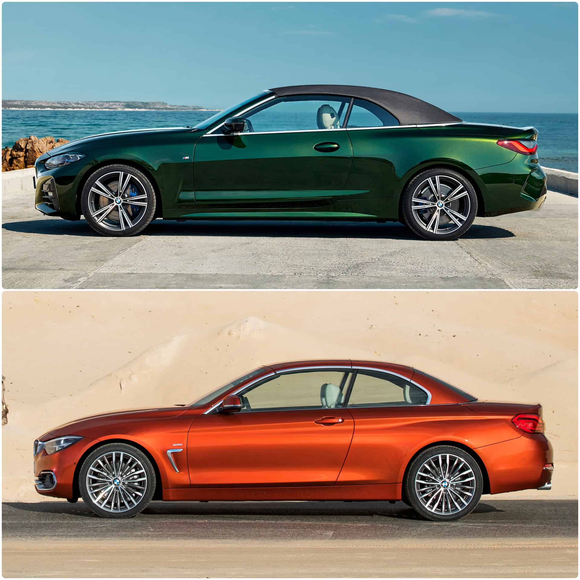
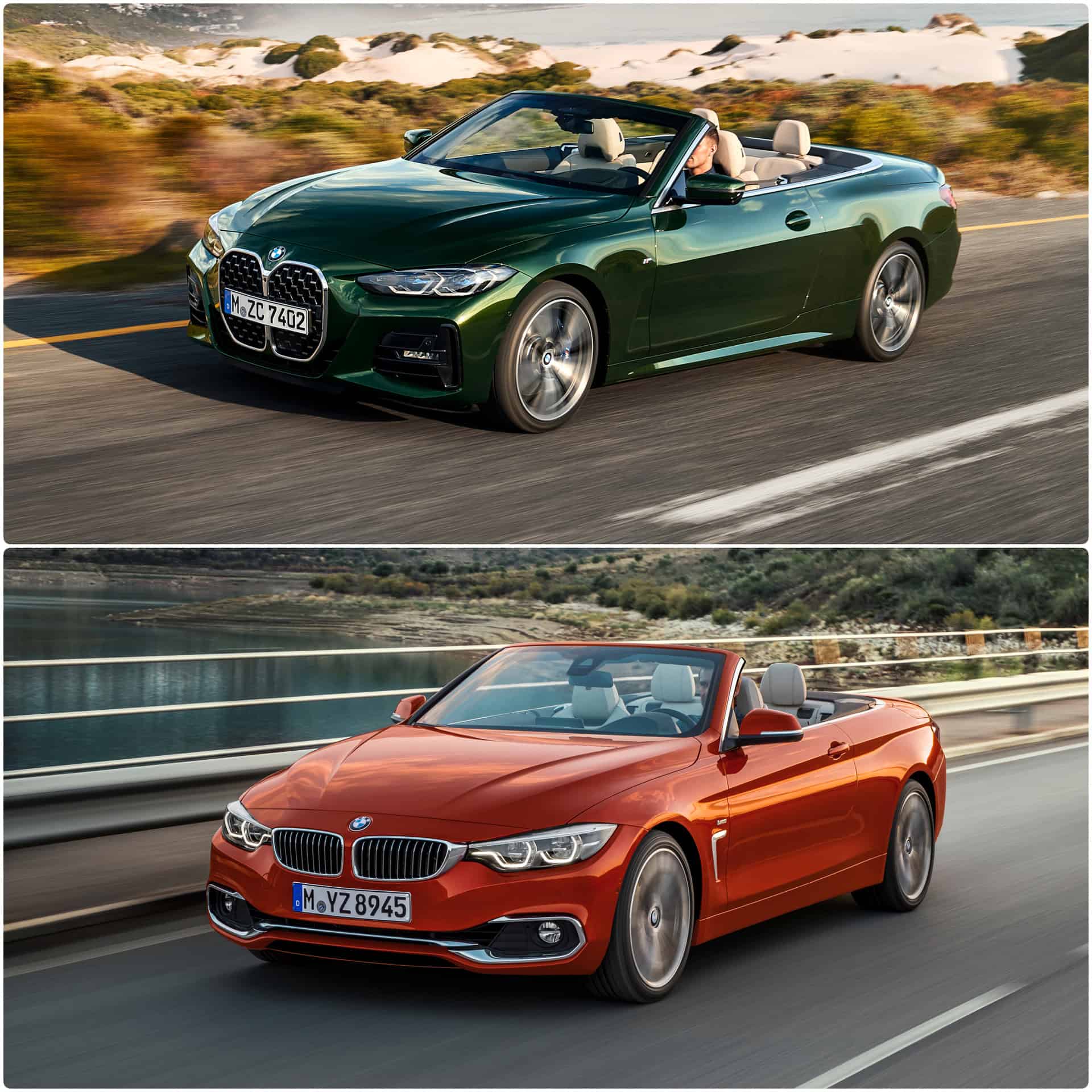
We analyze the design evolution of the drop-top 4 Series in all aspects, as we bring together the outgoing F33 model series and the new G23 generation. The former F33 generation of the 4 Series was officially premiered almost 7 years ago at the 2013 edition of the Tokyo Motor Show. Over the course of the years and coming down straight to the G23 4 Series, we can say that the new generation has undergone a complete styling revolution.
The new 4 Series Convertible marks a paradigm shift just like the G22 sister model. The open-top vehicle incorporates the new controversial front fascia with tall, upright kidneys. Even though we have first seen the new daring front end in June this year, it will still take a long time for many to get used to the new facial identity of the 4 Series.
If I were asked to choose between the F33 and the new G23, it would be rather difficult, even though the design of the previous series aged spectacularly well. There are certain aspects which I am still not convinced of in the case of the G2x 4 Series, but as well the new generation feels more powerful and daring compared to the F3x.
For the new 4 Series, BMW decided to write off the Sport Line and Luxury Line trims and go instead for the same approach as in the case of the 8 Series. Like the Coupe version, the new 4 Series Convertible is offered in just two lines: the basic trim and the M Sport, the latter being the most visually attractive choice and the one that will bring in the highest volumes.
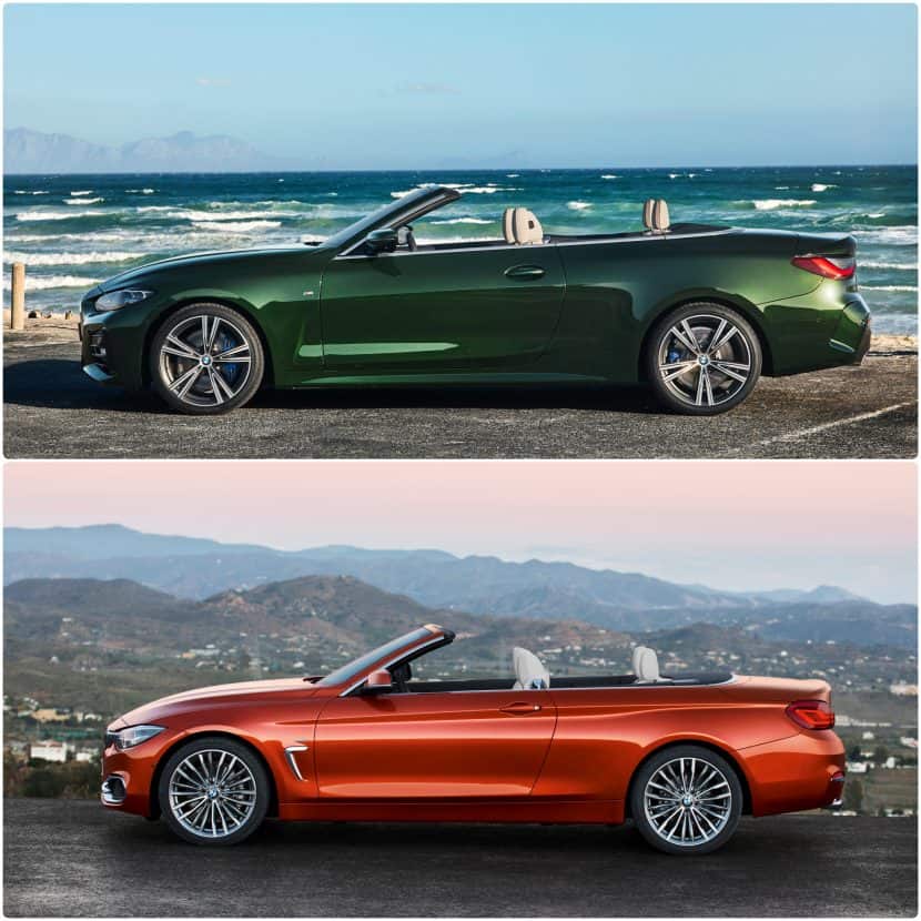
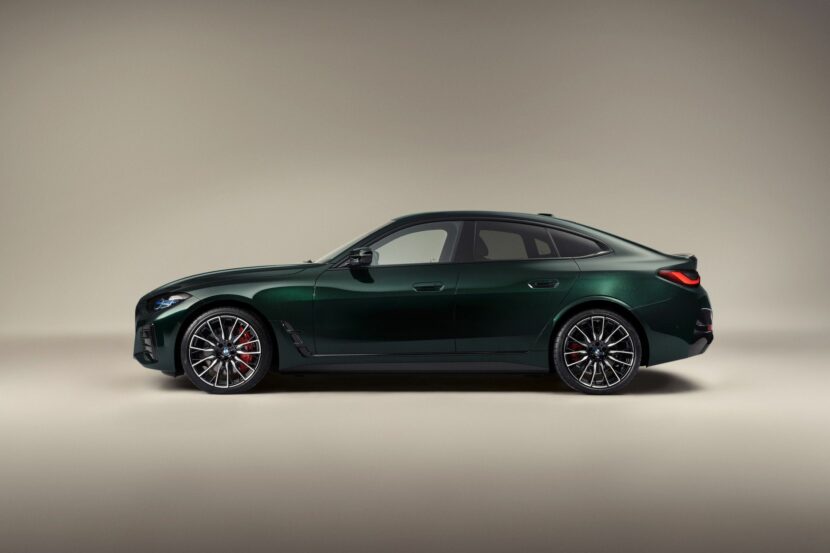
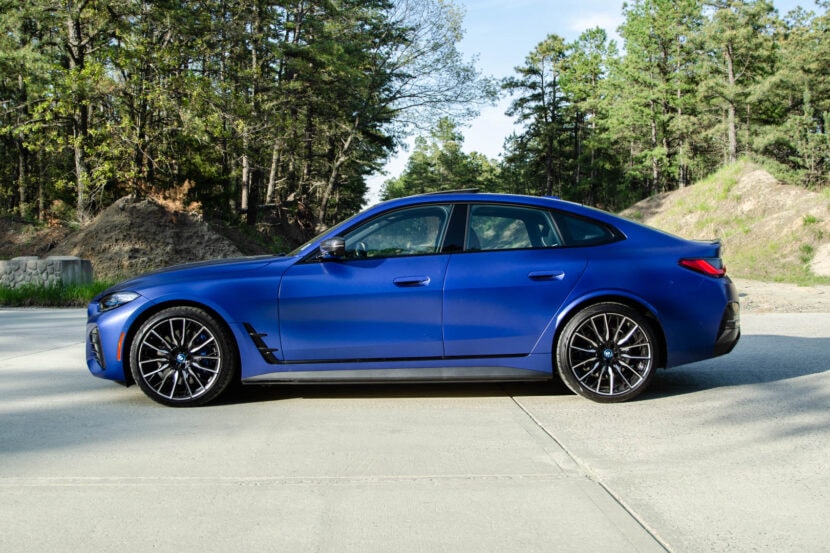
In this comparison, we brought together the new G23 generation finished in the elegant San Remo Green metallic paintwork and the previous F33 model featured in the striking Sunset Orange metallic color.
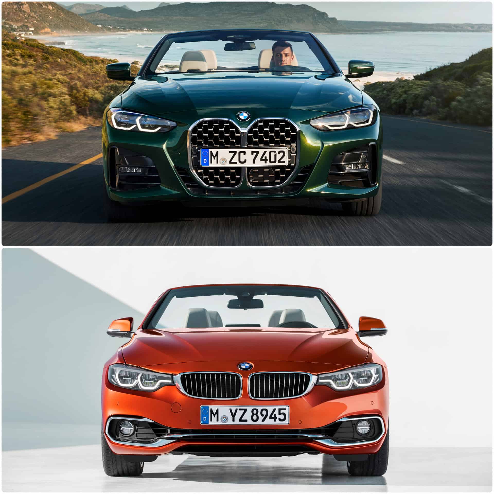
Starting with the front end of the two model generations, the differences are particularly astonishing as we are faced with two opposite design directions. If the F33 seems to have been developed to suggest the width of the car, the G23 is focusing primarily on making a powerful statement with the new kidney grille design.
On the former 4 Series Convertible, you’d get more chrome details as part of the Luxury Line trim, which adorned the wider, separated kidneys and surrounded the air vents. On the new generation, the mesh styling is different due to the honeycomb pattern that replaces the original vertical slats.
Also, the kidneys are now connected and are no longer connected to the headlights, contrary to what we have been accustomed to on the F33 series. The “eyes” of the G23 are as well bold and striking, suggesting sheer force. Their streamlined appearance and inner graphics are a radical evolution from the past design.
When looked at from the side, both generations reveal some sort of similarities. Yet, the silhouette of the new G23 has been reduced dramatically to the minimum in terms of detailing and sculpturing compared to the F33. For me, the F33 is the more elegant of the two, with its straight, upper boat line and the iconic character line that delivers a guaranteed visual effect.
On the G23, the character line is virtually gone and certain details are intentionally faded to express more simplicity, clarity and purity. Thus, the shoulders of the new open-top 4 Series look more robust and muscular. But the most striking difference comes when the roof goes up: the G23 ditches the metal hardtop in favor of a classic fabric top, which also help bring down the kerb weight.
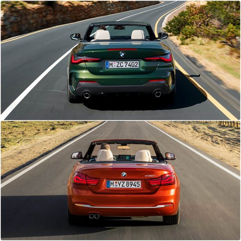
At the rear end, the new 4 Series Convertible is more expressively styled, with slimmer, L-shaped tail lights and added flank sculpturing. The section is also distinguished by the new M Sport rear diffuser and the side air breathers. The previous model featured a distinctive chrome line running across the lower part of the rear end, as part of the Luxury Line trim, further suggesting a discrete, tasteful elegance.
Furthermore, the G23 comes with dual exhausts that are placed one each side of the car, compared to the former F33 which grouped the pipes together in a single unit located on the left side of the rear.
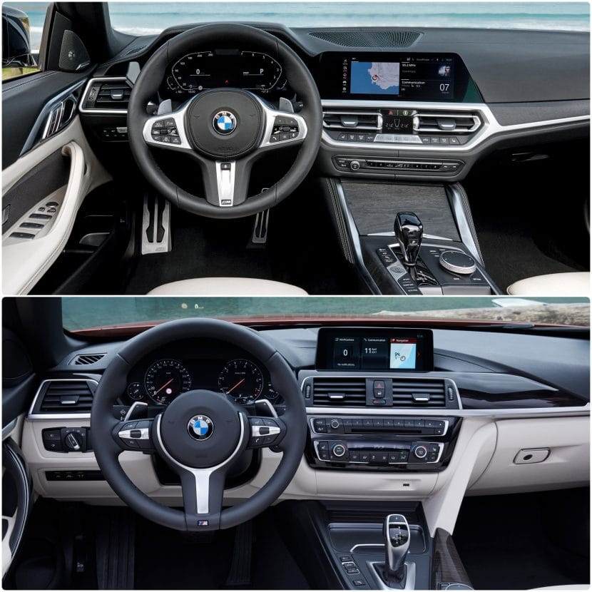
Going inside, both dashboards look familiar and styled in true BMW fashion. Of course, given the fact it was conceived in another era, the F33 4 Series comes with a load of buttons and physical controls (which, if you ask me, are more useful than accessing menus and sub-menus for finding what you need).
On the G23, you get the minimalistic, yet highly classy dashboard from the G22 4 Series. Many physical buttons are now gone and replaced by functions you need to access from the menu of the OS 7.0 infotainment architecture. Yet, the proposed architecture still remains suitable and practical for daily use with minimal stress. At last, the heated headrest function and the roof up/down button are kept on the center column, near the new electronic gear shifter.
Seen from above and with the top down, both the new G23 and the classic F33 evoke a balanced, elegant and self-assured attitude. Of course, the new generation is more radical and controversial, but it somehow manages to look better than the G22 4 Series in many styling aspects.
In the end, it is very challenging for me to pick one definitive favorite of the two verts, as I truly believe that the outgoing F33 series is an essential design benchmark in the BMW book of famous open-top models. So, which one would you choose?


