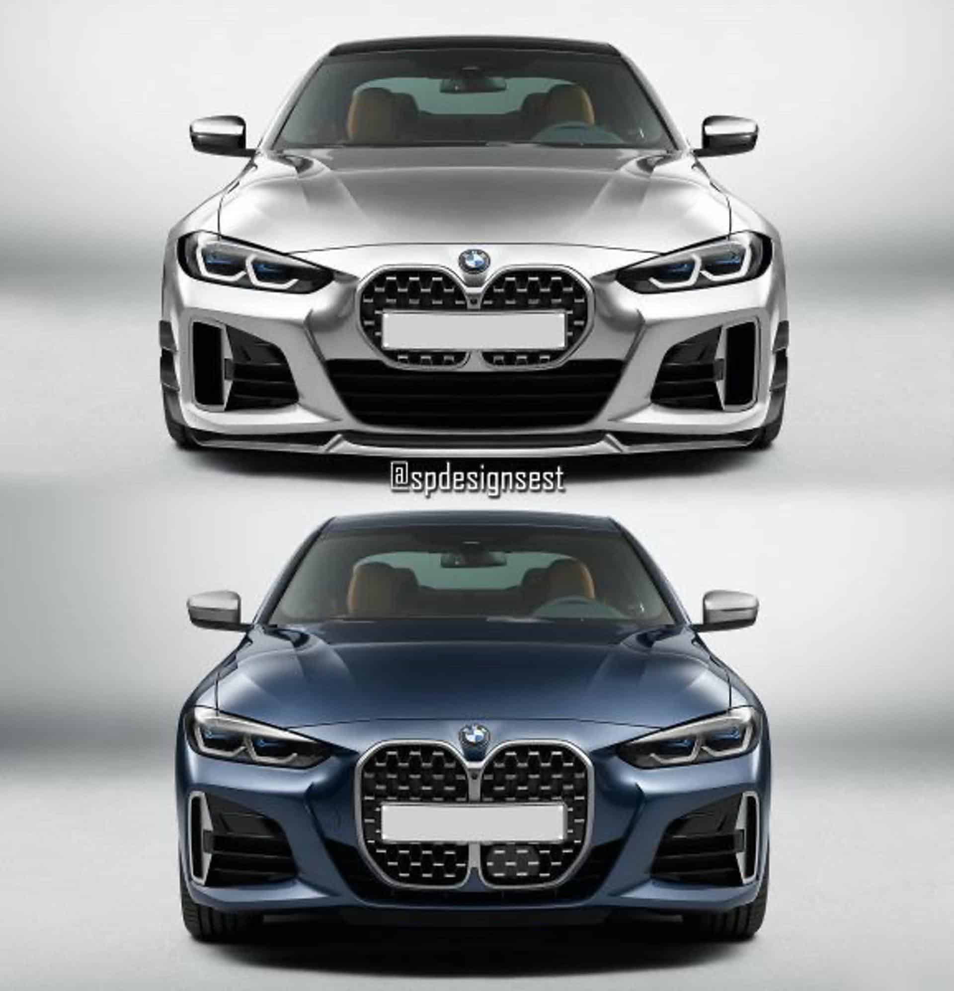
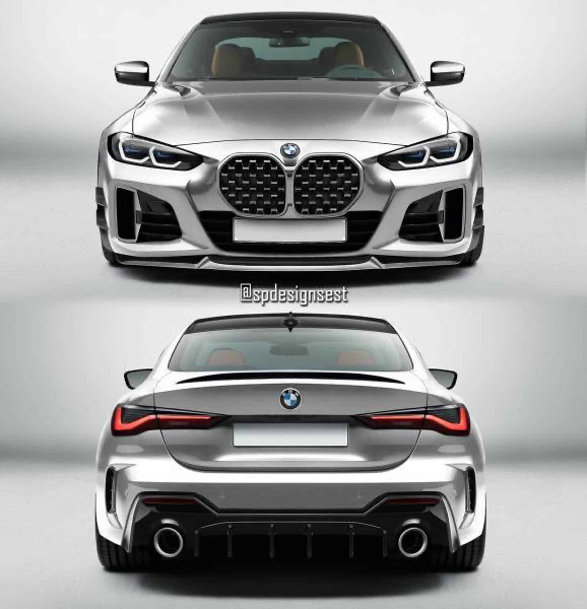
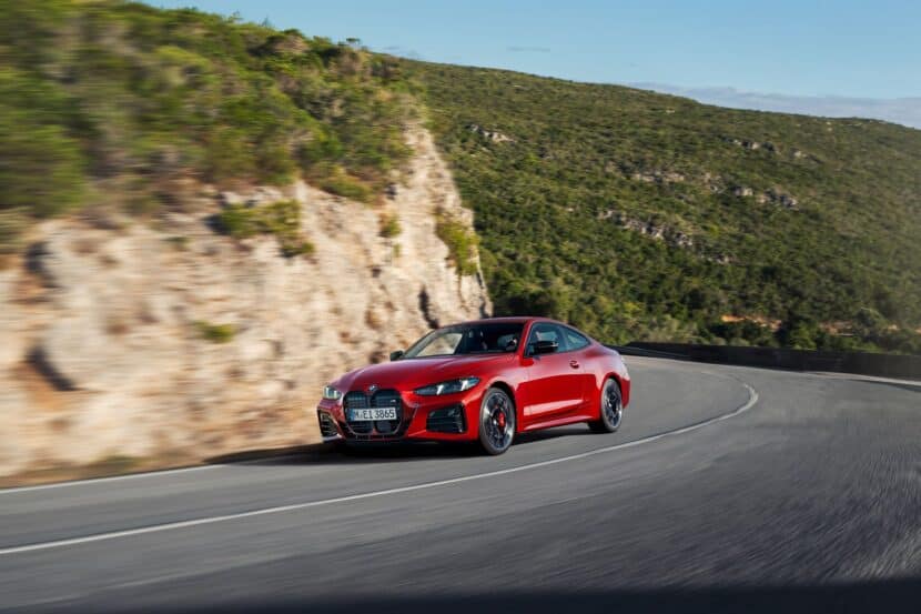
Not since the era of the Bangle Butt has there been a BMW design as divisive as this new 4 Series. Its new grille design has fans, enthusiasts, critics, journalist any pretty much the entire sighted world in shock. Not only is the new grille large but its disproportionate design is questionable. On a 7 Series or X7, the giant grille sort of makes sense. Not so on the 4 Series, where its sleek design and spot-on sports car proportions are more suited to a smaller, sleeker grille.
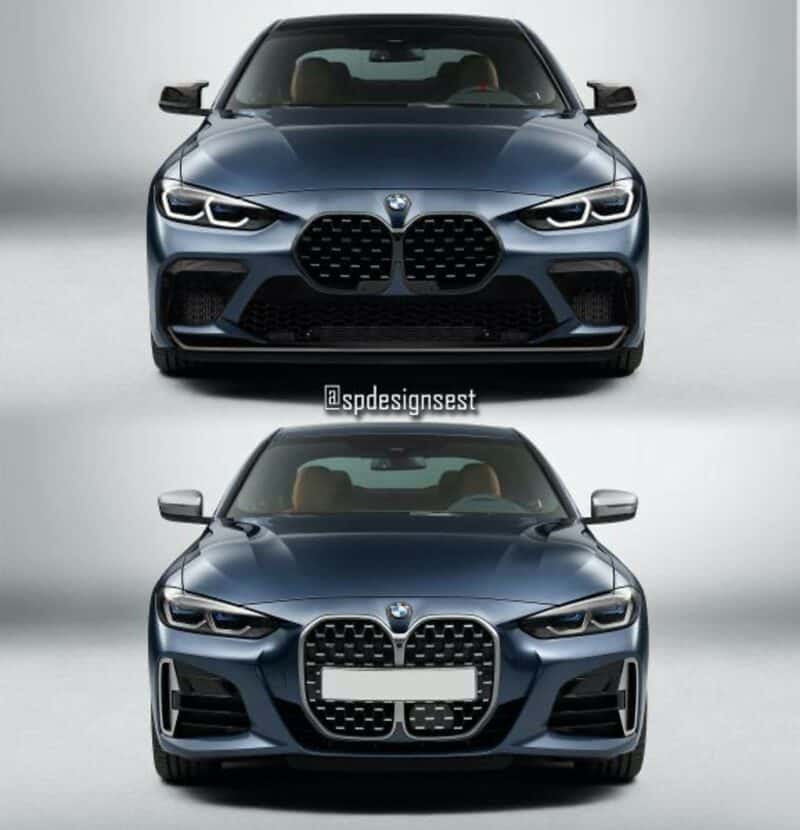
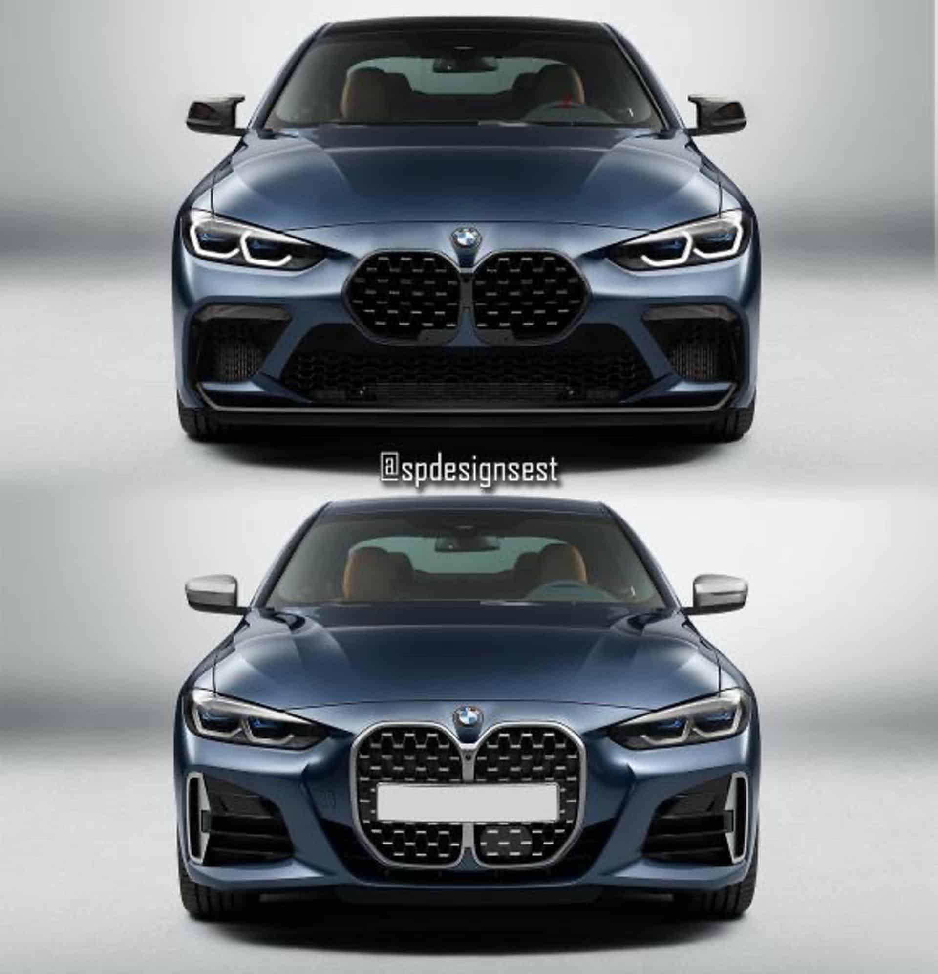
This divisiveness has led to countless render artists swapping out the 4er’s grille for a much smaller design. We’ve seen some renders of the new 4 Series with old 4 Series grilles but these new renders give it the grille from a BMW M135i. While that isn’t the best choice, as the entire front end of the 1 Series is very different from the 4 Series’, due to the former being front-wheel drive, it certainly looks better than the massive beaver-teeth grille of the stock 4er.
The smaller grille better compliments the sleek, aggressive headlights and makes the entire front end seem more cohesive. Even better still, the smaller grille gives the car a place to put a front license plate, something BMW seemingly forgot about when designing the new 4 Series.
While I think there are better grille choices that the one in these renders, it’s still better than the grille that adorns the stock 4er. When every render artist in the world can improve the grille design by simply making it smaller, you know that something’s wrong. I genuinely feel bad for constantly picking on the 4 Series, and feel bad for the design team behind it that’s been taking constant criticism since, but when it doesn’t look as good as any internet renders, there’s a bit of a problem.
[Source: @spdesignsest on Instagram]


