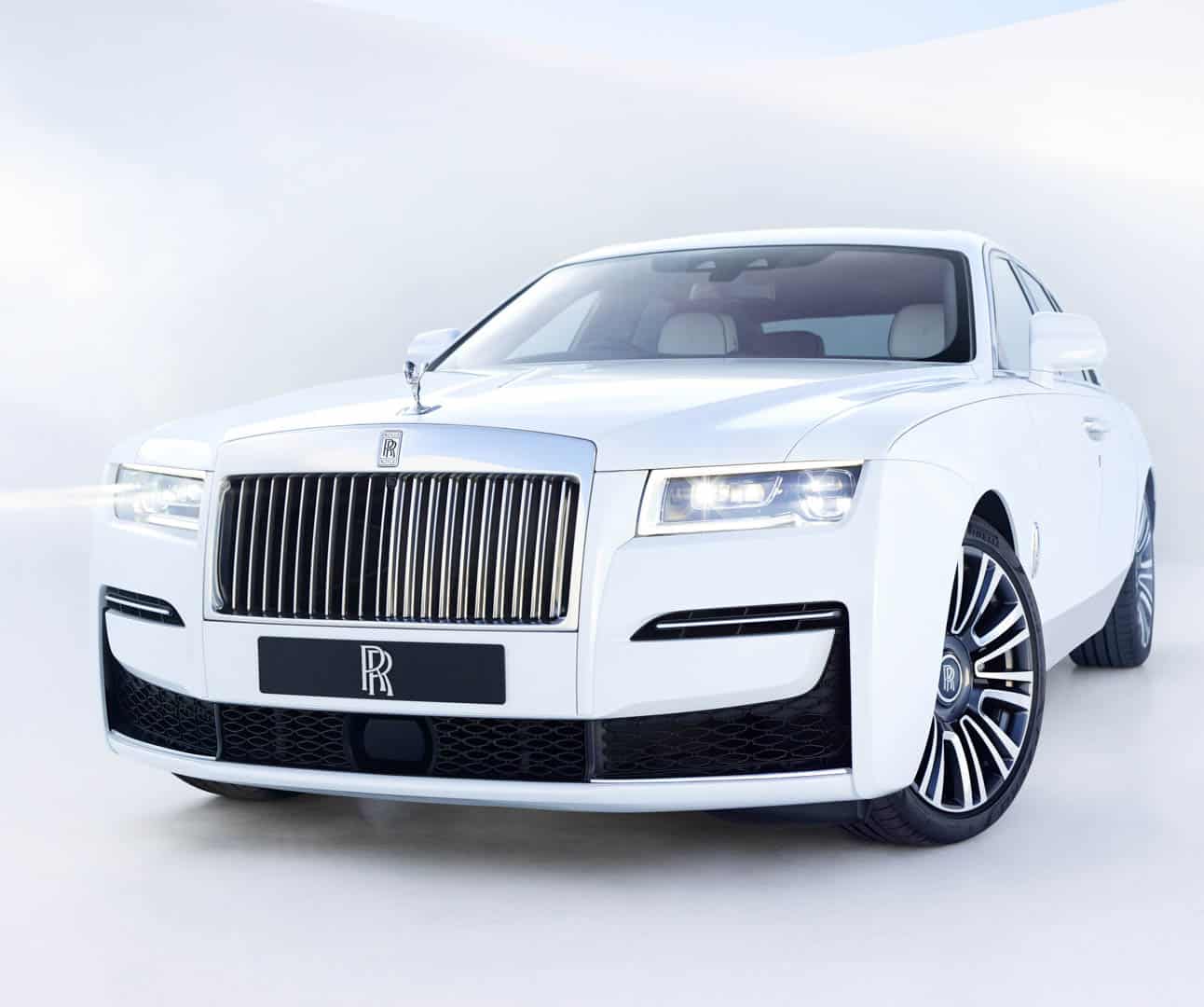
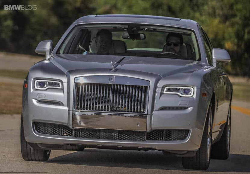
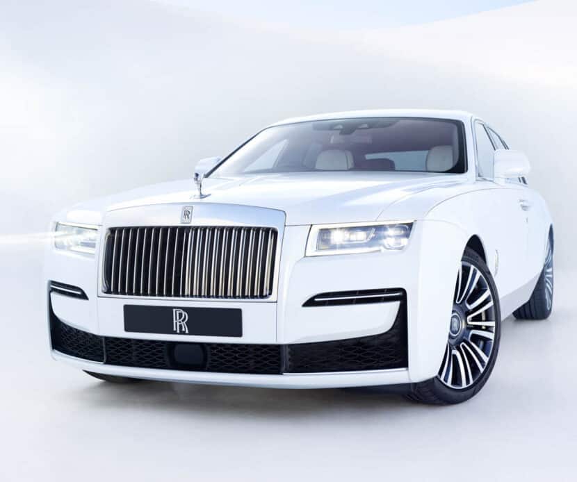
Looking at this new Rolls-Royce Ghost without the context of its predecessor, it might seem as if the new car hasn’t changed a bit. The famous British brand isn’t exactly known for radical design changes. Having said that, if you actually look at the new Ghost next to the old one, you’ll notice that the design has changed quite a bit. By Rolls-Royce standards, this is a radical change and one brings the Ghost into the modern era. So we thought we’d put the two car side-by-side to see just how different this new car is.
The biggest exterior changes to the new Rolls-Royce Ghost are up front. The new headlights now feature an outward-pointing “L” shape that look far sleeker and more modern than the outgoing lamps. The new lower front air intake is also sleeker and even looks sportier than before. I know such a claim could get me hanged for blasphemy but it’s true. While the grille looks mostly the same, the new car’s is actually backlit by twenty LEDs. Snazzy.
Out back, the taillights are roughly the same shape on both cars but the new Ghost’s are sharper and sleeker, making them look a bit more modern. Also, more interestingly, you can actually see the new Ghost’s exhaust pipes. Typically Rolls hides its exhausts, as the idea of seeing dirty exhausts could put off its clientele base. However, the new Ghost is designed to be a bit more exciting than the old car, so as to attract a younger audience. So exposed exhausts it is.
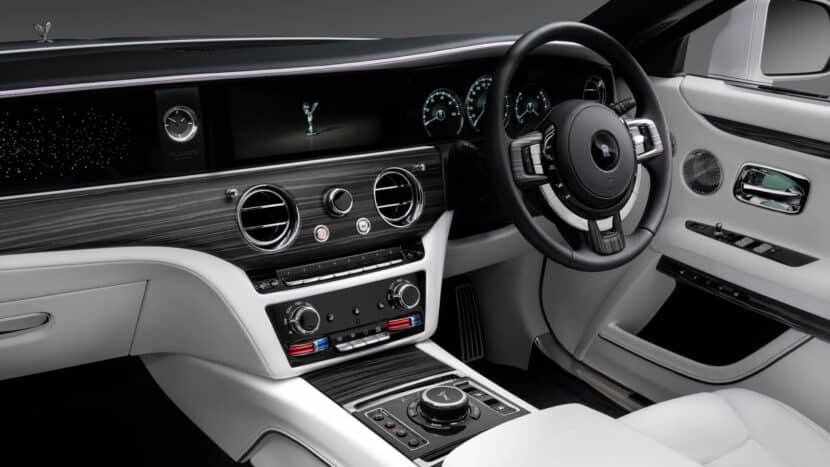
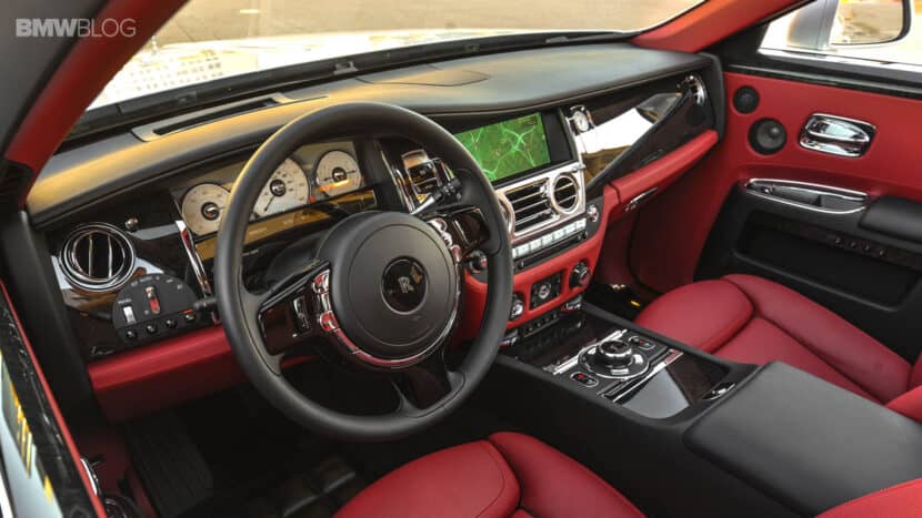
Inside, the new Rolls-Royce Ghost hasn’t visually changed too much but the changes have made a huge difference. The new car’s cabin is so simple and modern that it makes the old car look busy and cheap. It’s actually quite impressive, how Rolls was able to craft such a familiar looking interior while also making it seem light years ahead, in terms of luxury and tech.
We can’t wait to give this new Ghost a test drive, see if it’s as enjoyable to drive as claimed and to try out its fabulous cabin. Until then, these photos will have to do.


