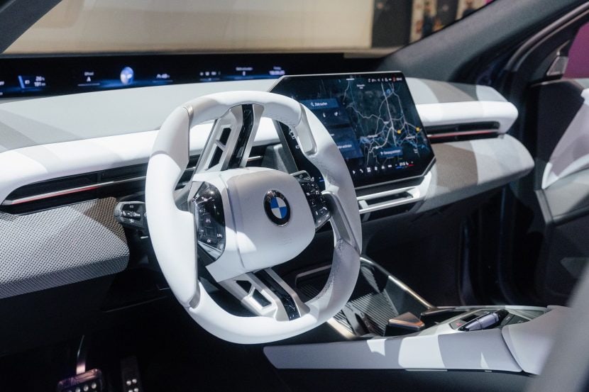
Last month, BMW introduced the Vision Neue Klasse X, heralding a new direction for the future BMW iX3. This move marks a departure from BMW’s established design language, embracing a unique aesthetic for the Neue Klasse family. The Vision X concept car nods to the iconic Neue Klasse vehicles of the past, featuring minimalist lines, a small vertical kidney grille, and an overall streamlined design.
Despite its new styling approach, the unveiling sparked a lot of discussions, with many online warriors suggesting that there’s room for refinement. Motivated by this feedback, we ventured into Photoshop to experiment with adjusting some of the design elements for a fresh perspective. While we lack the expertise of professional car designers and are not constrained by industry regulations or safety standards, this freedom made our creative process significantly more straightforward.
The Front-End Changes
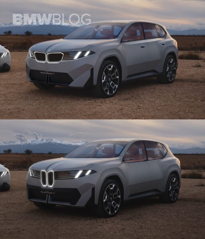
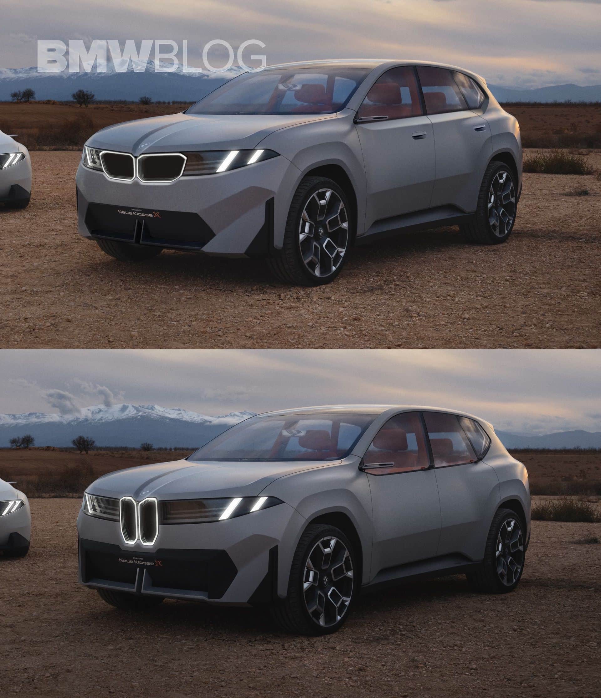
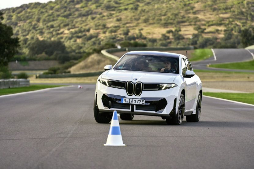
Upfront, the first change we made was to reduce the contrasting black graphic on the bumper area. As most of it served a purely aesthetic purpose, we decided to lower it to let more body color fill up the bumper area, while also giving it a more trapezoidal shape to better emphasize the actual size of the air intakes. Not only does this new bumper appear less complex, but it also helps in making the car appear slightly higher than it is.
Horizontal Kidney Grille
Another component we adapted from the front bumper is the bisected air splitter. We decided to paint it black, similar to the one on the new X2, as it looks much more discrete and doesn’t contrast that much with the other elements from the bumper’s design. The next obvious change we made was the “kidney transplant”.
Similar to BMW’s approach of distinguishing X models with vertical kidneys from sedans with horizontal kidneys in the Neue Klasse, we wanted to experiment by mixing a more conservative shape with this new design language. Over the years, we’ve become accustomed to seeing kidney grilles grow significantly in size across the current BMW lineup.
This is why we felt the pill-shaped kidneys on this model needed a bit more room to breathe within the front fascia. In addition to reshaping them into a horizontal layout, we also added a sleek chamfer around the frame to enhance the light reflection from the dual signature headlights and the kidneys themselves.
More Aggressive Design Lines On The Sides
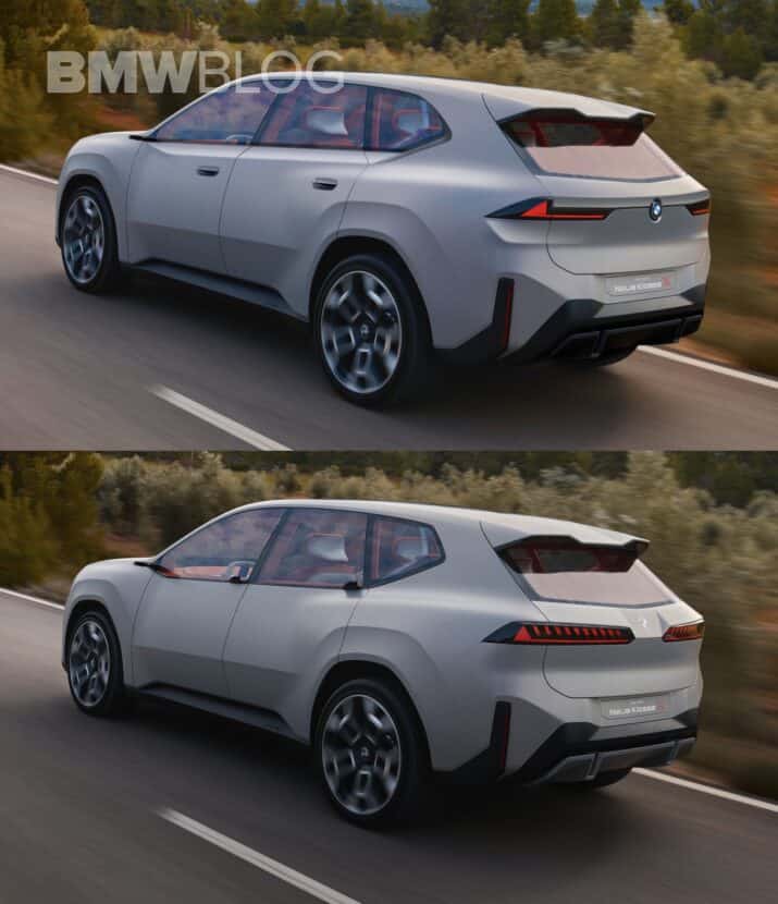
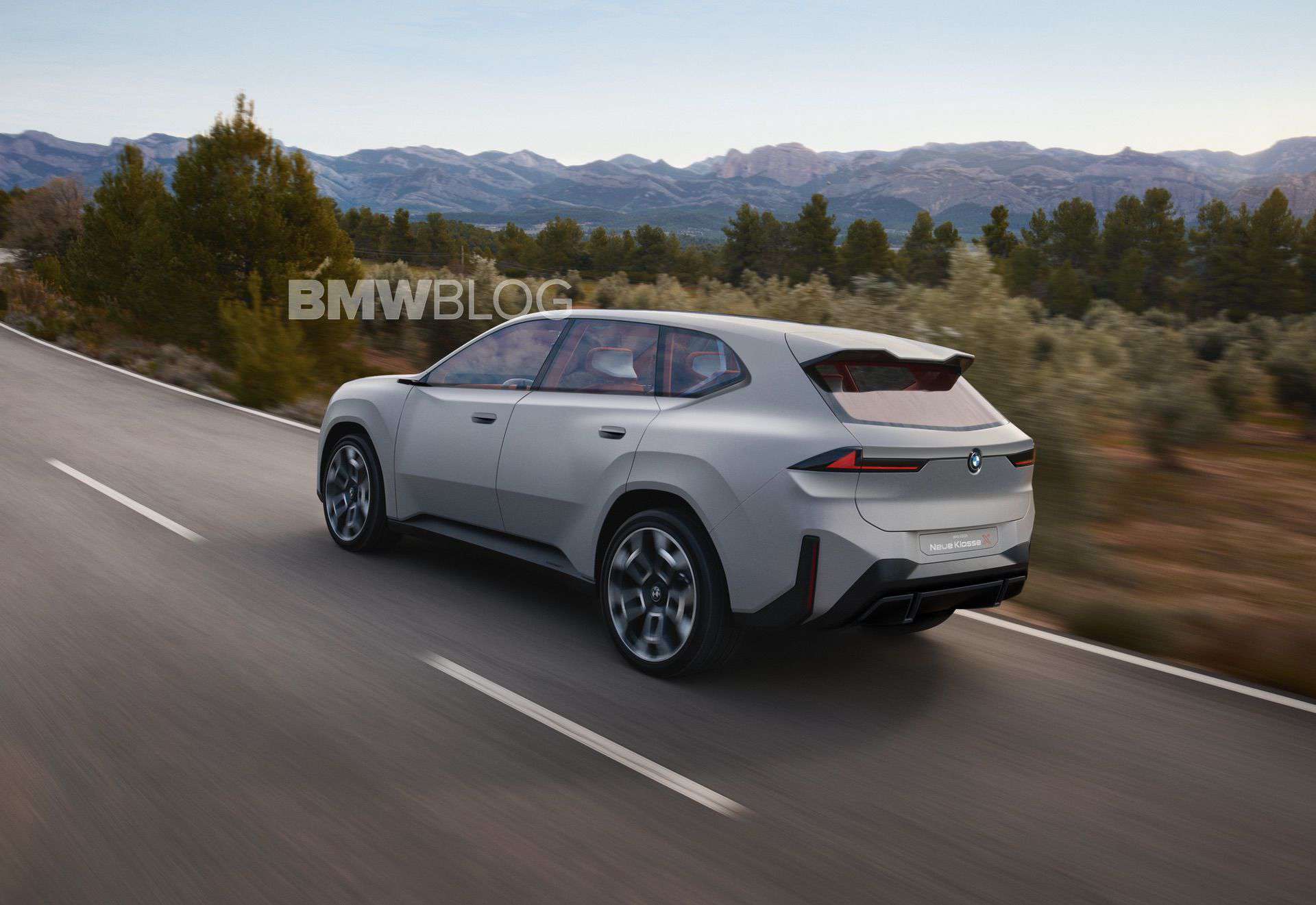
Moving onto the side view, the car now features a more prominent nerve across its shoulder line. By raising the lower frame of the greenhouse and covering that area with a perpendicular flat surface, the car now gains much more character without clashing with the bulging fenders or losing that “monolithic” design language from recent BMWs. And, to avoid making the shoulder line cut right through the rear fender’s muscle, we connected it with a chamfer that neatly curves around the Hoffmeister kink. With this new three-dimensional frame around the greenhouse, we also removed the new fin-style door handles in favor of the typical flush handles we’ve seen on recent models.
We Changed The Taillights As Well
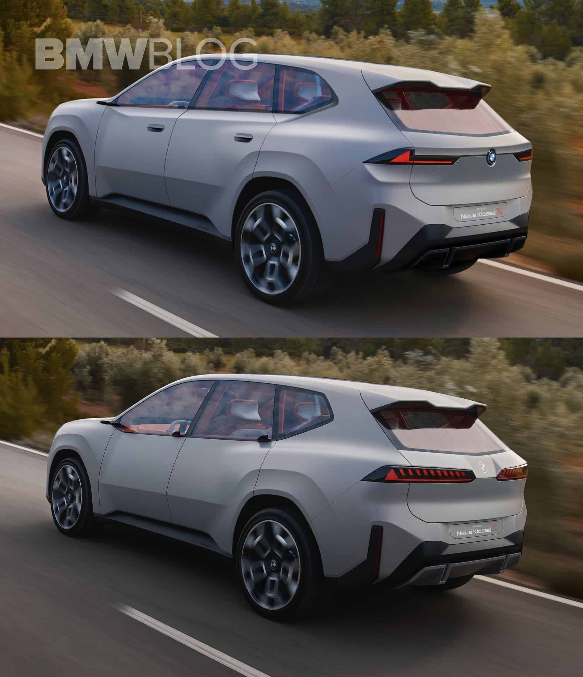
Looking at the rear, the changes may seem less drastic. Starting with the taillights, we shortened up their width —making the car look wider— and reshaped them to further emphasize the iconic L-shape design we’ve seen across the different eras of BMW design. Below them, we chiseled a clean curve that not only reflects light upwards but also resembles the shape seen on the classic X5. The idea behind this is to give the taillights more personality even when the LED signature is turned off.
We didn’t want to interfere too much with the rear bumper’s design, as its vertical light reflectors and number plate position already make the car look sportier than the typical BMW X models. Nevertheless, we did give the diffuser piece a stealthier look to make the bumper area look less overstyled and more consistent with the front end.
Aside from this, we drew some clean horizontal lines that align both taillights through a concave surface —same as on the classic E83 X3 and E53 X5 models. And of course, for the final touch, we replaced the monochromatic flat logo between the taillights with the colored roundel the BMW deserves.
Please see the final result in the video below where we show exactly how we drew these changes and let us know which design you like best: the original one or our own interpretation of it?


