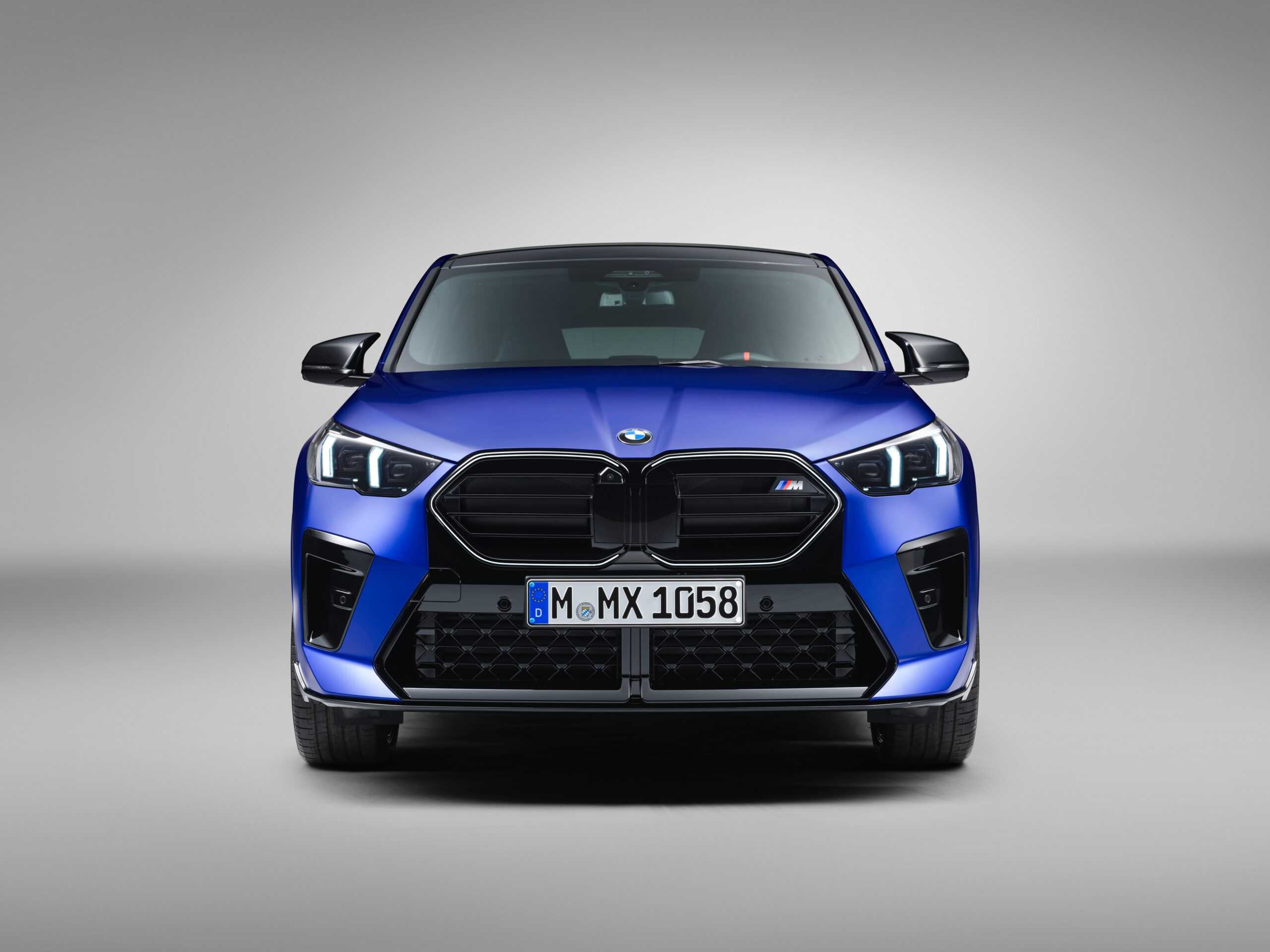
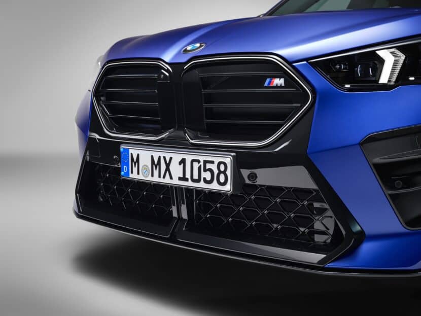
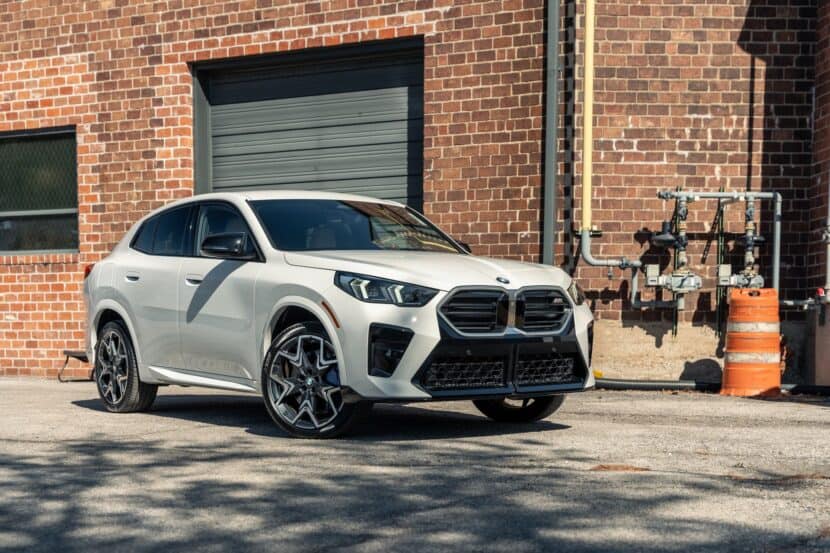
Now that the new BMW X2 is finally here, it is time to analyze its design. For its second generation, the sporty hatchback has evolved into a much larger coupé crossover with more stance and menacing looks. Let’s take a closer look. BMW really wanted to differentiate this one from the current X1, which is a new development, considering the similarities between the X3 and X4 or even the X5 and X6 designs. Immediately, we are struck by an aggressive fascia with large air intakes. The new hexagonal kidney grill combines the Iconic Glow illumination with horizontal slats and, resembling the X6 M, connects sharply into the lower trapezoidal air intake through a black graphic.
The air intake has a new split design that cleverly emphasizes the separation between the kidneys and even the two pronounced creases in the hood. It is likely that we’ll see this new split intake design on future M models like the upcoming M5. The headlights also differ from the X1’s, now featuring a more simplified dual arrow design and a similar lower border to those on the new 5 series. Another nice detail is the M-style view mirrors, which set the distinction from the rest of the X2 range.
Sleeker, yet more muscular
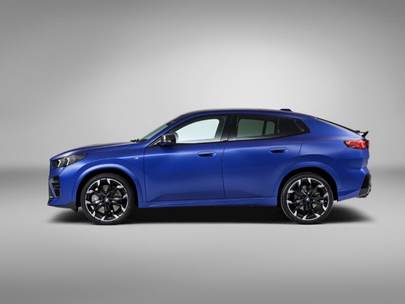
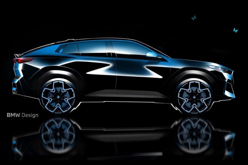
If we take a look from the side, we get to see not only how much the car has evolved from the previous gen, but how little resemblance it has with its sibling, the X1. The first visual element that separates these two is clearly the sloping roof, which gives it a coupé styling we’ve seen throughout the years on the X4 and X6. The window frame, however, looks quite similar to that from the previous X2, which featured a sleek design with an inverted Hoffmeister kink. The absence of the roundels on the thick C-pillar gives it some XM vibes, although with a much more evident fastback silhouette.
Moreover, the sharp shoulder-line we saw on the X1 has now been smoothed out to add more stance to the front and rear fenders. The car also features a higher belt-line crease to visually reduce weight, emphasizing its more athletic character in contrast with the X1s.
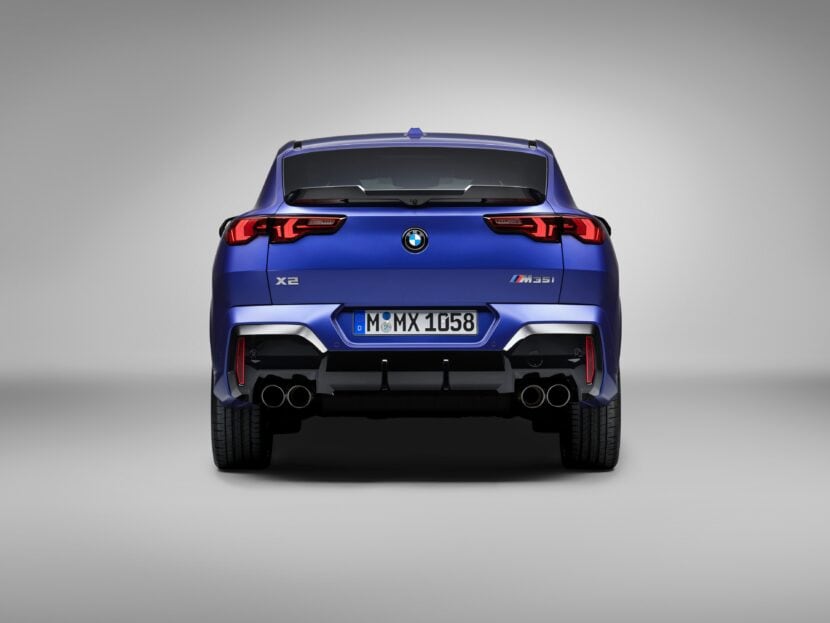
The rear is where it gets interesting. The new taillights are unlike anything we’ve ever seen from BMW’s design language, yet they give the car a really unique feel and a lot of character. Their unusual and sleek shape houses a dual arrow light pattern which reflects the graphic design of the headlights. It seems like the L-shape taillight graphic we’ve seen throughout years of BMW design is evolving into this new dual LED pattern, and it might take some getting used to.
Furthermore, the design team has ditched the previous gen’s organic lines and creases in favor of the new ‘monolithic design’, characterized by sharp horizontal lines and minimalist surfaces. What really makes it look sporty must be the combination of the Gurney-style wing, the protruding blacked-out bumper, and the prominently flared hips. And, of course, the M35i features those quad exhaust pipes, just like we saw on the X1 M35i.
An interior with entry-level M goodness
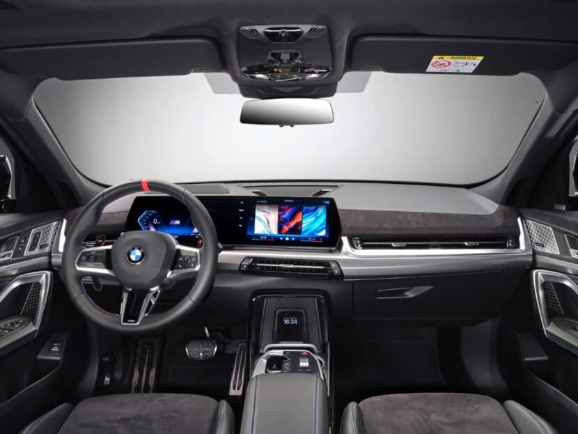
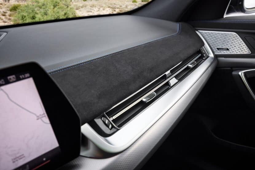
Mirroring the X1, the new interior boasts the latest curved display with BMW’s Operating System 9, the new simplified gear selector control, and also lacks the iconic iDrive wheel. In this M35i version, we can see the new M-design steering wheel with the red trim on the 12-hour mark and large shift paddles with red accents. There is, however, one new detail that we can’t see on the X1’s interior, and that is the new alcantara piece across the dashboard and door trims, which is exclusive to the X2’s M35i variant.
Every new BMW design introduces an element of debate, pushing boundaries and challenging our initial impressions. The new X2’s design is no exception, as it deviates from a mere X1 coupé variant we initially expected. Instead, the new crossover presents a bold and sculpted design, providing the X2 naming the distinct identity and gravitas that its predecessor sought.


