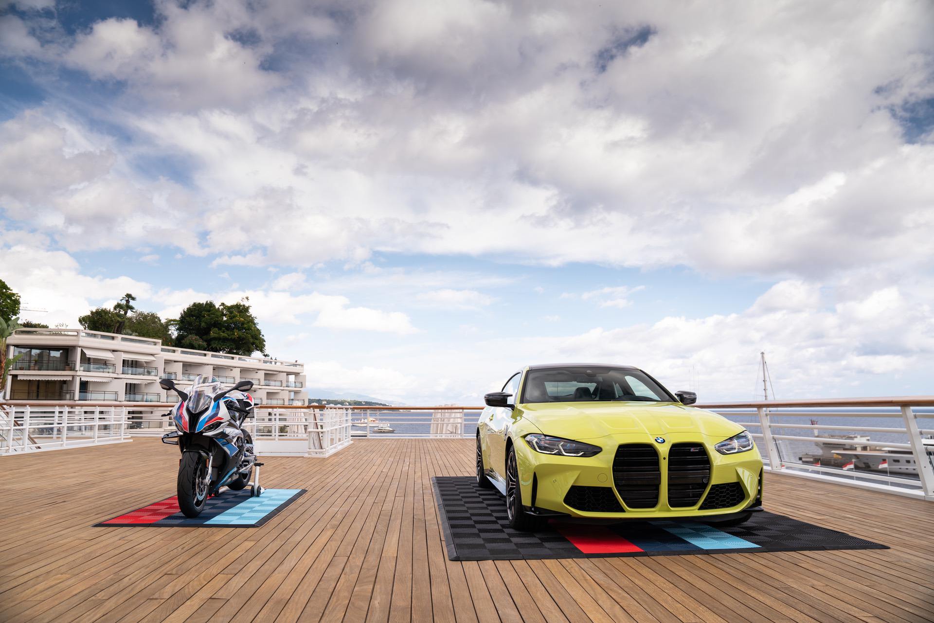
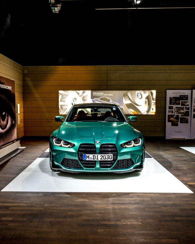
The new BMW M4/M3 grille design is dividing enthusiasts, with most thinking its awful, some saying that it’s weird but give the car a chance (<– us) and some that actually like it. But there’s no getting around just how polarizing it is. BMW can try and spin the new grille all it wants, trying to claim that it harkens back to cars like the original BMW 328. No one’s buying it, though, as the grille is completely disproportionate to the rest of the car’s design. To prove it, a render artist decided to give older generation M3s similar grille styling and it’s sort of hilarious.
In these new renders, each generation of M3 essentially gets its grille elongated to the bottom of its front bumper. This way, it gets a similar design to the new car. Obviously, digitally stretching some old grilles doesn’t make this an apples-to-apples comparison. But it does prove a point.
With the new BMW M3 and M4, it seems as if the Bavarians forced this grille upon the designers, as the rest of the front end doesn’t seem to fit. So the new grille is way out of proportion and seems like a bit of an afterthought. Just as these rendered grilles are.
Just yesterday, I claimed that we should give the BMW M4, and also M3, a real chance, as it should be an excellent car, grille aside. However, that doesn’t mean it should be free of criticism and it certainly deserves some from this new grile.
My personal favorite of these renders is the one of the E30 M3. Its standard grilles are so small and skinny compared to modern BMW grilles that elongating them down to the front bumper makes the E30 M3 look like Nosferatu. And that just makes me laugh it a bit.
[Source: Auto Evolution]


