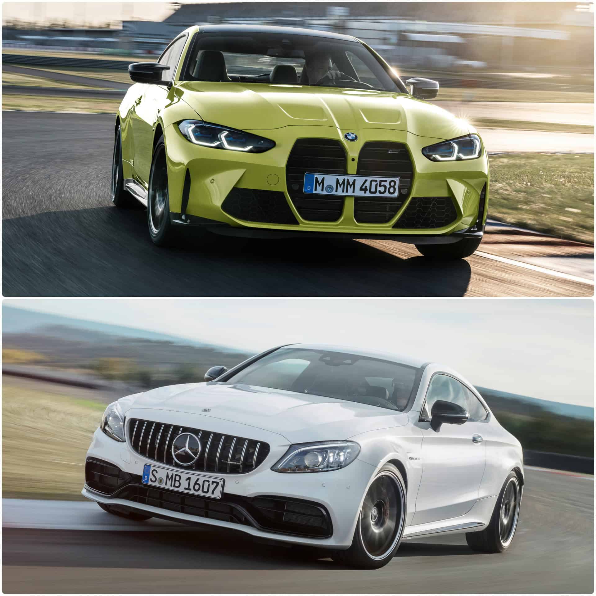
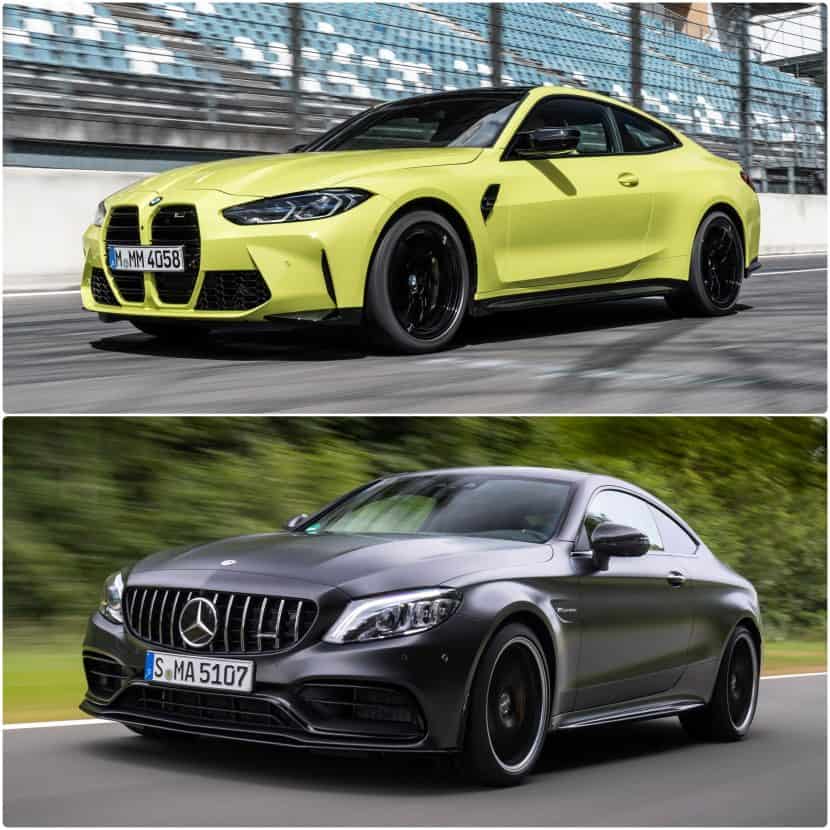
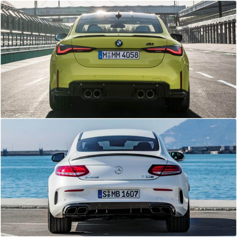
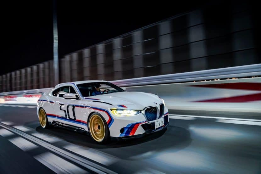
The new M4 Coupe goes head-to-head in visual comparison with the arch-rival from Affalterbach, the current generation C 63 Coupe. AMG, beware: the Garching-based BMW M division will bring some serious competition to the high-performance two-door segment. As the G82 model series has already hit the big stage of the automotive industry, it is a good time to see how it compares to its long-standing enemy from Affalterbach in terms of design.
Again, this battle is purely a matter of personal choice, because we are talking about different brand philosophies and design approach. Biased or unbiased as I am may be, I have to acknowledge that Mercedes-AMG is a very tough and powerful contender for BMW M. But the new M4 Coupe generation will really give the C 63 Coupe a good run for its money.
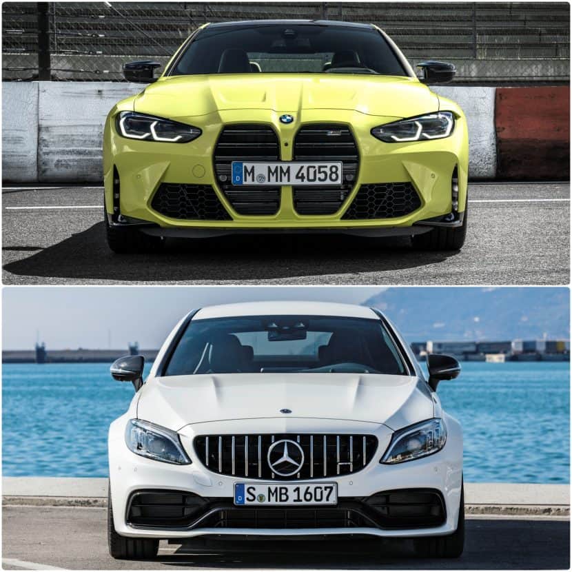
Let’s start with the front-end of both competitors. Right from the beginning, we are faced with a massively striking difference in styling philosophy. The M4 Coupe premieres the new M signature grille with upright kidneys, whereas the C 63 Coupe builds up on the rich motorsport tradition of the brand with the Panamericana grille inspired by the 300 SL of the ’50s decade.
Both cars look absolutely sensational in person and in photos, so choosing one over the other all comes down purely to personal taste. For me, the G82 M4 manages to look menacing in both bright and dark shades, whereas the Affalterbach rival is better suited in darker colors.
Personally, I feel that the new face of the M4 really speaks for itself, with the giant nostrils depicting the high-performance character of the Garching contender. The M4 is clearly the winner in terms of front-end identity, as it is more cohesive, modern and futuristic than the C 63, which looks a bit dated and bland.
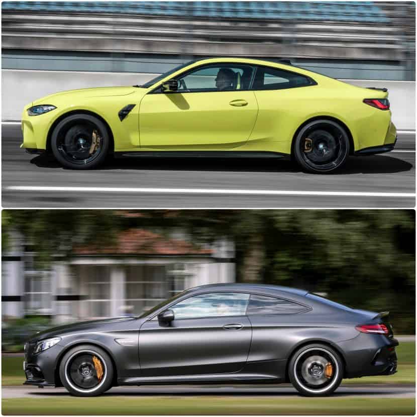
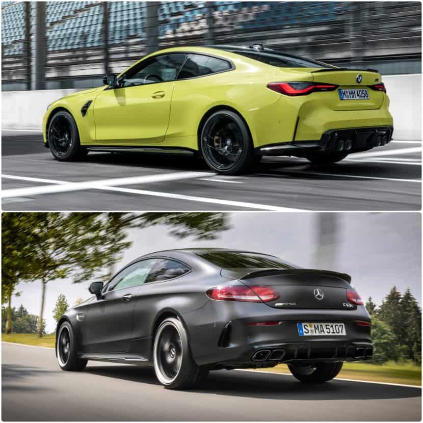
In terms of side silhouettes, we are faced again with the same brand differentiation, even though the designers of the M4 seem to have inspired from the C 63 when it comes to the upwards-oriented window line.
The M4 feels more muscular and athletic thanks to the clean surfacing and styling based significantly on cues and edges to reflect the sheer power of the car. In my opinion, the C 63 is a bit more understated. Luckily the car has some proper wheel designs in store, that deliver a spectacular visual effect.
At the rear-end, the AMG C 63 feels a bit shallow, as the license plate is installed on the bumper. Of course, the horizontally-placed rear lights are looking elegant and premium in all aspects, but the iconic L-shaped lamps of the new M4, with their streamlined appearance, look very modern and futuristic.
The main centerpoint of the M4’s rear end remains the centrally-positioned quad exhausts and the generous rear diffuser, which delivers an exhilarating visual effect. But the C 63’s rhombus-shaped exhaust pipes, pushed towards the sides, are also equally attractive and enchanting.
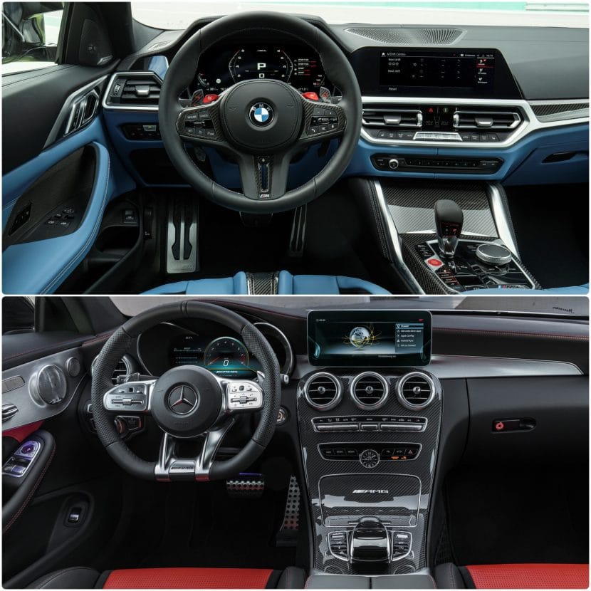
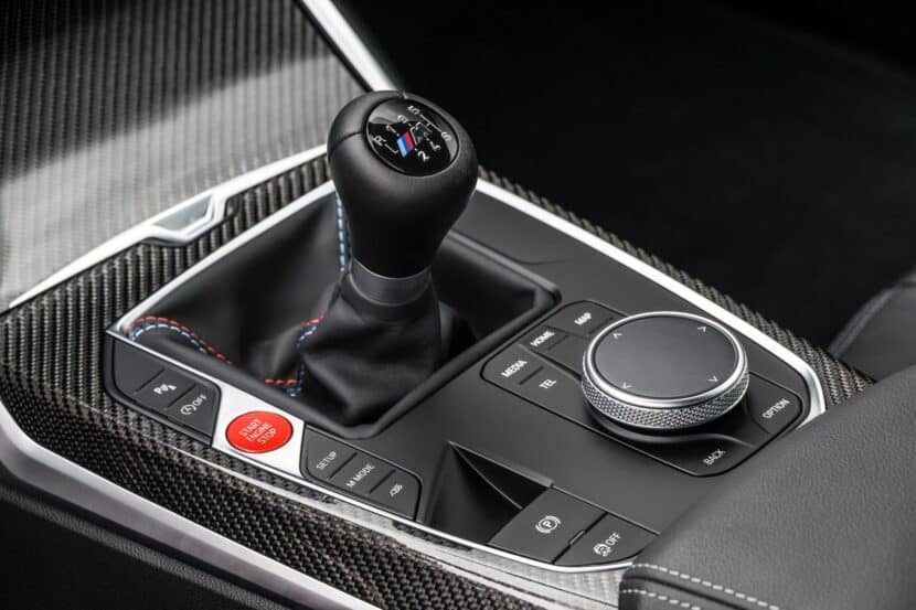
Again, comparing the dashboards of the two competitors reveals again the different philosophies in which they were conceived. The M4 features a balanced amount of physical buttons and an impressive amount of digital technologies. The infotainment interface is based on the BMW OS 7.0 and is exclusive to the BMW M brand.
The C 63 is the older model in the game and had to adapt to a newer world. This means not everything inside the Affalterbach high-performance Merc came naturally as part of facelift procedure 2018. The central screen at the top of the centre console looks like a forced after-thought, as is the digital instrument cluster. But, the steering wheel of the C 63 looks better and transmits more sense of brute force than the M4.
The new M4 certainly stands out with a functional design and unmatched user-friendliness and cohesiveness. The different M layouts for the digital BMW Live Cockpit Professional offered as standard equipment further enhance the driving experience aboard the G82.
So in your opinion, which of the two contenders wins this visual contest?


