Now that we’ve seen the new G20 BMW 3 Series, which seems to be one of the most drastic styling changes of any 3 Series generation, we thought it’d be an interesting idea to compare it to the car it replaces. The F30-generation 3 Series was a handsome car but it was never gorgeous. Could this new car be a step in that direction? Let’s find out.
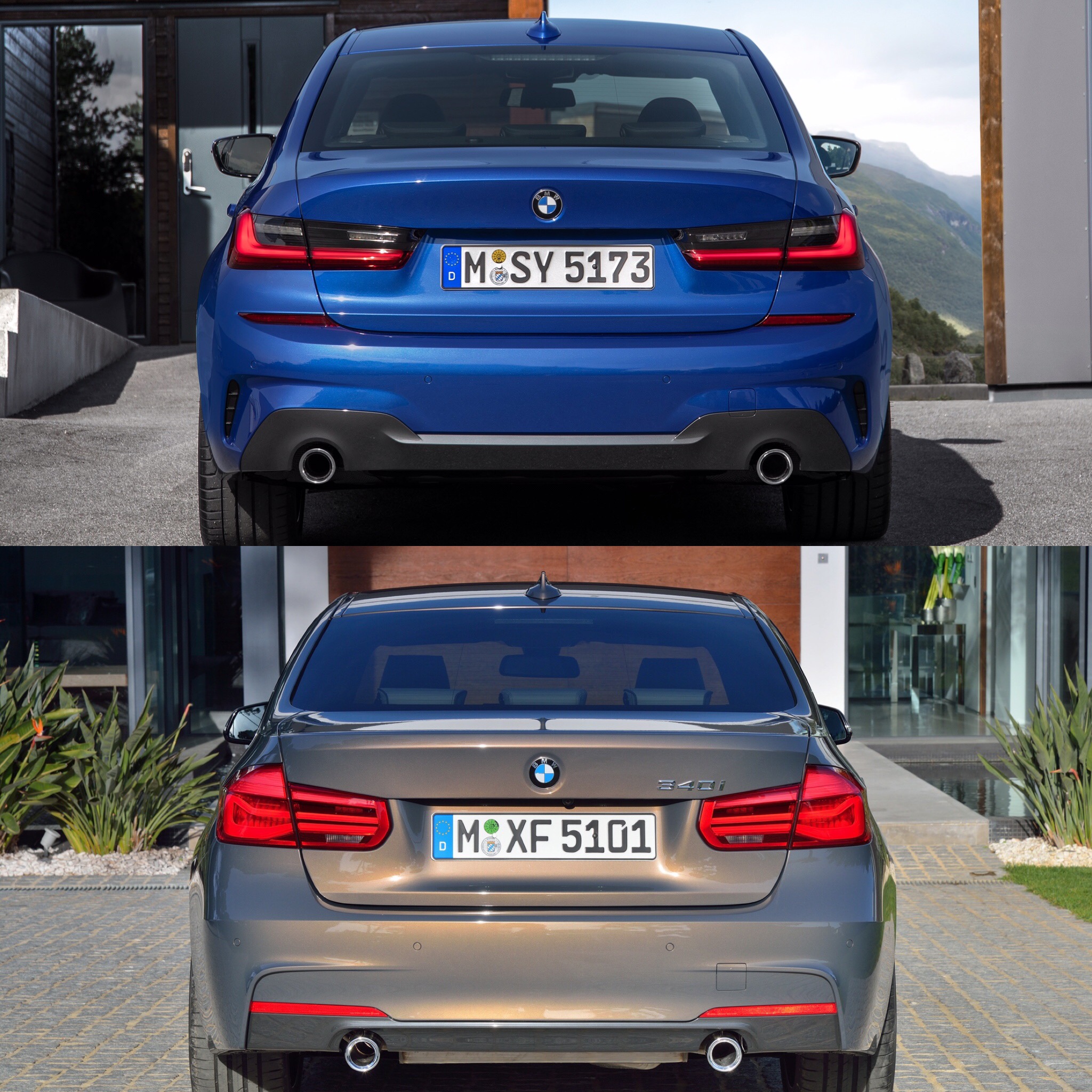
For this example, we decided to compare both cars’ M Sport variants. For the F30-gen 3 Series, the only official M Sport photos similar to those of the new G20 M Sport were of the 340i variant. However, the equivalent G20 is actually an M340i M Performance model and that’s far more aggressive than the old F30-gen 340i was. So we decided to use the F30 340i and the new G20 330i M Sport as, looks-wise, they’re closer to each other.
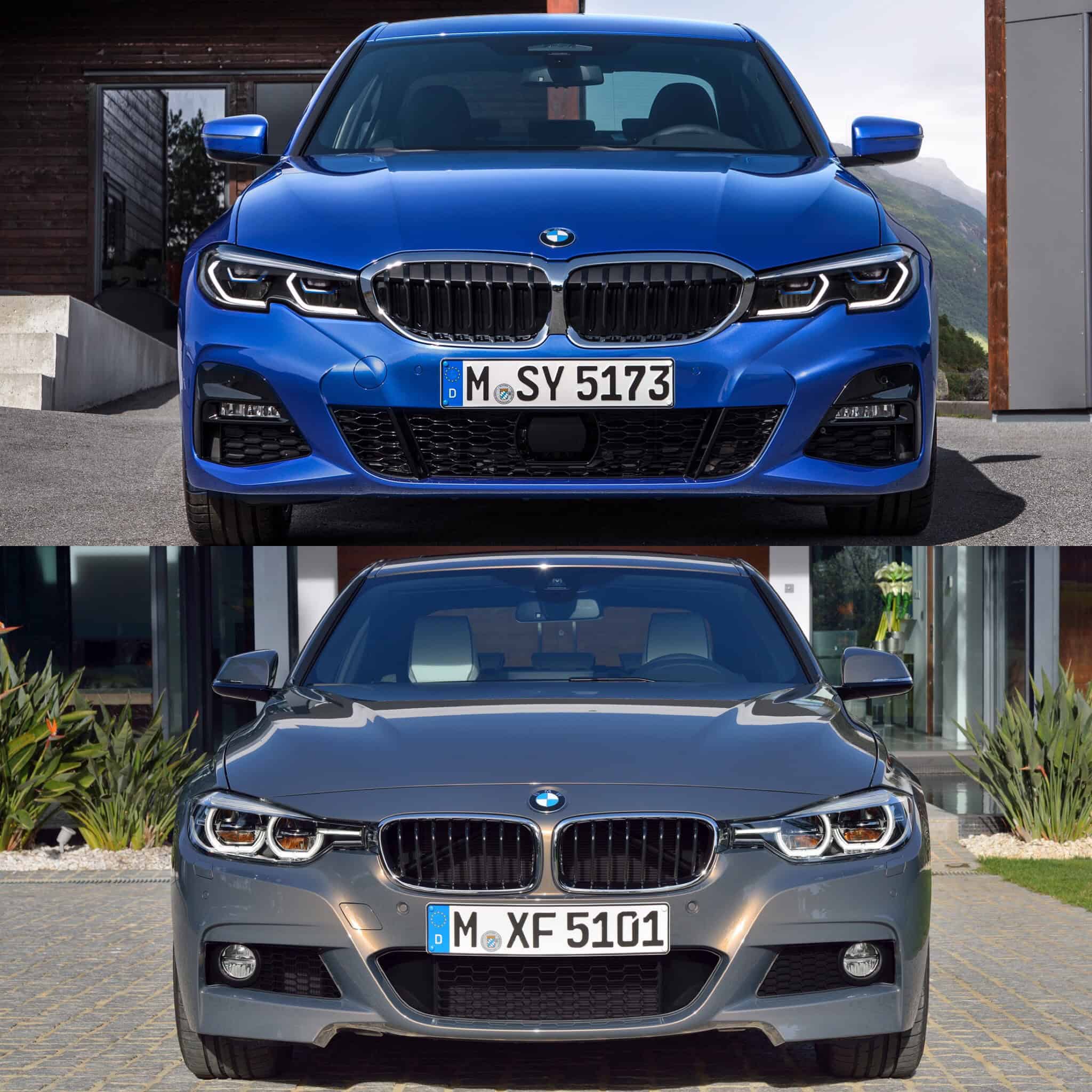
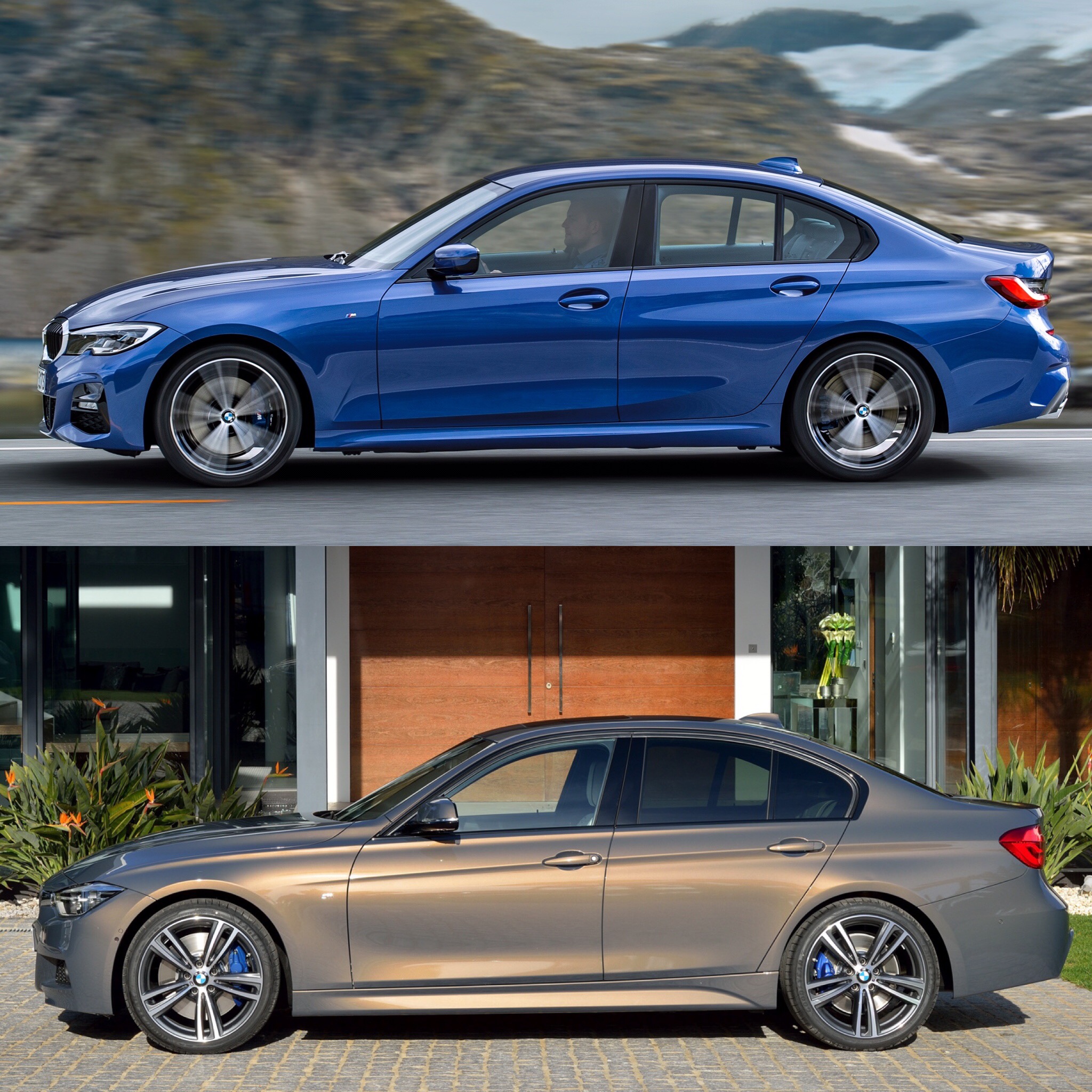
The two cars are far more different than we previously thought. When you see the G20 in isolation, it seems like a evolutionary design but when you see them side-by-side, it’s far more revolutionary than we had assumed.
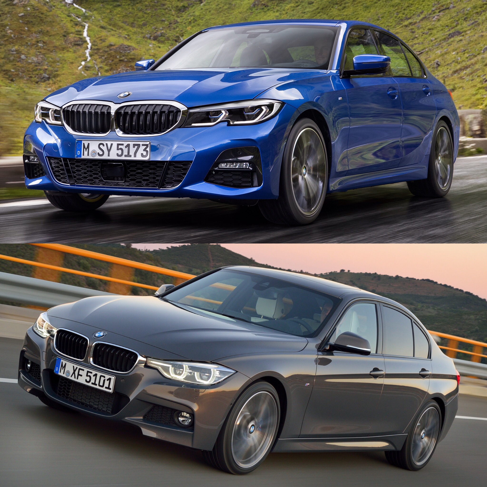
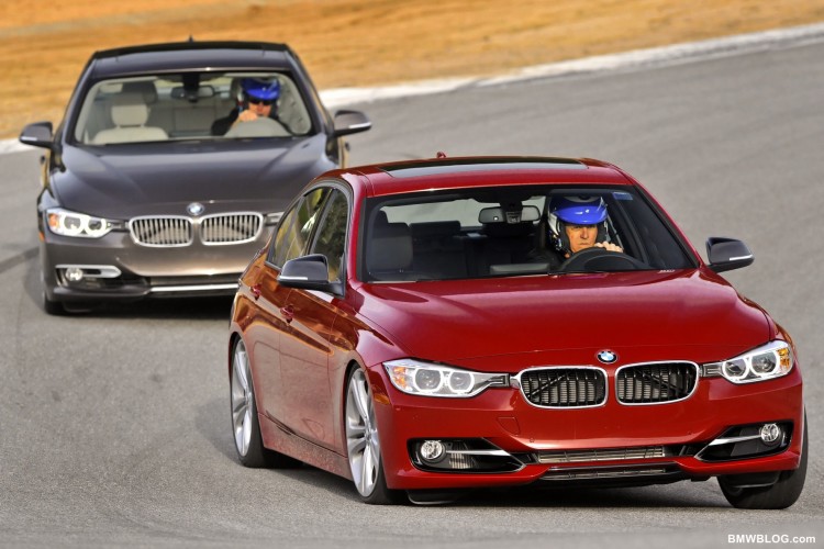
From the front, the new G20 3 Series is significantly wider looking, with its massive Kidneys Grilles that blend into the headlights in a far more cohesive fashion than the F30’s. The hood is more aggressive creased, its headlights are wider and feature little upward notches in the bottoms of them, its lower front air intakes are larger and wider and its foglights are horizontal LED jobs. Overall, it’s wider, lower and more aggressive than the car it replaces, while also looking more modern and more premium.
Down the side, the new G20 is significantly lower looking, even though it’s 1mm taller, and sportier. It also features a sharper, more aggressive Hofmeister Kink, even if it’s a bit arrow-like. It shoulder line is also quite a bit softer than the F30’s but you can noticeably see the swell in the rear wheel arches from the side. While I’m not so sure I personally love the look of it toward the rear, from the side view, I think it looks better overall, this new G20.
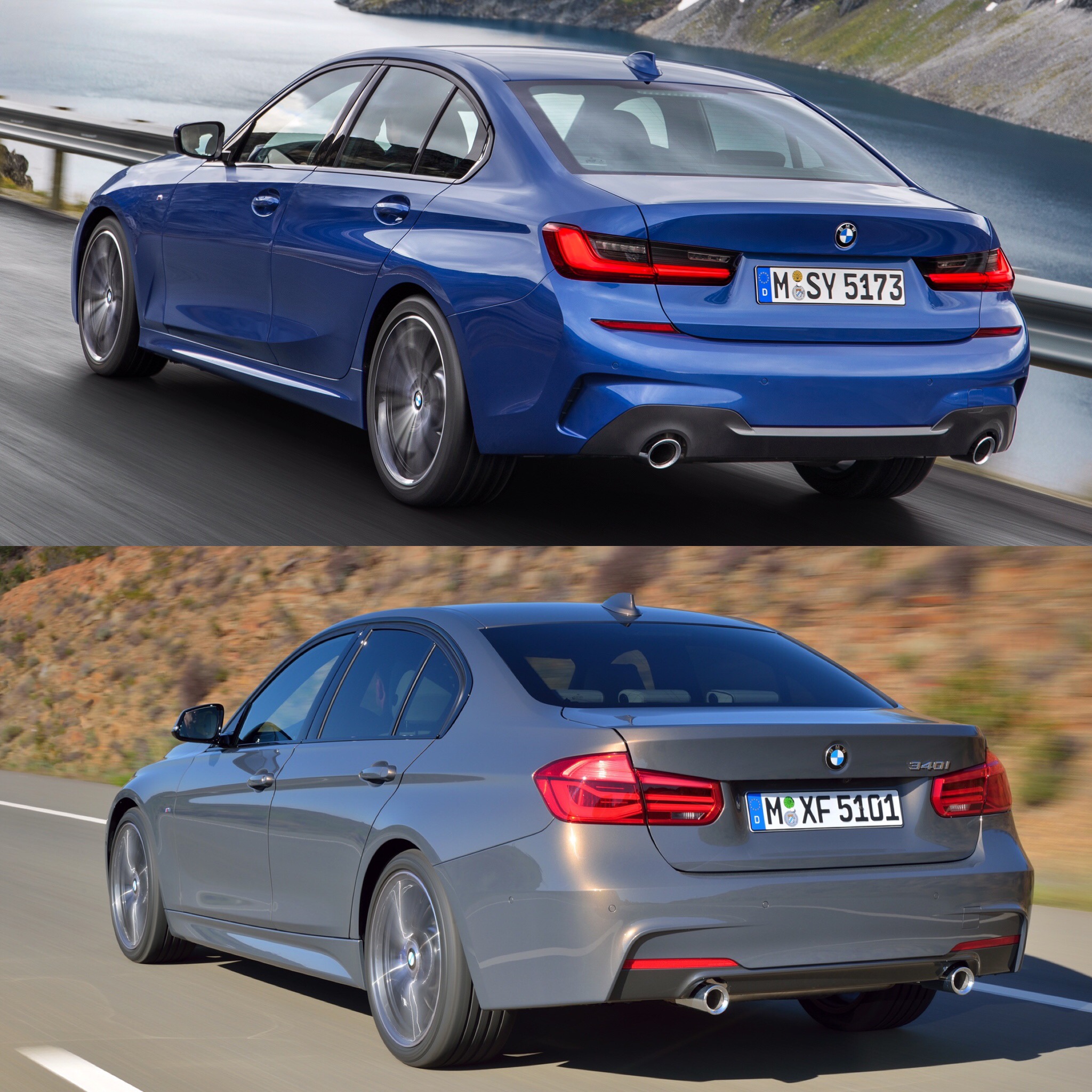
From the back, you can really tell how much wider the new G20 3 Series is than the old F30. It’s almost F80 M3-like, with how flared its rear wheels seem to be. That look is accentuated by dual exhaust tips that are wider apart than before. The new taillights are sleeker and a bit more modern, even they’re a bit Lexus IS-like.
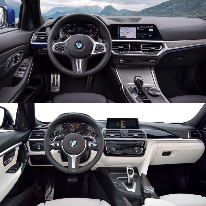
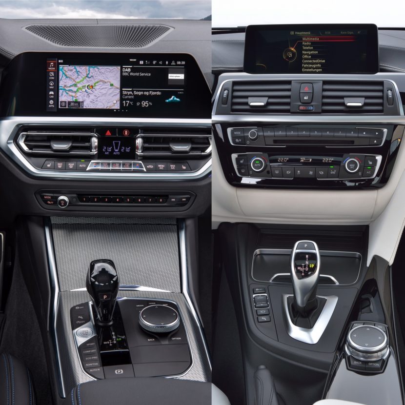
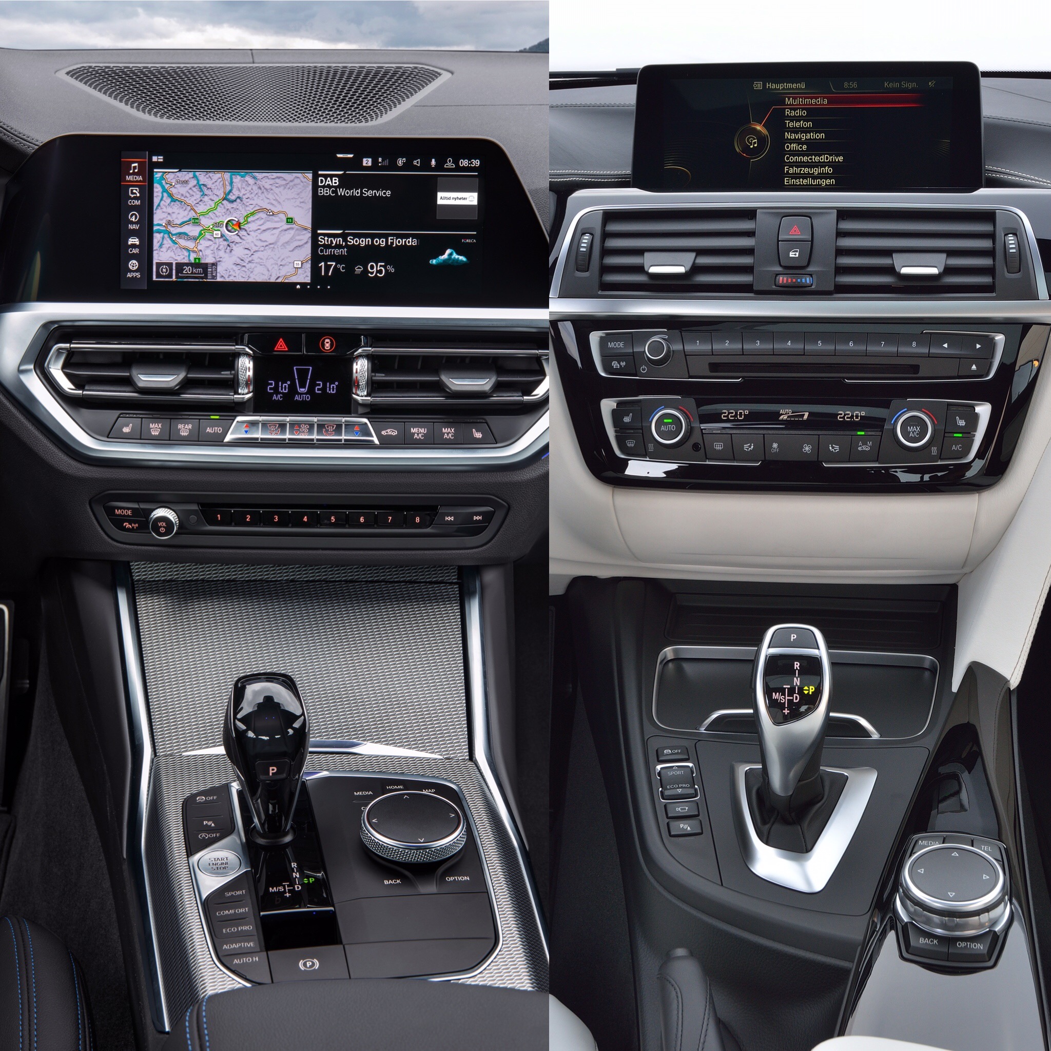
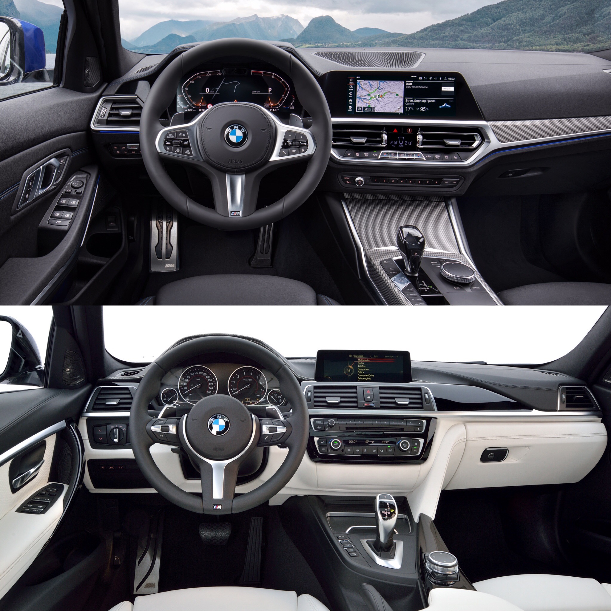
On the inside, the changes are even more vast. BMW did what we think is a superb job giving the new G20 3 Series more interior space, an airier cabin and more technology while also making it sportier looking. That’s a tough thing to do, as the removal of the classic handbrake and addition of digital gauges can make car cockpits seem less sporty. But BMW did the opposite. The new pseudo-waterfall effect on the center console, aluminum-look air vents, metal buttons on the climate controls and new button “island” on the console all combine to make the interior much more expensive and premium.
When you add in the new tech, which is far superior on the G20 than the F30, it’s as if it’s an entirely new model. BMW’s newest iDrive is incredibly impressive and the new digital gauge cluster is a massive leap forward, we think.
Overall, the new G20-generation BMW 3 Series M Sport is far, well, sportier than the car it replaces. Some might love the new looks and some might prefer the old car. But I don’t think there’s a question that the new car looks more premium while also looking more aggressive.


