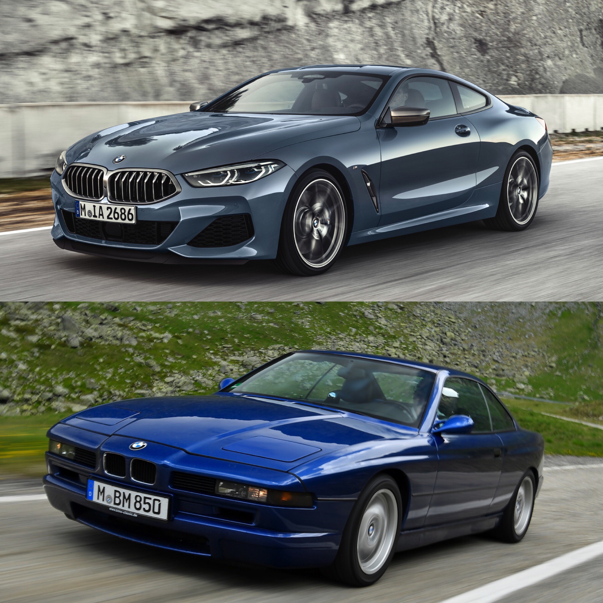
The new BMW 8 Series is finally here. After almost two decades, BMW finally released the long-awaited second-generation of its flagship grand tourer. Despite the first car being a bit of a swing and a miss, fans have been begging BMW for another for a long time. And now that it’s finally here, I think it’s better than most fans were hoping for. However, is it better looking than the original, the car that preceded it? We take a look with these new comparison photos.
We actually did a similar comparison back when the 8 Series was still wrapped in prototype camo. Now, though, we’ve seen the new 8er in the flesh. So which looks better?
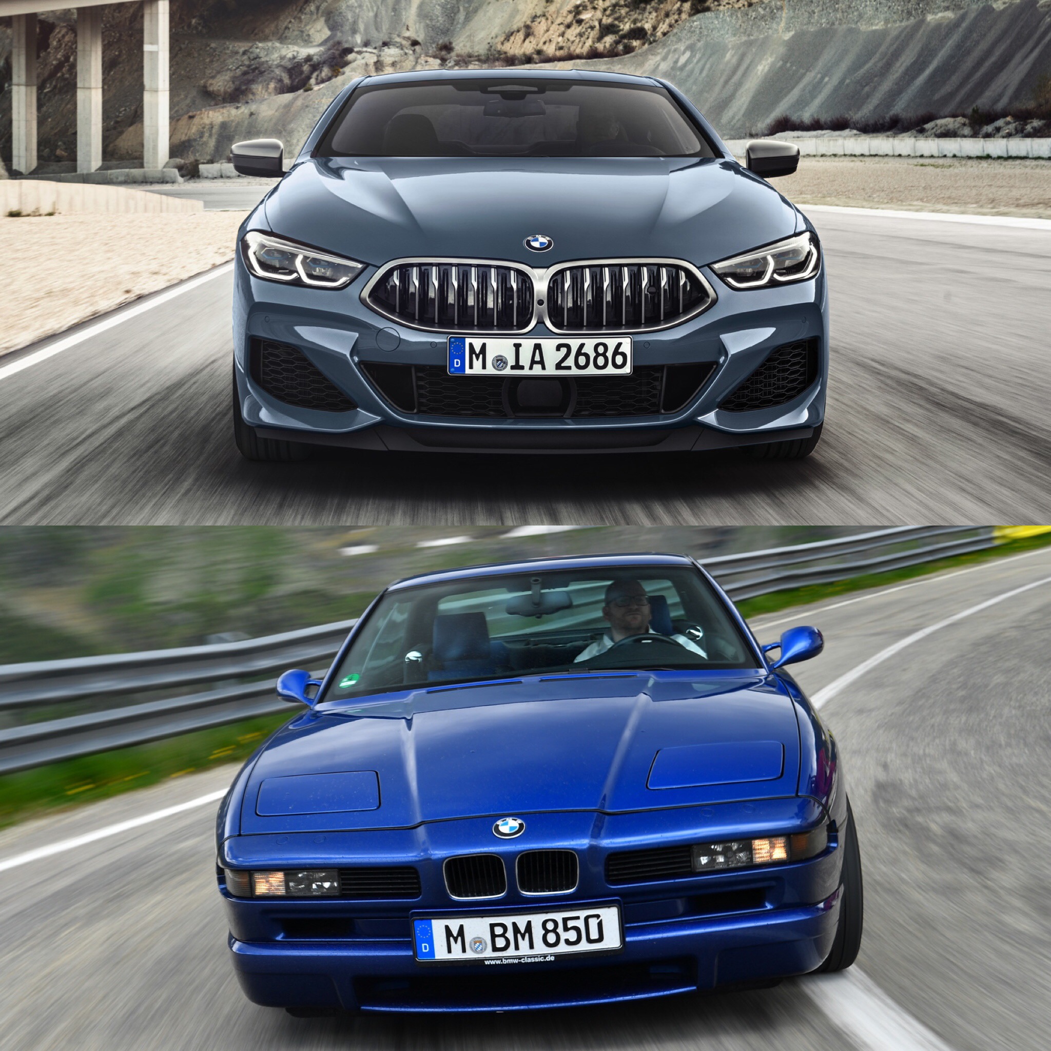
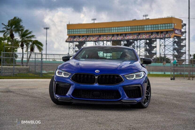
From the front, it’s tough to choose. They’re similar in some ways and polar opposites in others. For instance, their noses both slope quite low, with the highest point of their front ends being at the A-pillar and sloping downward from there. However, they’re complete opposites in other ways, such as Kidney Grilles, as the new 8er’s are massive and the old one’s are tiny. While the new 8 Series is the prettier car from the front, and is objectively better looking, I have to give the nod to the old car, because pop-up headlights.
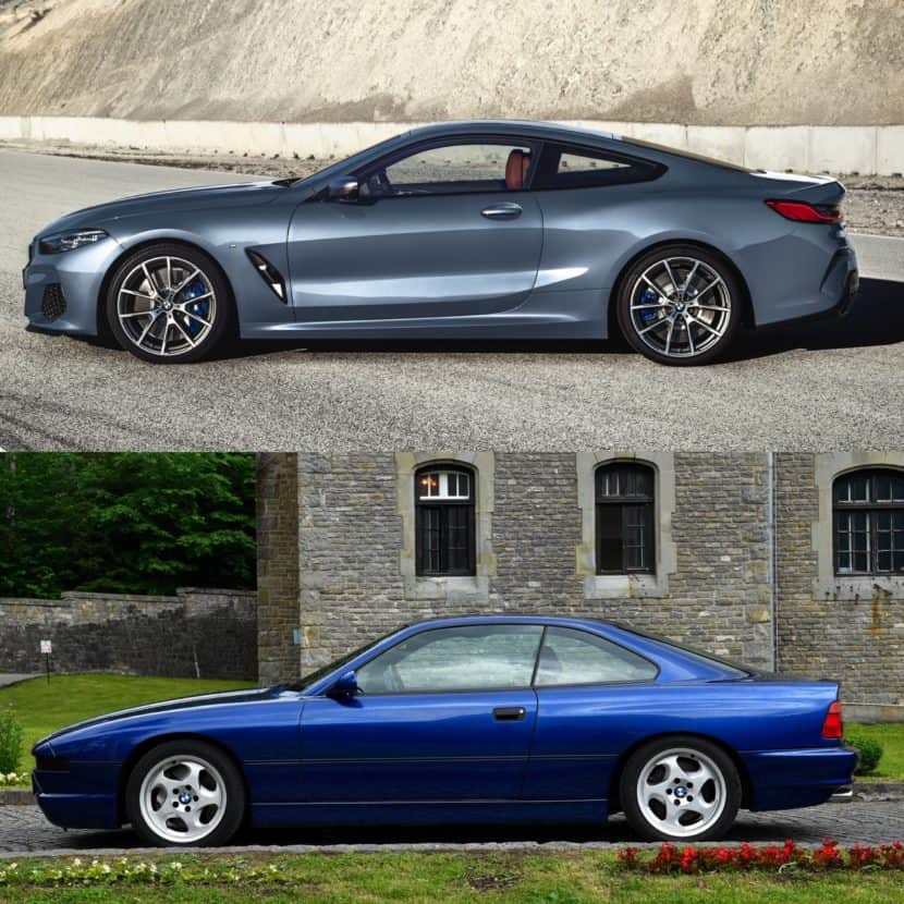
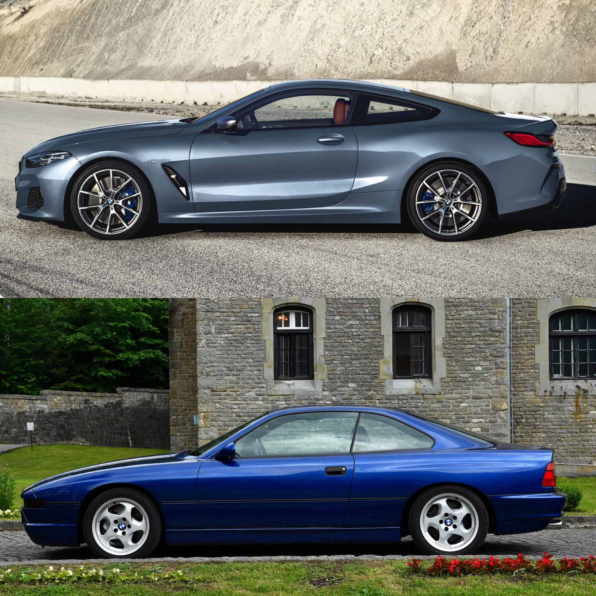
In profile, the new 8 Series has it all over its predecessor. It’s far more muscular and aggressive looking. The old car is cool, thanks to its classic wedge shape but the new one is far prettier while also being sportier. It’s just a stunning car. Though, it is interesting to see how similar their proportions are.
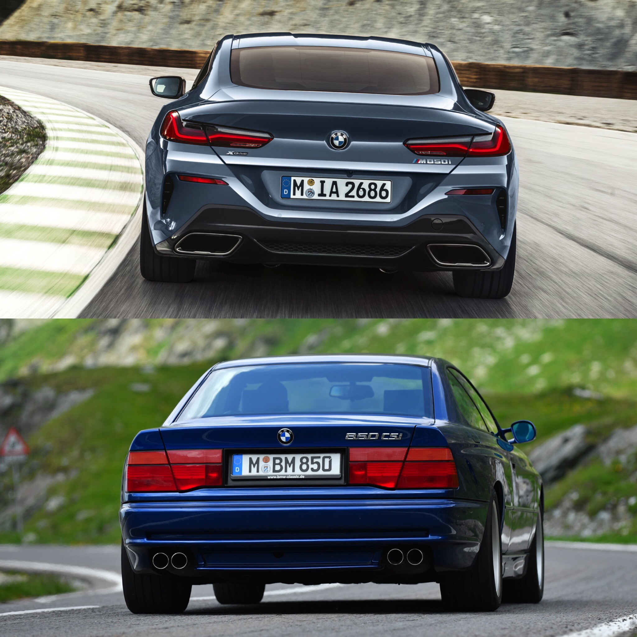
Out back, the new car is the winner as well. Its taillights are gorgeous, slim, sculpted pieces, while the old car’s are blocky and oddly shaped. The new 8 Series also has nicer, more swollen rear wheel arches from behind and looks more squat and athletic. While still attractive, the old car just can’t hang with the new one.
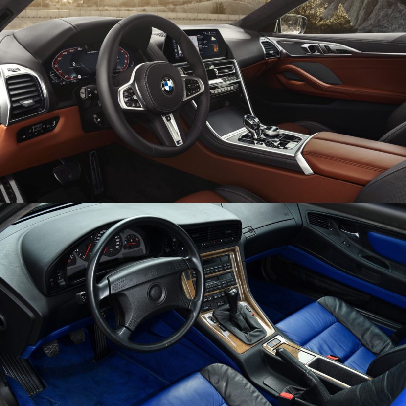
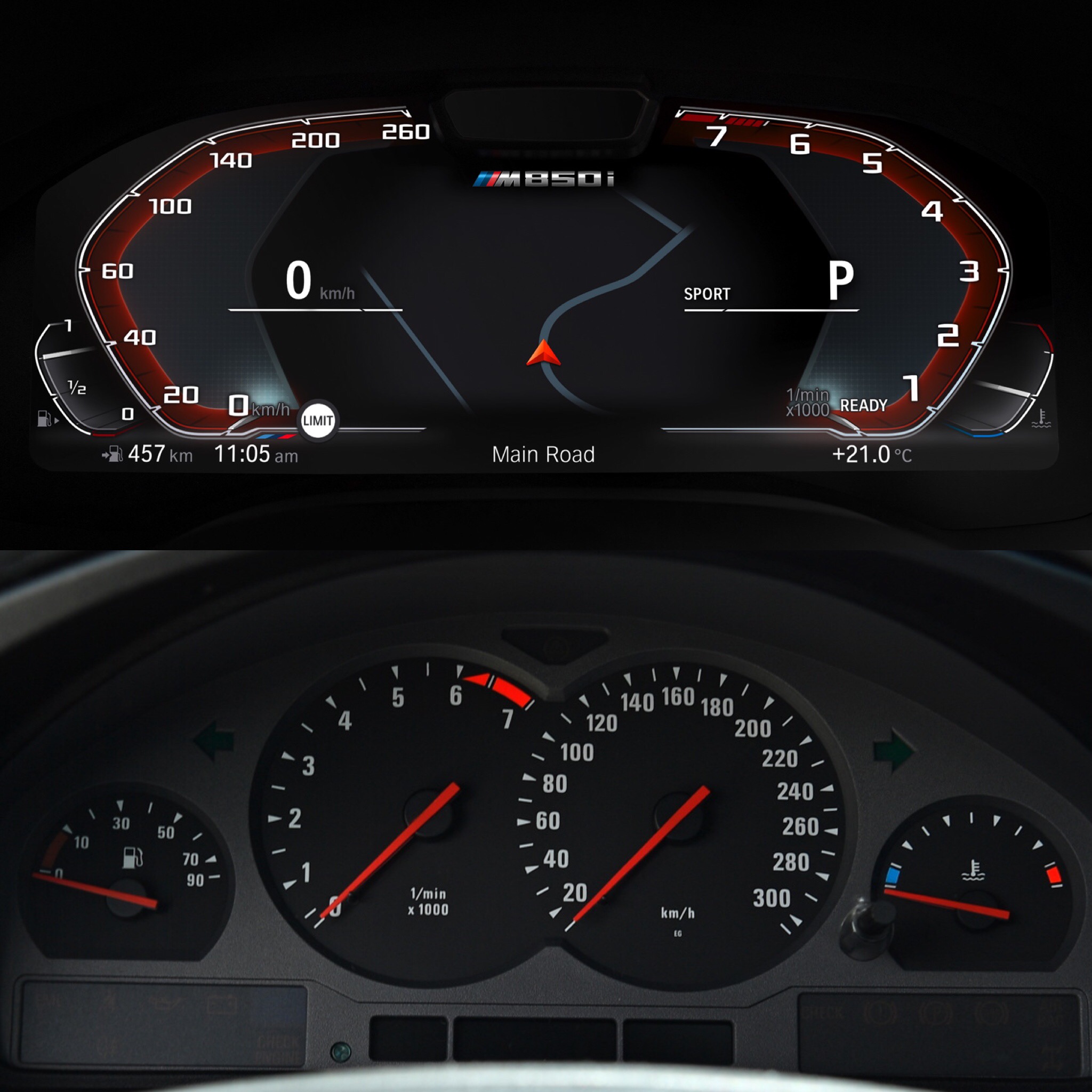
Inside, it’s astonishing how similar they are. Fans have been complaining already about the 8er’s cabin, calling it too bland and conservative. Though, when you look at it back to back with the old one, you can see where BMW got its inspiration from for the new car. Everything, from the waterfall center stack to the way the air vents on the old car are in sort of the same place as the new iDrive screen and even how the door panels are shaped. Say what you want about it, but this new BMW 8 Series interior is a faithful throwback to the car it replaces. Though, because they’re so similar and one is so much newer than the other, we have to call this one a wash.
Overall, though, it’s the new 8 Series that’s better looking. It’s prettier but also more muscular and athletic looking. I still would love to own an E31 8 Series but this new car is a car that I covet greatly.


