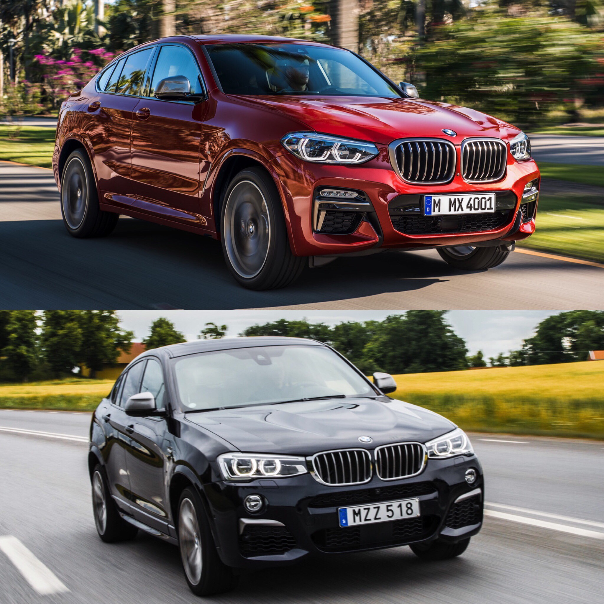
When the first-gen BMW X4 debuted, it received, let’s be kind and say mixed reviews. Most enthusiasts felt that its oddball styling and frumpy proportions made it useless and that it further diluted the brand. While others felt that it was a quirky and more interesting version of the BMW X3. However, customers were more in the latter camp, as it sold quite well. So well, in fact, that it spawned competitors, such as the Mercedes-Benz GLC-Class Coupe and a potential Audi Q4. So it warranted a second model and BMW created just that.
With this new BMW X4, we were hoping for better looks first and foremost. Thankfully, it seems as if BMW delivered on that. This new X4 looks significantly better than the first car. Where the first car seemed more like a chopped X3 that was designed on a lunch brake, this new one seems like it’s been more thoroughly thought out. But there might be some fans that actually like the first model better. So let’s compare the two and see how they look against each other.

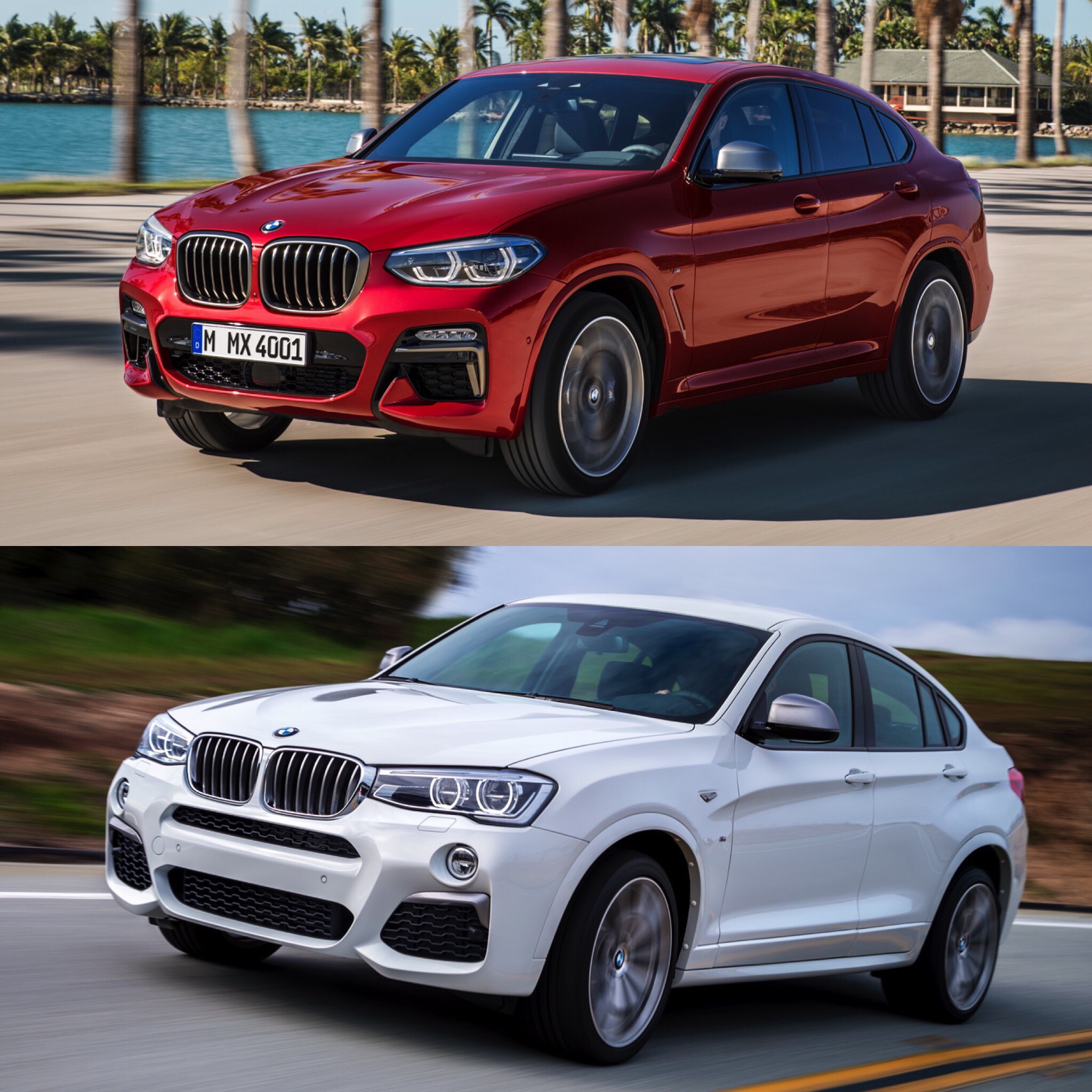
I think if there’s any angle where the first model might actually be competitive is from the front. The new one is better looking, to these eyes at least, but the older car isn’t bad. They both look exactly like the X3s of their respective times. However, the new one is still more handsome, with its headlights that are separate from the grilles and chunkier styling.
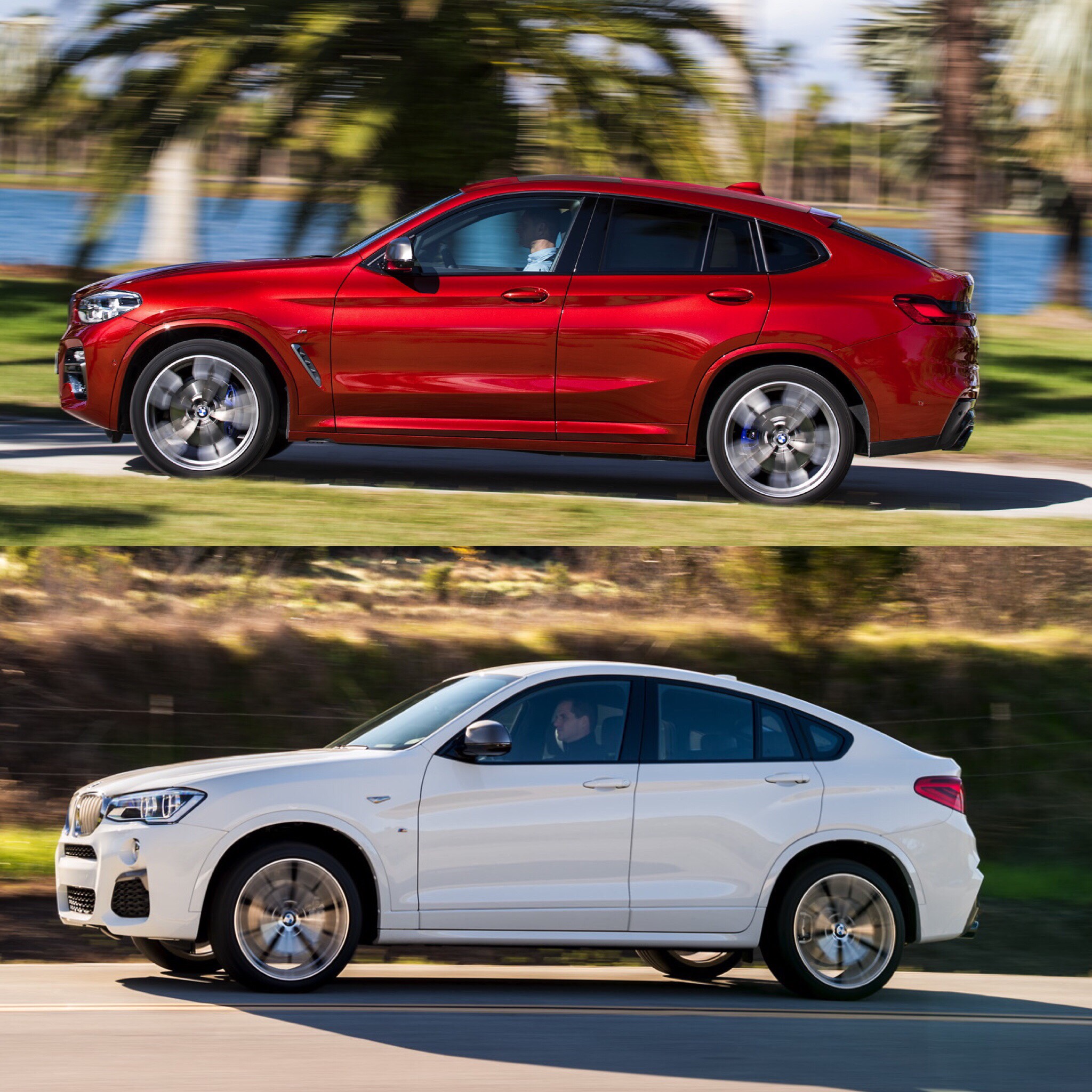
In profile, though, I don’t think there’s much of a contest. The old F26 BMW X4 just isn’t a good looking car from the side. Its silhouette is bulbous and the shoulder line is weird. The latter starts down below the top of the front wheel arch and makes its way up to almost the D-pillar before it disappears. Then, a new one starts from above the front of the rear wheel arch and continues to the taillight. They overlap each other and it just looks odd.
The new one has one smooth shoulder line that starts from the front wheel arch and continues to the taillight, with the only brake being from the flared rear wheel arches, and it makes the new X4 look more muscular and more cohesive. The new X4 also has a much better looking Hofmeister Kink, which is again smoother.
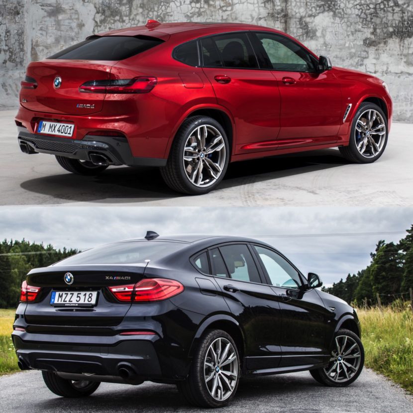
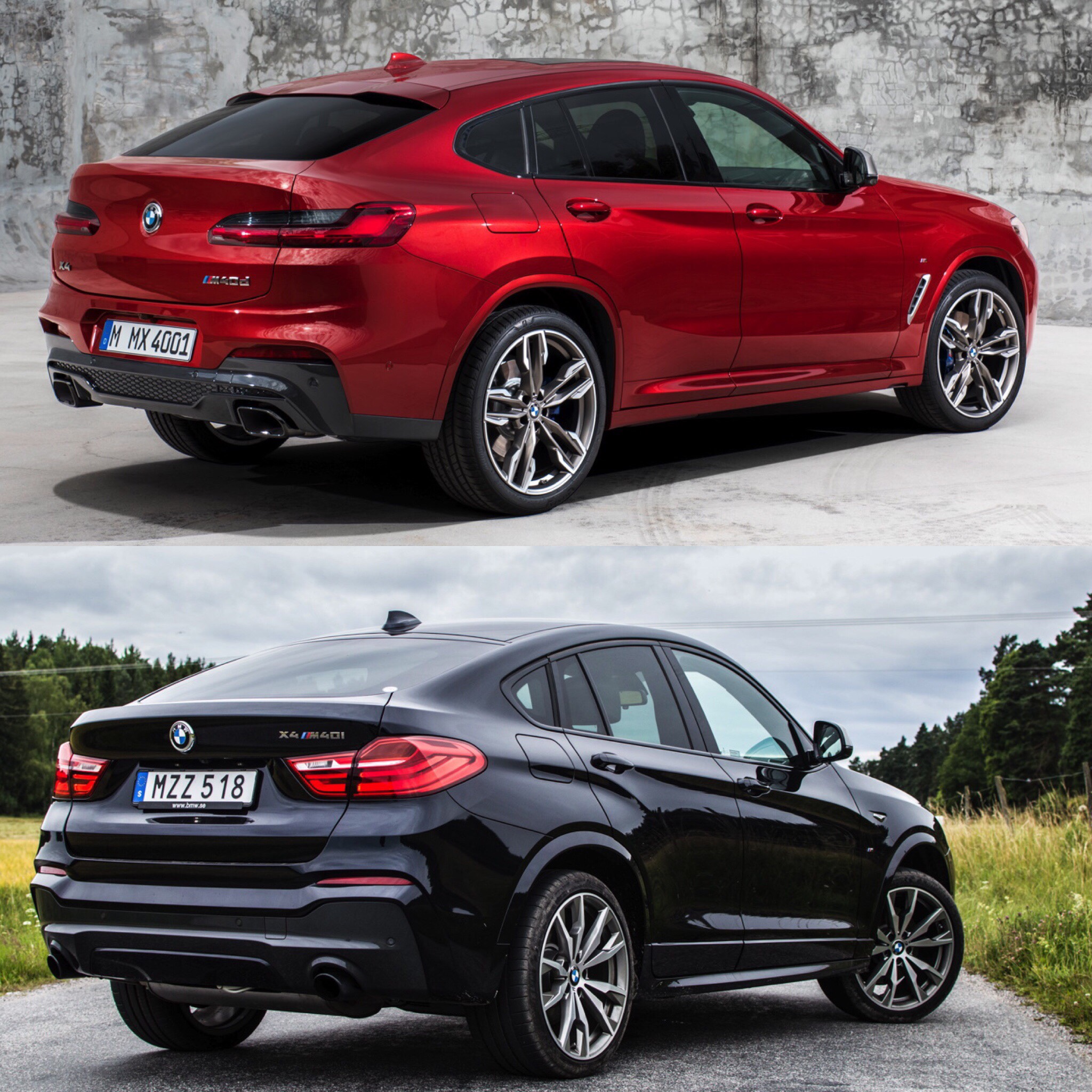
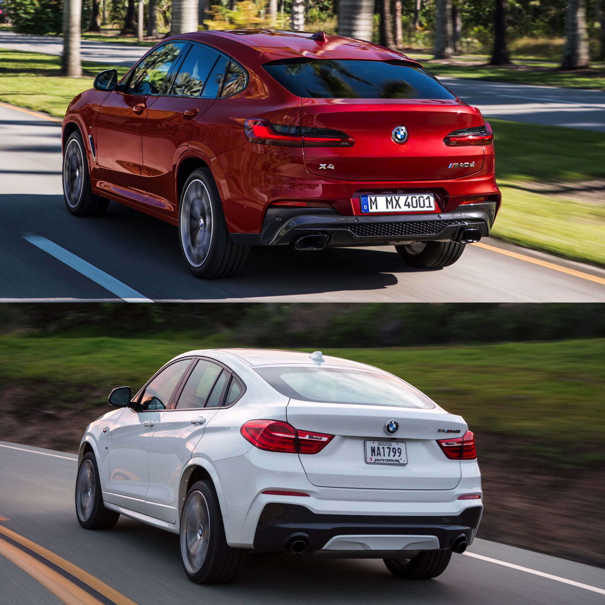
Out back, the old X4’s taillights seem more tacked on than cohesively designed into the car. They’re also just a bland design. The new car’s are slim and sleek and really fit the look of the car. It’s also smoother out back than the old car, with a better looking rear spoiler and rear bumper.
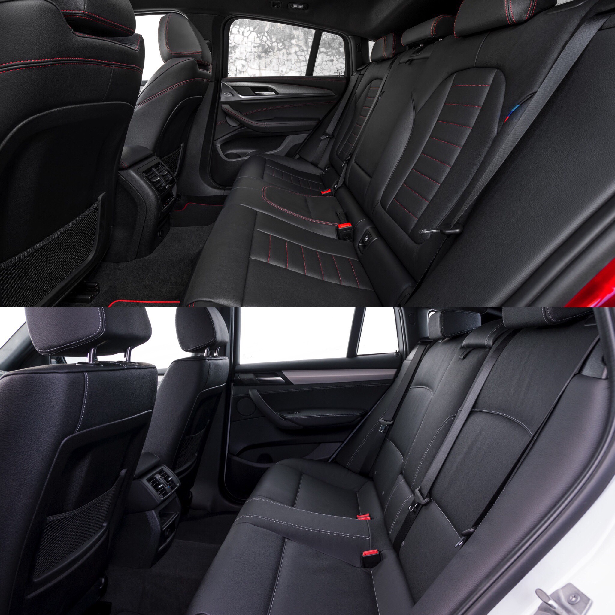
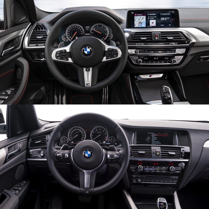
Inside, I don’t think there’s going to be any debate as to which car is better. It’s the new one. BMW’s new interior design language is quite good and it makes the old interiors look ancient. Everything from the steering wheel, to the new gauges, to the dash and the seats are all far superior in the new X4.
Compared to the new car, the old one just seems way over styled, like BMW’s designers just didn’t know when to stop. On top of an odd shape, that excessive styling just looked odd. It’s not that the X4 was a bad car, it was just odd looking. This new one, though, is far better looking and is a much better car to drive, thanks to being based on the brilliant new X3. So it’s a win/win.


