There’s no question that the Tesla Model 3 is one of the most hotly anticipated car in the history of the automobile. Hundreds of thousands of people put $1,000 deposits down on the Model 3, far before they had even seen it, while also not knowing when, or even if, they’d receive their car. People were sleeping outside Tesla stores waiting to get in an leave their deposit, as if they were waiting for the latest door-buster on Black Friday. It was absurd. So is the Tesla Model 3 as cool or as impressive as its hype would suggest? Doug Demuro seems to think so, as evidenced by this latest video.
In the video, Demuro goes through the entire Model 3, from design, to tech to the way it drives. It’s a lot, as there’s simply so much information to take in. If the Model 3 came with an owner’s manual, it’d be the size of a dictionary. Which actually makes the Model 3 a bit contradictory, as the design is so minimalist that its extreme complexity seems a bit at odds with its nature. Having said that, there are some fascinating features, as well as some infuriating ones. So let’s take a look.
As far as it’s design goes, there’s really not much to be said. The only really interesting part of the exterior of the Model 3 is the way you get in and out. There’s no key, not even a modern key fob, for the new Tesla. Instead, it uses an app on your mobile phone to recognize when you’re in range of the car and then it unlocks on its own. There’s no unlocking the Model 3, it simply does it as you approach. Once in, it recognizes your phone and starts on its own. Easy peasy. If you’re loaning your car to someone or your phone has died, there’s a backup in the form or a Tesla card. The card is the size of a credit car and fits perfectly in anyone’s wallet. Press the car against the B-pillar and the car unlocks and then you’re in.

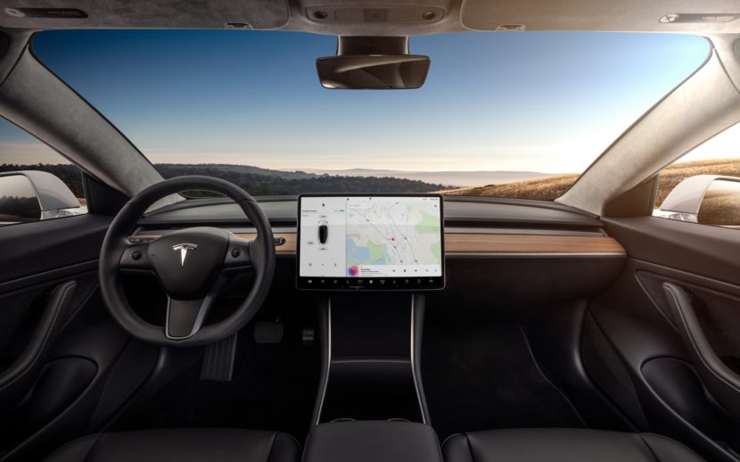
On the inside is where things get really interesting. The design of the Model 3’s cabin is about as minimalist as it gets, for better or worse. Tesla fans and most millennials will likely love its almost absurd take on minimalism. However, some will feel that it seems cheap and uninspired. Love it or hate it, there’s really only one interesting bit of aesthetics in the car — its massive screen. The screen controls literally everything about the car, from the climate controls to the HVAC system to the car’s settings. It’s mounted on the center of the dash, much like a typical infotainment system, and is about the size of an elementary school lunch tray.
There’s literally no other screen or significant button in the car, aside from window switches and a hazard light button. So, thankfully, it works really well and is very slick. The graphics are excellent and it’s probably the fastest, most responsive touchscreen in the business. Though, there’s just too much to do on it and it seems like Tesla, in trying to make things as simple as possible, made things overly complex.
For instance, to adjust the mirrors, you have to press a few buttons on the screen to get to the mirror menu, then use the little scroll wheels on the steering wheel to actual adjust them. Compared to what is typically a tiny switch on the door panel that can be operated without averting attention from the road, this seems completely unnecessary and like Tesla tried reinventing the wheel for the sake of reinvention and ruined a perfectly simple control. Trying to simplify the cabin actually ended up over-complicating the easiest control. And that seems to be a theme with the rest of it.
But how does it drive? Is it the reinvention of the automobile and worth the hype? Well, it’s quick. The Model 3 Demuro drives is the to-end battery Tesla, as evidenced by its 280 mile range, and it’s quite fast. It’s also quite a bit tighter and sharper than I think a lot of people had expected. Its steering is tight, the suspension is firm and the dynamics are actually quite good. But no one’s going to buy a Model 3 for its driving dynamics. You want a sporty sedan, buy a 3 Series, Jag XE or Alfa Giulia. Customers are lining up for the Model 3 for its tech, its electric propulsion and its impressive range.
There’s no denying the Model 3 is one of the most interesting and impressive cars of our time. It’s an affordable electric car that seriously tries to do away with traditional automotive controls and trends for its own new ones. However, in doing so, it feels completely uninspired. Looking at the cabin of the Model 3, it doesn’t look any more special than that of a Hyundai Sonata. There’s nothing of interest and nothing to make it feel personal. Once you get over the novelty of its minimalism and its massive screen, the Model 3 will become trivial, I feel.
I once stayed at a very hipster, very minimalist, yet high-end hotel in Richmond, Virginia. Its room had a concrete floor, concrete-colored walls, really minimalist, unfinished wooden furniture and virtually none of the typical amenities you’d expect in a hotel room. At first, it was interesting and fresh, offering a different take on a hotel room. When it came time to get to bed, though, the room felt cold and uninviting. There was nothing comfortable feeling about it, despite its modern, fresh take. That’s sort of how I feel about the Tesla Model 3.


