Despite being quite old, the seventh-generation Rolls Royce Phantom was still considered to be the pinnacle of luxury, even towards the end of its life cycle. So it wasn’t easy for the famous brand to replace it with a newer model. How do you replace a car that’s still so highly regarded, even after existing for thirteen years? Well, you don’t fix what ain’t broke, for starters.
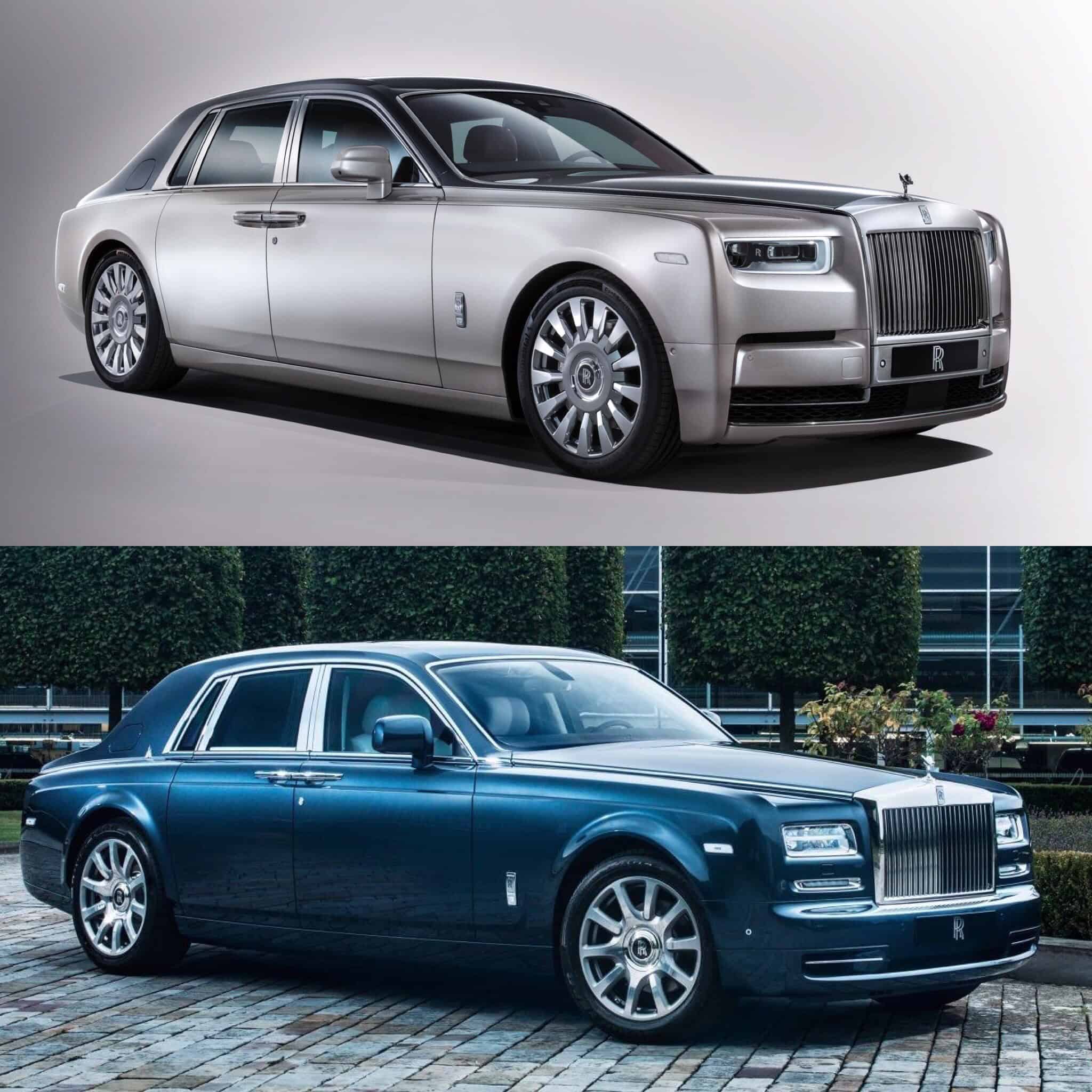
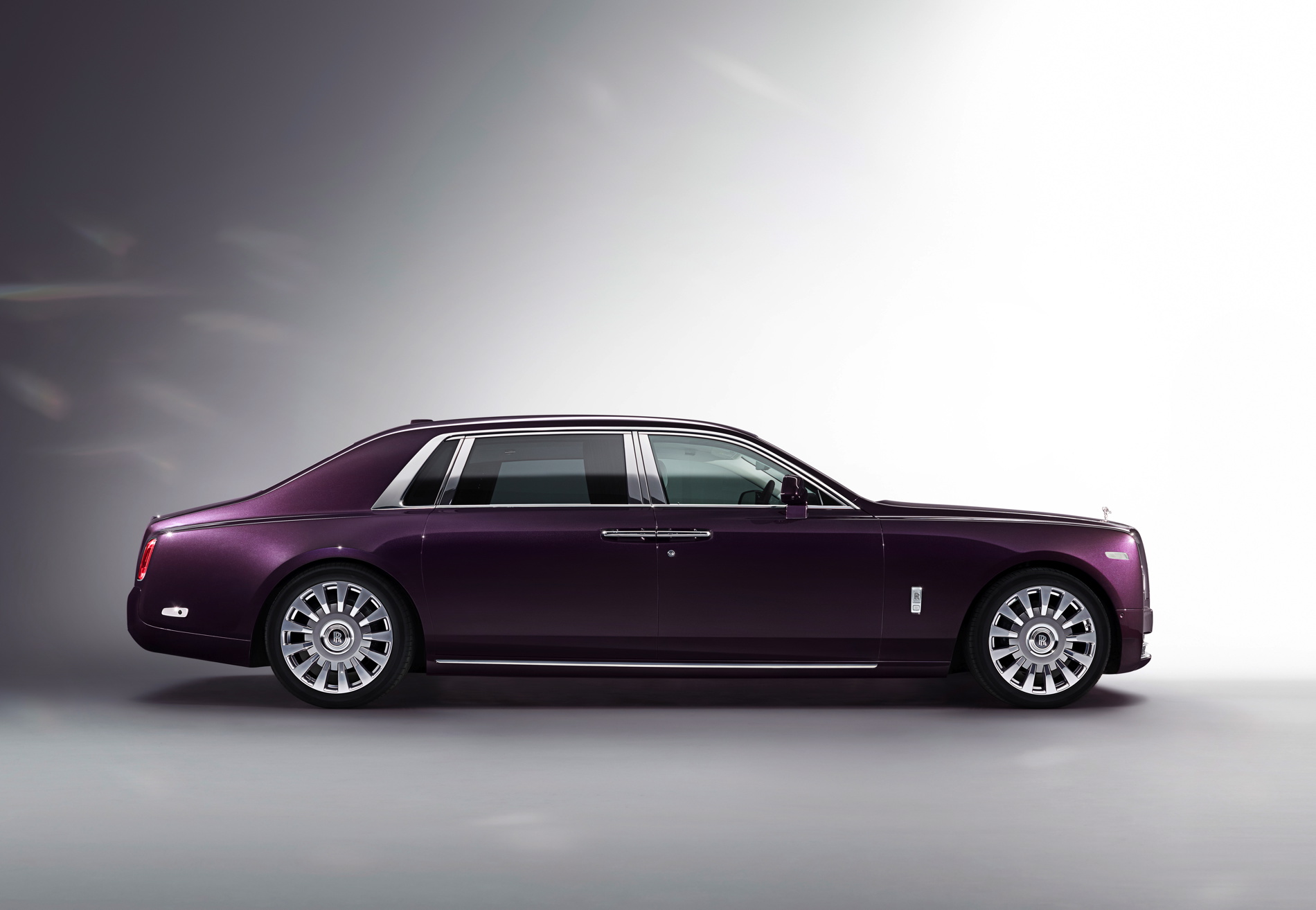
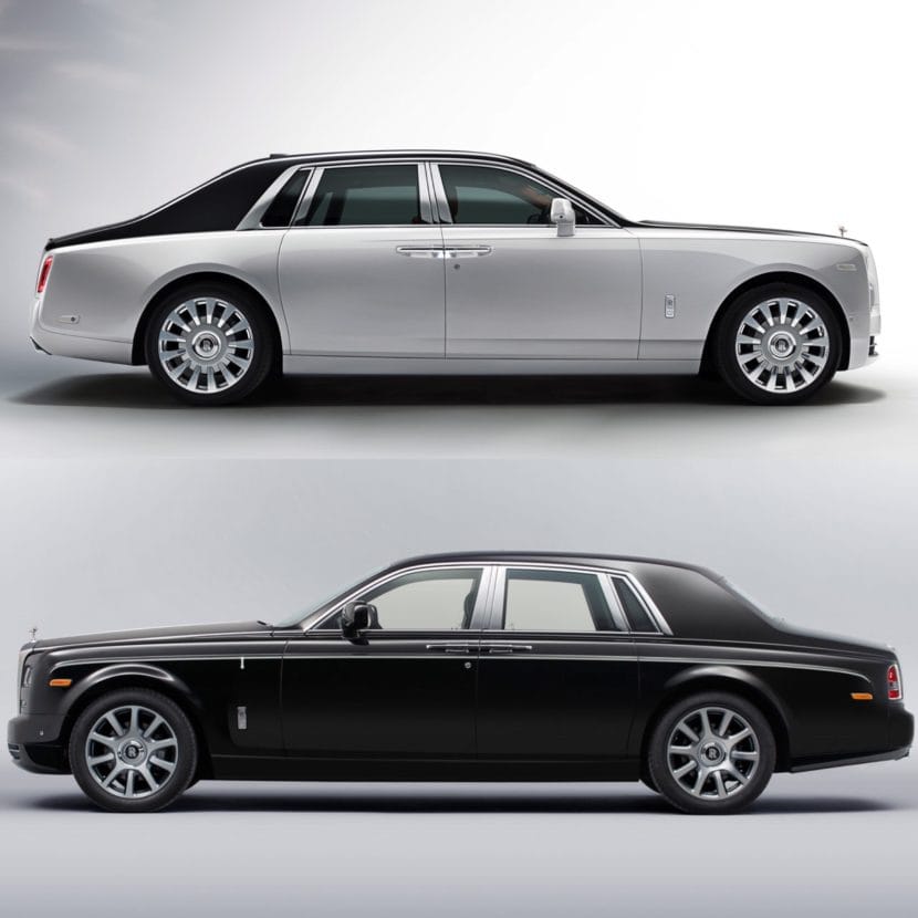
If you look at this new eighth-generation Rolls Royce Phantom, there isn’t that big of a stylistic change. Sure, it’s entirely new and the trained eye can notice that it’s a very, very different car. But the overall styling has remained rather similar and that’s really done intentionally, so as to keep the now-iconic shape. Rolls customers loved the Phantom VII, so why change it dramatically? Instead, Rolls made a car that looks like its predecessor, except made for our modern era.
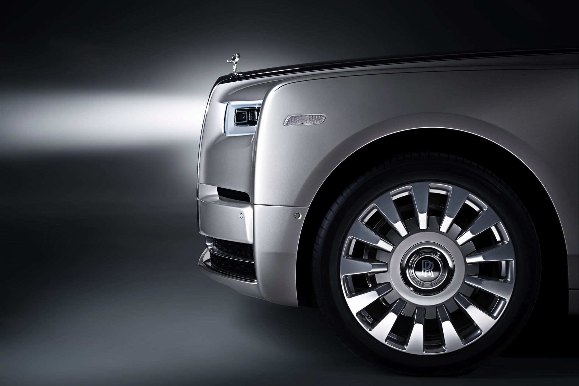
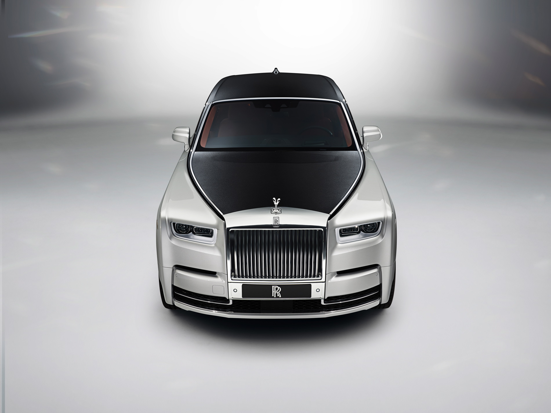
From the front, you can see how much sharper and how much more angular the new Phantom VIII is. The way the fenders come all the way out to the front end of the car, and make a right angle straight down, is far more pronounced. It’s actually refreshing to see how boxy the front end is, it’s all right angles and sharp edges. It’s refreshing in this modern day of funky shapes and architectures. It’s sort of the anti-BMW i3. Also, the headlights look far better this time around. While the first-gen Phantom’s headlights look sort of tacked on, these new ones look set deeper in the fascia and ringed in LEDs. Its grille is also now much larger and sort of built into the body work, which looks better.
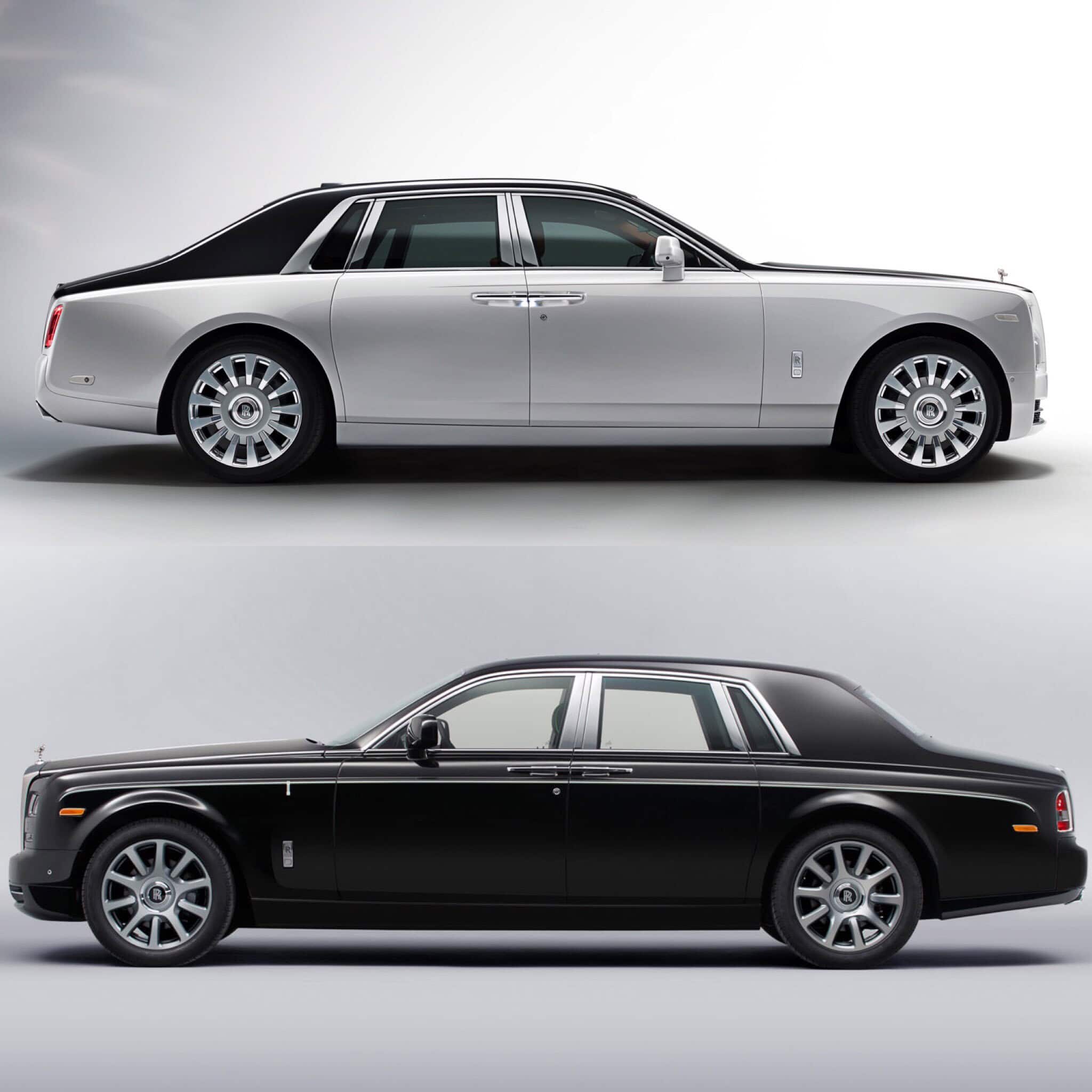
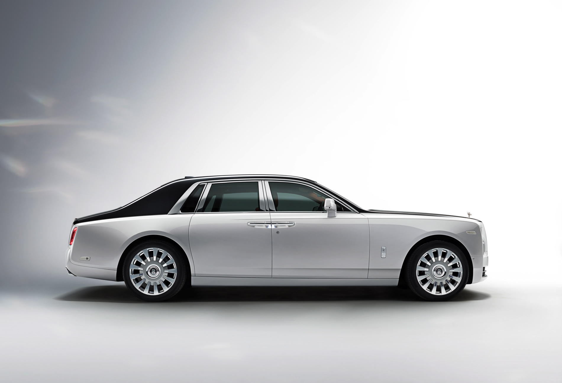
Down the side, the new Phantom VIII looks much better. In profile, the old Phantom always looked good but somewhat odd and a bit frumpy. The new car looks far smoother, more streamlined and seems to be better proportioned. Something as simple as moving the door handles a bit lower completely lowers the belt line of the new Phantom, which makes it seem far more planted. In fact, it makes the old Phantom look like an old man who wears his pants up to his nipples.
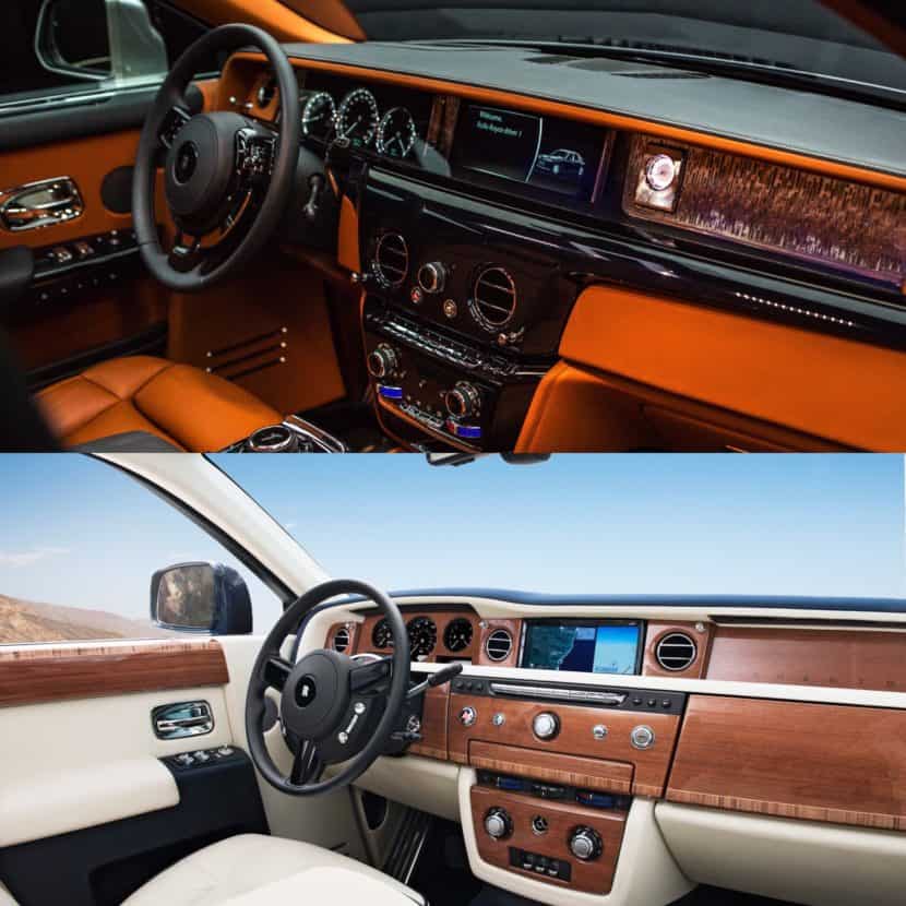
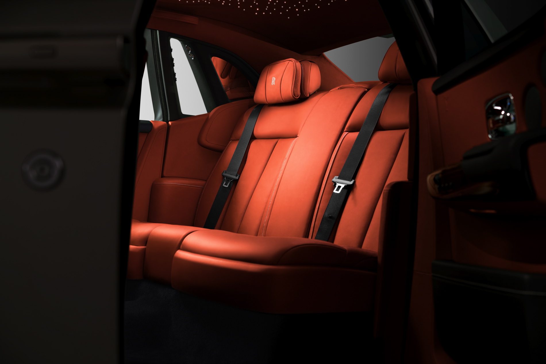
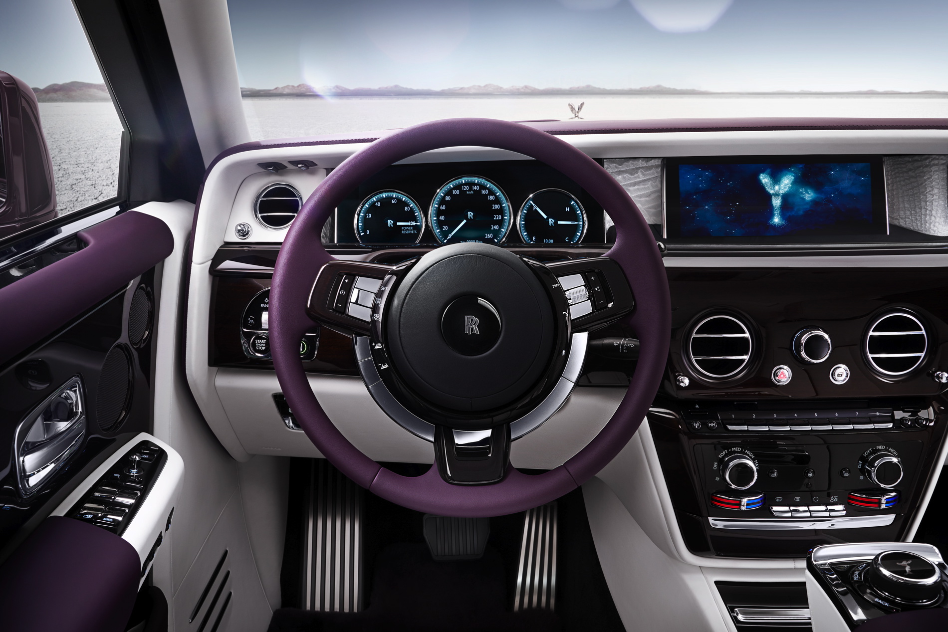
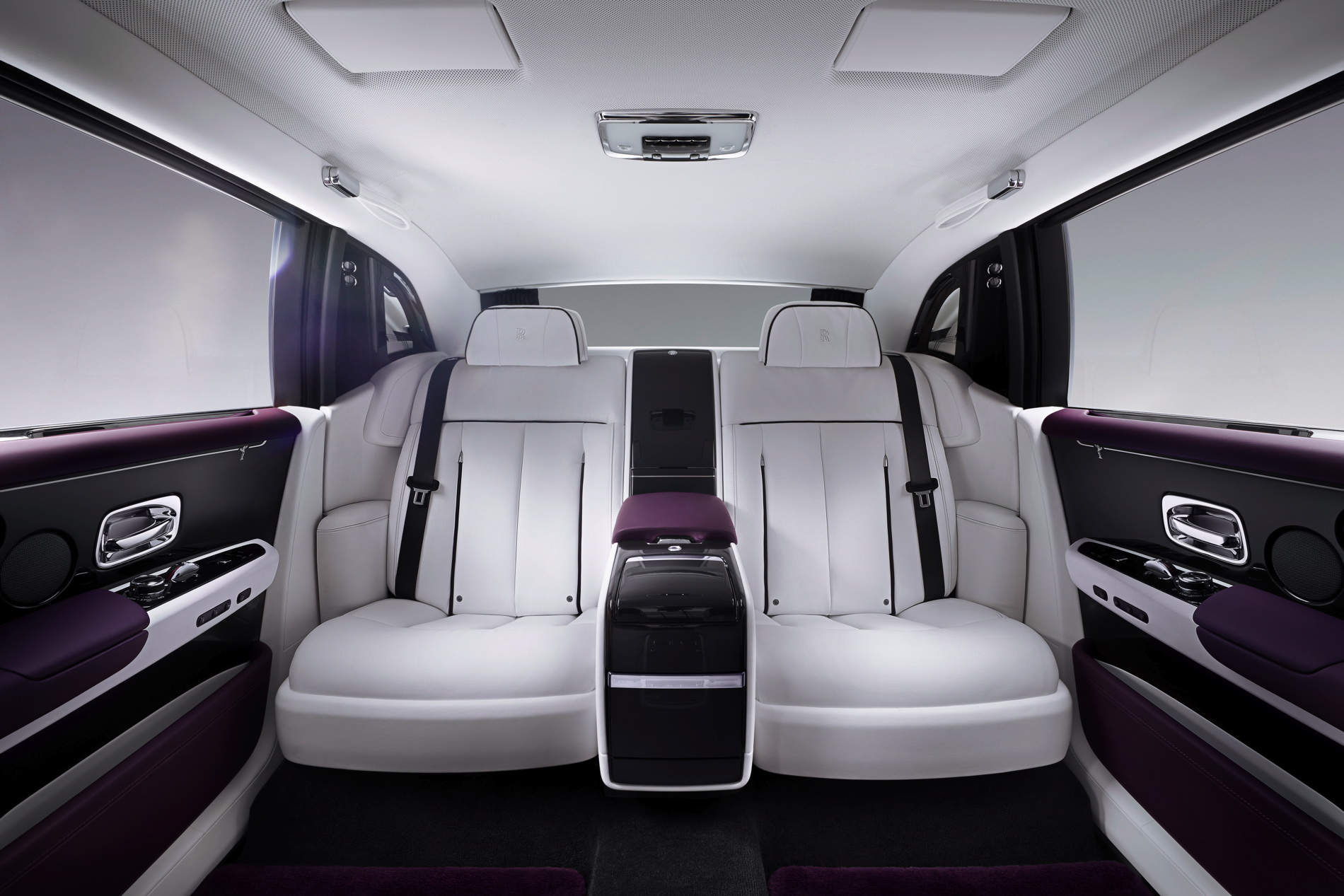
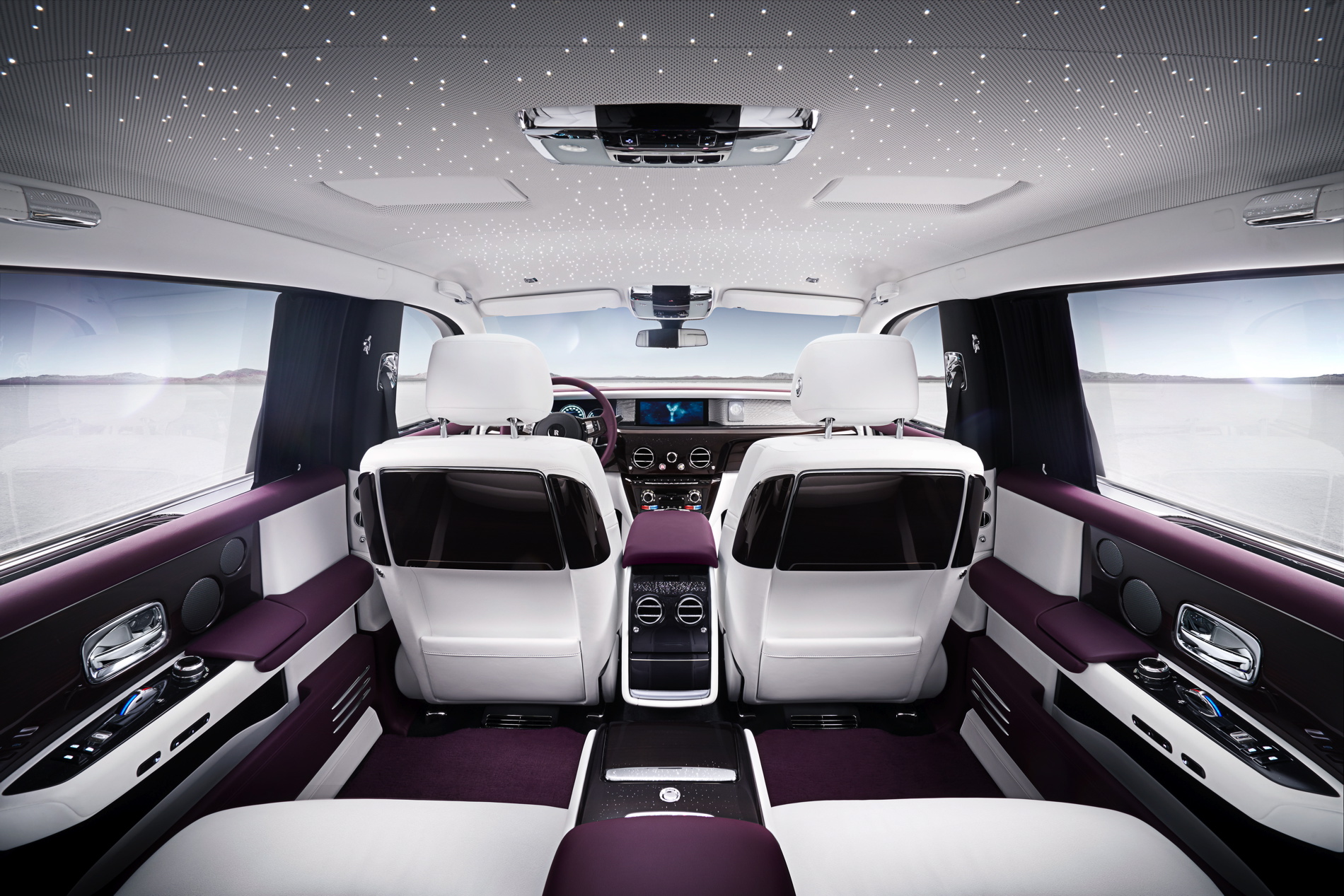
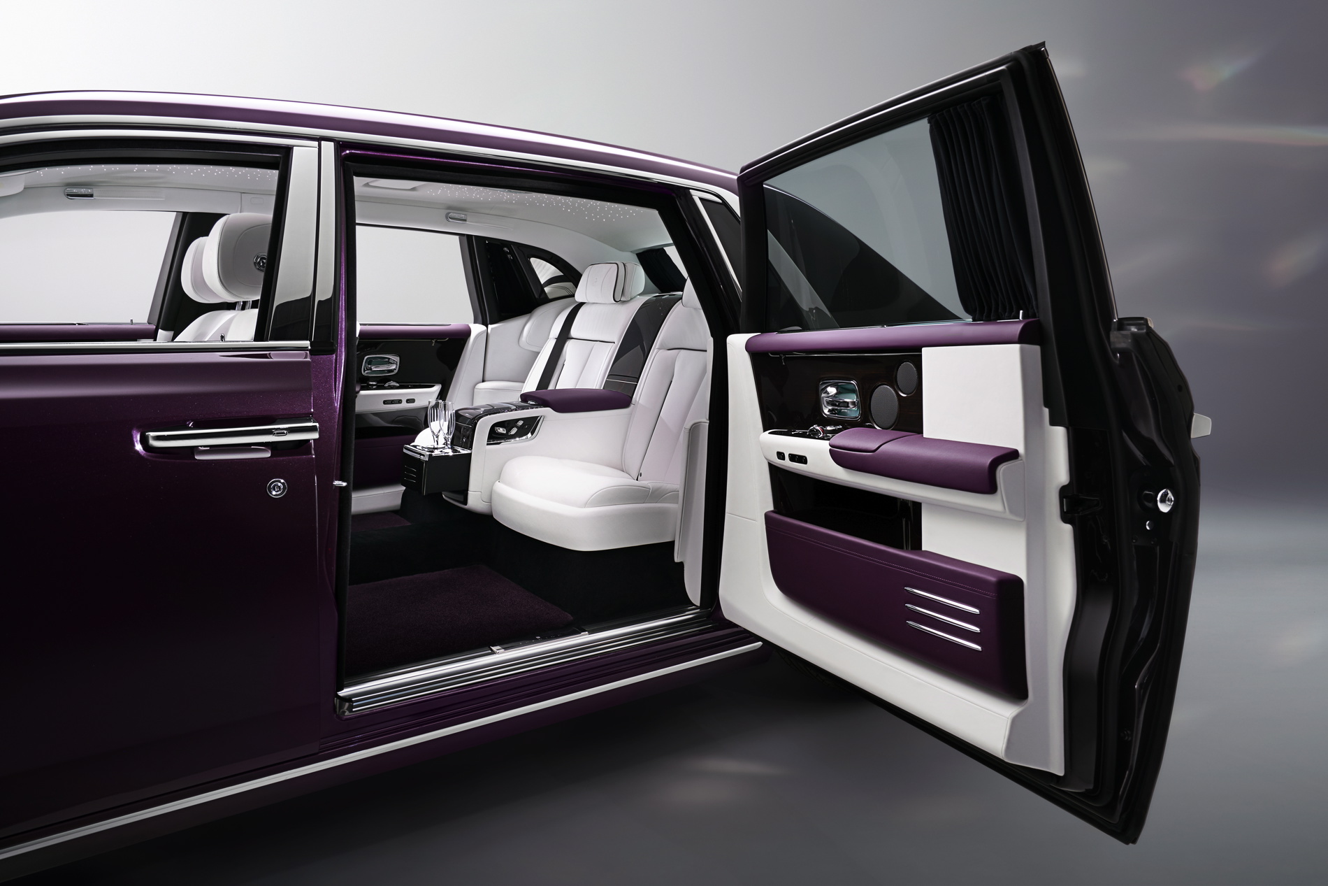
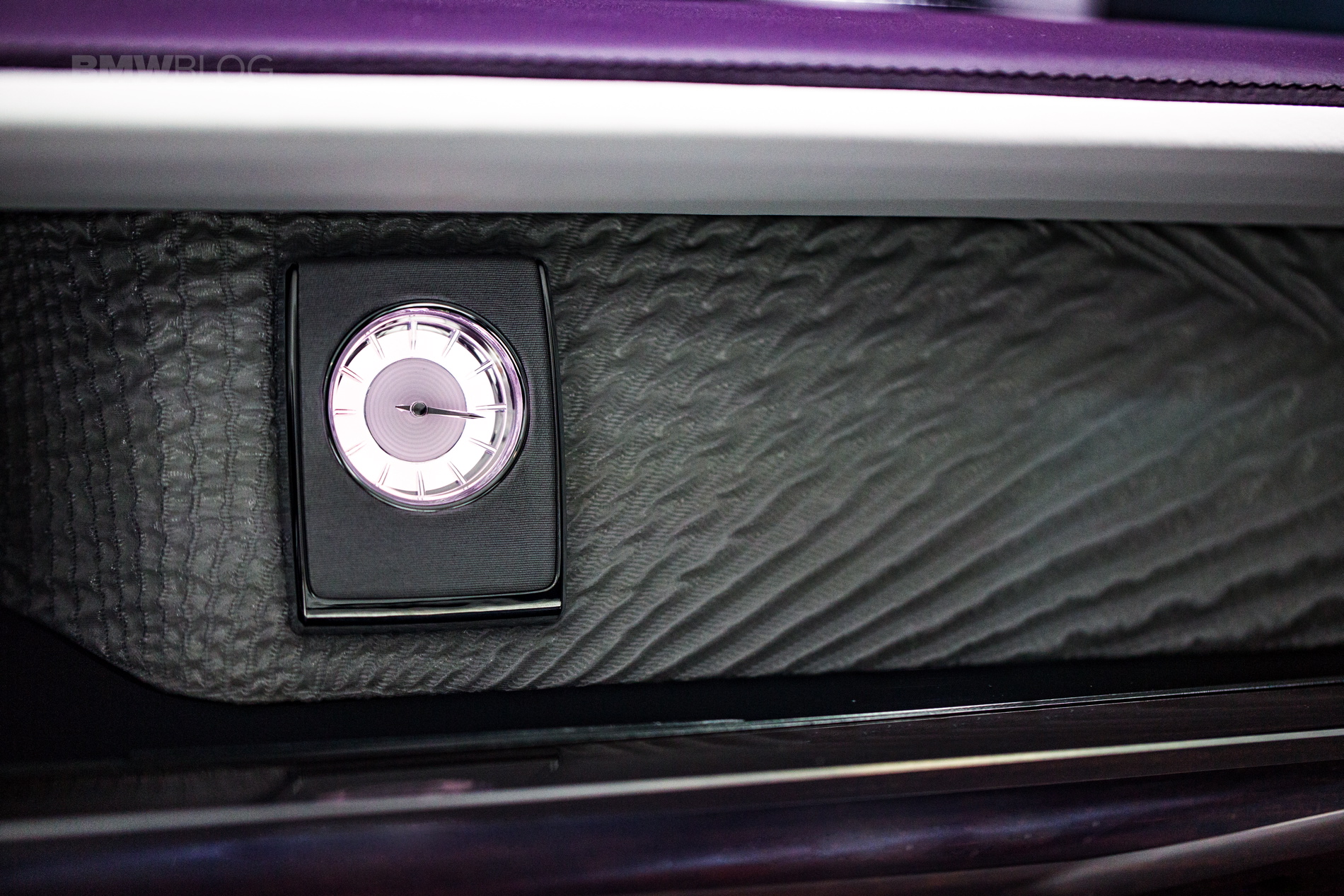
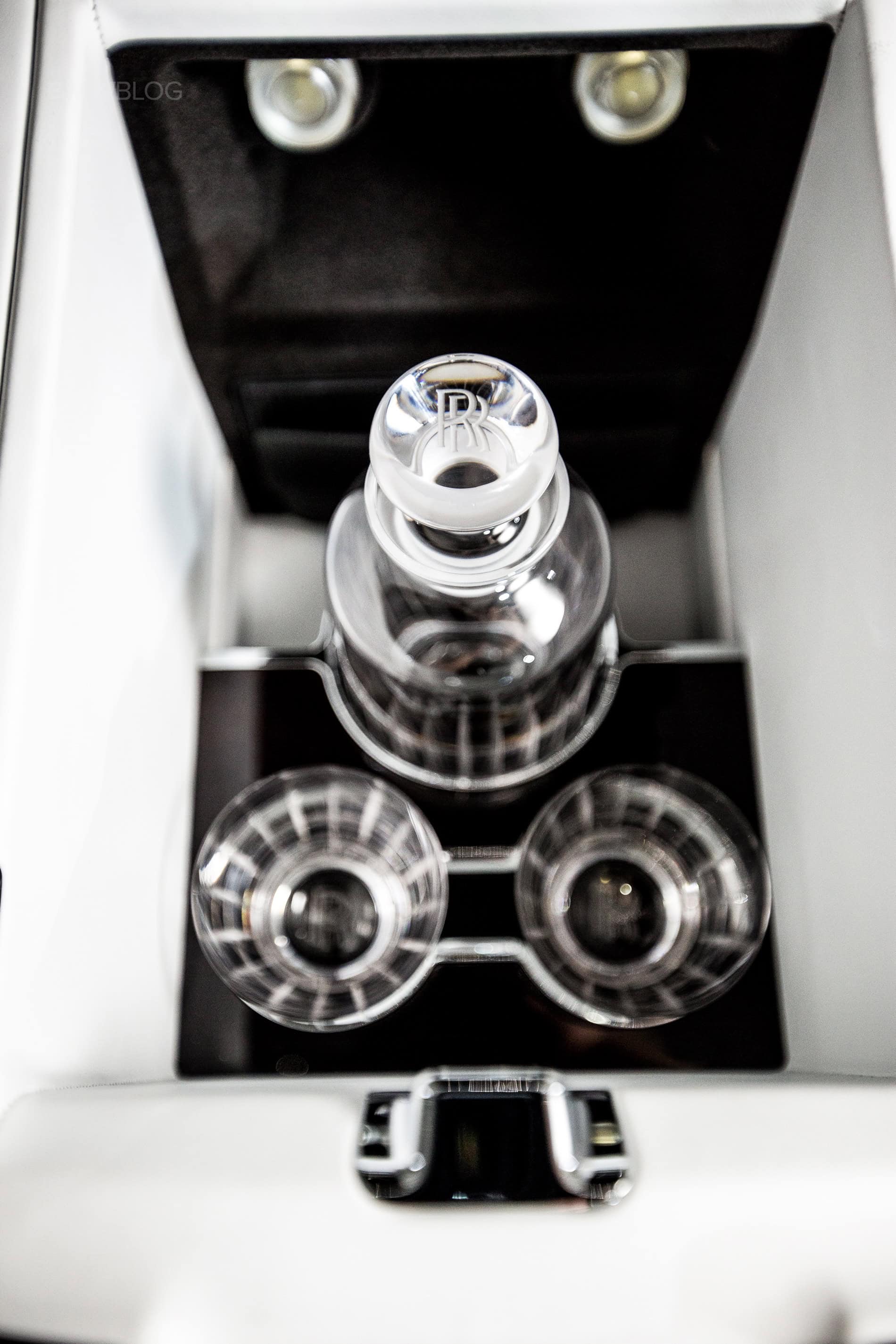
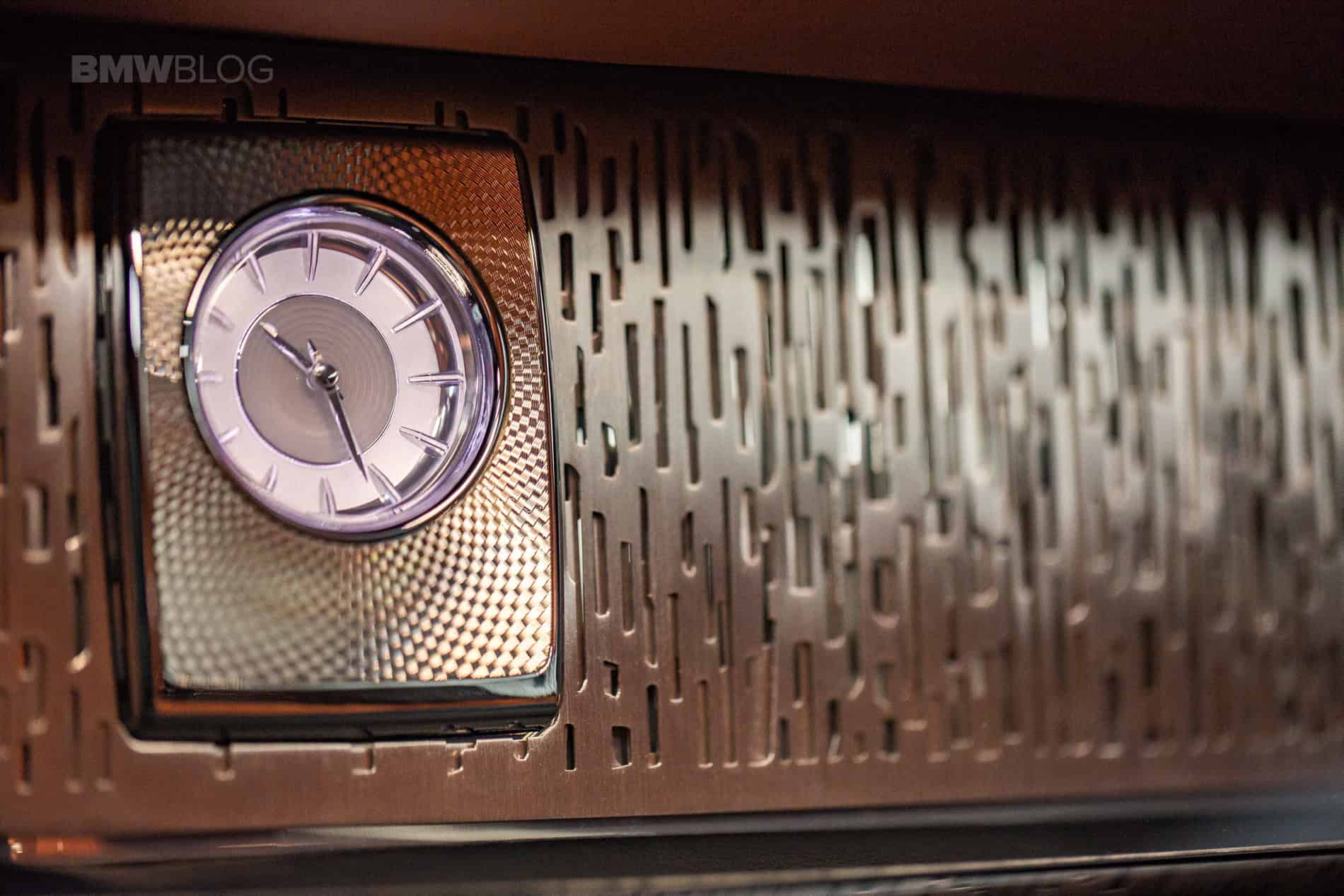
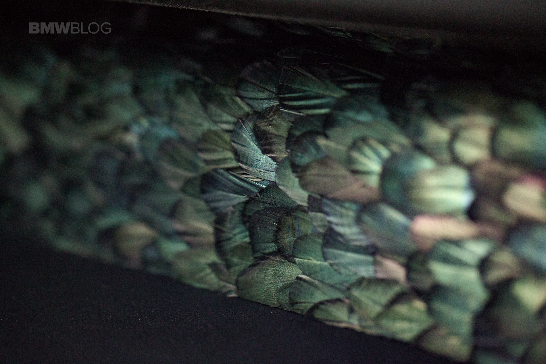
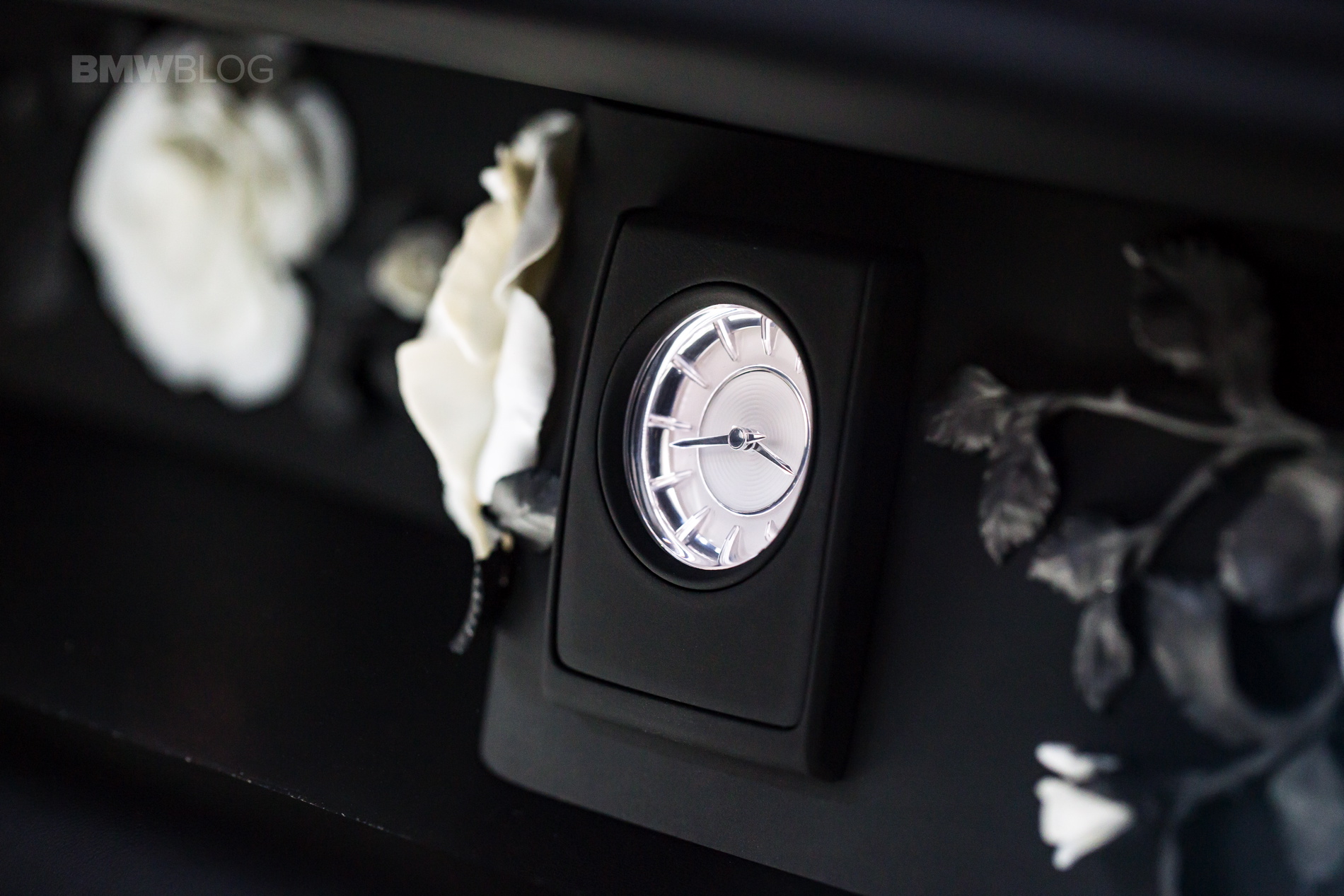
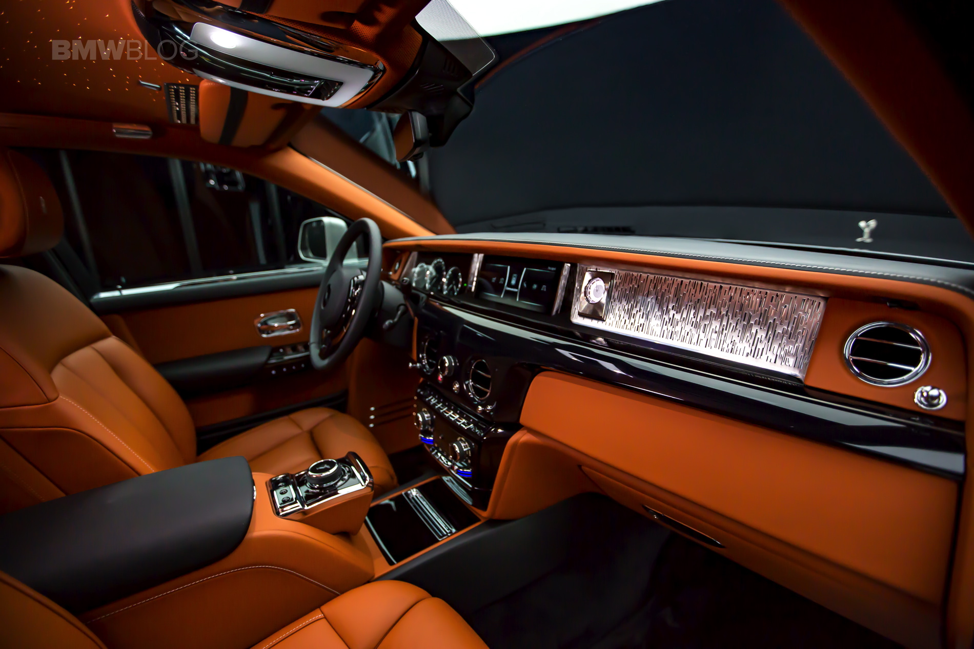
But it’s on the inside where the Phantom VIII really sets itself apart. While, again, the overall design and shape of the new cabin isn’t that much different from the one it replaces, the devil’s in the details. It seems as if Rolls Royce told its interior designers to go out and design the most elaborate, gorgeous and expensive pieces of automotive trim. In the spirit of Professor John Hammond, Rolls Royce simply spared no expense.
The interior trim pieces are works of absolute art. I sat for what seemed like an hour admiring the craftsmanship of these trim pieces. Check out the photo gallery below and just behold the work, attention to detail and the differences between the new Rolls Royce Phantom and the old one.


