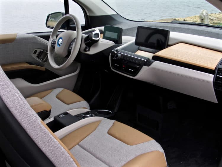
We just recently discussed the fact that the BMW i3 has one of the coolest interiors on the market, if not the very coolest. Reason being is that it’s so completely different from anything else on the road. Its minimalism is taken to an entirely different level than anything else and it has so much negative space and funky architecture that it really stands out from the crowd. It’s not just us that feels that way, though, as many enthusiasts are fond of the i3’s cabin for those very reasons. However, one of the BMW i3’s most important new competitors is also very minimalist inside and it’s just been caught showing off its interior — the Tesla Model 3.
The Tesla Model 3 is easily one of the most hotly anticipated cars of this year. It’s Tesla’s entry-level car and the one that sold about a bajillion pre-orders in eleven seconds, or something like that. Basically, the Model 3 is every EV fan’s savior. So the fact that its interior is now seen in the flesh is a big deal because, up until recently, most fans hadn’t seen the Model 3 in any way, shape or form.
Inside the Tesla Model 3, the design is very, very minimalist. The dash is just a plain dashboard, though it does house some nice wood trim (eucalyptus?). The steering wheel is just a steering wheel and the door panels are just door panels. In fact, it almost seems as if Tesla took minimalism too far. Until you notice that tiny, little detail that is the monstrous touch screen that cantilevers off the dash.
To be honest, the interior of the Model 3 is really just a massive touchscreen with some seats next to it. It’s as if Tesla designed the screen first and then the rest around it. Though, I have to say that the mammoth screen looks like it will work well there. It’s right in the line of sight of the driver, so they won’t really have to look up or down from the road much at all. And it’s so large and in-your-face and it will likely be easy to use while on the move. Plus, Tesla has a reputation for making excellent touchscreens, so we’re confident it will be easy to use and intuitive.
Personally, I still like the BMW i3’s cabin more, just because it’s more visually interesting. Aside from the massive screen, this Model 3 could be the cabin from a Honda Accord and no one would second guess it. It looks nice and of high quality but it’s minimalism to the point of being boring, whereas the i3 looks like it’s from the year 2030. Now, if BMW could steal Tesla’s big screen and somehow implement that into the i3, then we’d have the real winner.
[Photo Source: Chris Llana]


