Infotainment systems seem to be all the craze with car companies, as of late. Some automakers even put infotainment higher on their priority lists than actual driving dynamics. Admittedly, these systems are extremely important for car makers in this modern, highly connected world we live in. Controlling virtually everything about the car, infotainment systems need to be easy to use, have good, easy to read graphics and overall, be intuitive.
iDrive
BMW is really the father of the modern day infotainment system, with its iDrive.
The first generation of iDrive debuted in the E65 7 Series and was met with much criticism from both customers and journalists alike. Even at the time, iDrive was slow, confusing and difficult to operate. Compare it to a modern day system and the original iDrive seems prehistoric. My parents own an E60 5 Series with an earlier version of iDrive and it’s absolutely maddening to use. It did, however, create a blueprint for BMW, and the rest of the automotive world, to follow.
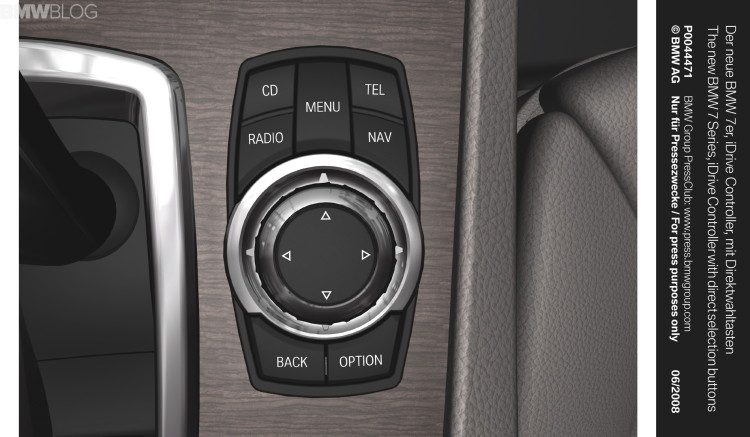
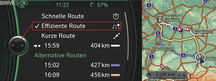
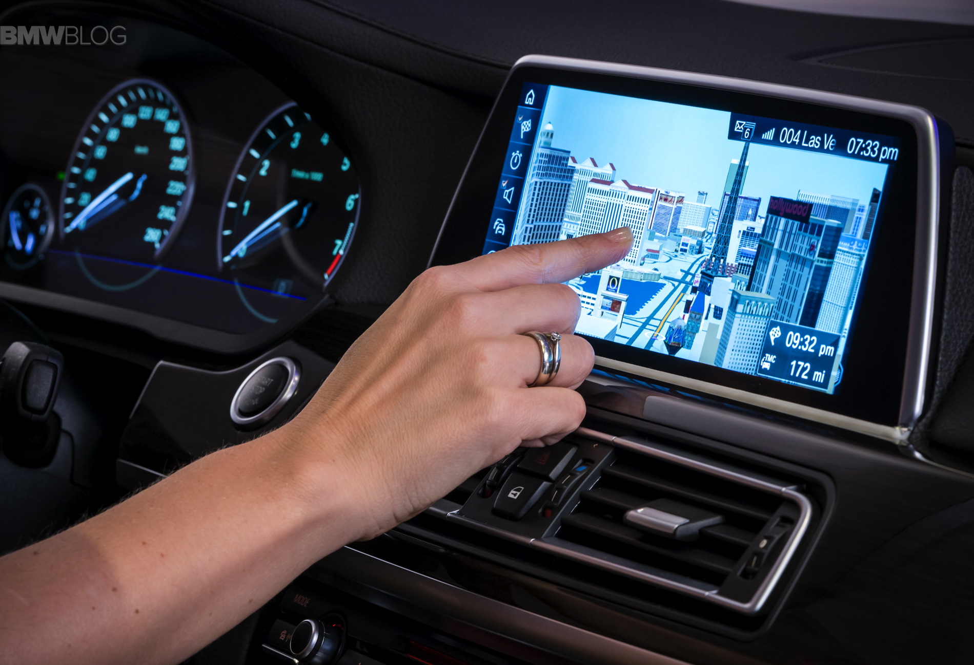
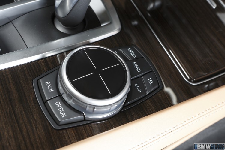
iDrive was only in its infancy then, and has since greatly improved. As it stands now, iDrive is one of the best, if not the very best, infotainment on the market today. The menus are thoughtfully laid out and displayed with crisp, clear graphics all while being controlled by an intuitive console-mounted rotary knob, and in newer BMWs, with touch capabilities. There are even redundant buttons at all four corners of the knob to take you straight to navigation or the radio with just a single button press, as opposed to sifting through the menus.
The new iDrive not only obliterates the original, in terms of overall usability and likeability, but it sets the standard for the rest of the industry. The latest and greatest iDrive system with a touch screen will appear this fall in the new 7 Series.
There are few systems in the automotive world that work as well as iDrive. The Germans seem to be the only ones to get it right.
COMAND
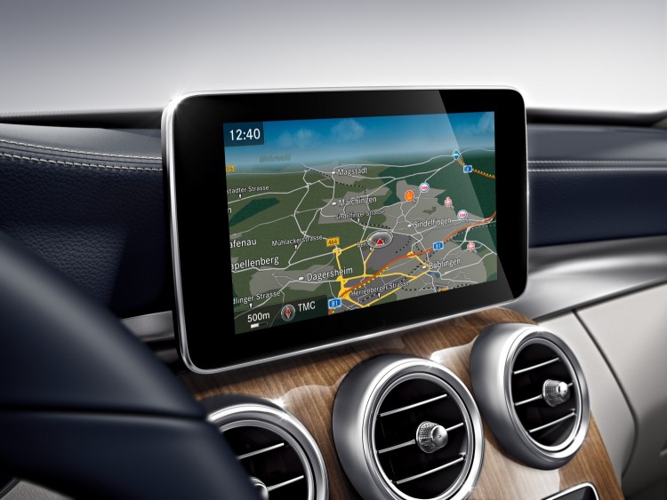
Mercedes-Benz’s COMAND system works very similarly to iDrive, in that it uses a console mounted rotary to control its menus and also has a touchpad incorporated into it, much like iDrive’s.
MMI
Audi’s MMI system is also quite similar, combining a rotary and touchpad as the controller. However, MMI’s rotary works backwards and it kind of freaks me out every time I use it. Maybe cause I’m used to mostly operate the iDrive.
ENFORM
Lexus, at the moment, uses a computer mouse-like pad that moves a pointer on the screen. This might seem intuitive, but it’s just distracting while driving. It’s cool to passengers, but for the driver of a moving vehicle, it’s too difficult to point and click while trying to watch the road. To Lexus’ credit, the pointer does snap to nearby icons, so as to make clicking faster and easier, but it’s still too distracting while driving.
inControl
Jaguar has its own system as well, and it’s just not quite there yet. Or at least until this new generation inControl is standard in all new Jags. The current one looks fine and the graphics are nice, but the menus are a little convoluted and some features and setting are hard to find. But by far and away the worst part about it, is that its touchscreen inputs are slow and unresponsive. The latest update though is said to fix that.
Touchscreens are so much more difficult, while driving, to operate a touchscreen than it is to find a physical button or knob and either push or turn it. You don’t have to take your eyes off of the road with iDrive or COMAND, as you can memorize the redundant button placement and/or the amount of click-turns it takes on the rotary knob to select something. BMW recognizes that and the latest trends, so it will offer a hybrid version in the future cars, starting with the previously mentioned 7 Series.
CUE
By the worst system of all, and it’s not even that close, is Cadillac’s CUE. I like modern Caddys, I really do. But they’ve got to work on CUE. Firstly, it’s touchscreen. Fine, everyone likes touchscreens nowadays, so I get the reasoning behind it. But the real issue is that all buttons, like volume, HVAC, and even the Start button, are all touch buttons. This makes them very difficult to find while keeping eyes on the road and when you do find them and touch them, they rarely work. It took me almost a minute to adjust the volume in my last drive in an ATS.
The software is also horribly slow to respond, so when you touch an icon on the screen, it doesn’t do anything for a second, nor do you feel the haptic feedback right away. This makes you think that the touch didn’t register so you touch it again, but by the time you touch the second time, the first touch registers and changes screens. So now your second touch happens on a new screen to a different icon, doing something you didn’t want to do. All of this while driving is maddening. I almost punched the CUE system last time I drove a Cadillac.
Using some other infotainment systems makes me appreciate how good iDrive really is. Maybe it’s because BMW’s been doing it longer than most, so there’s a level of expertise there that’s missing in other companies. But either way, iDrive is probably the best system on the market, using the rotary knob and redundant buttons on both the console and steering wheel. Mercedes’ COMAND and Audi’s MMI are close runners up, but I think iDrive is the winner. Don’t get me wrong, the others look pretty cool visually, but the iDrive seems more intuitive.
iDrive will also be getting better, with the adaptation of gesture based controls, drivers will be able to control the system without touching anything. I’m not sure how well such a system will work, but if it works as well as advertised, it will make life much easier inside new BMWs.


