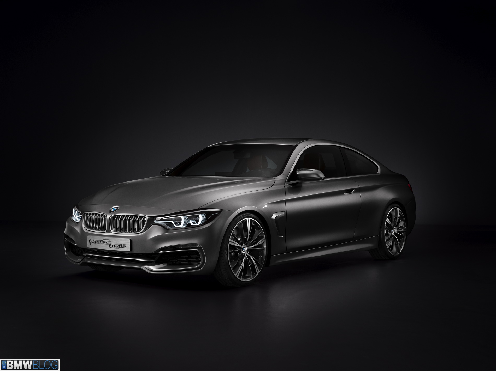
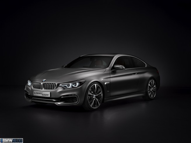
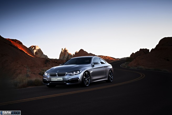
BMW has released what is undoubtedly the boldest, most beautiful 3 series to date. Except it’s called the 4 series. This change in badging is a whole other topic in and of itself – we’ll save it for an Opposite Lock discussion – so today we’ll focus on what matters most to our eyes: the 4 series’ new sheet metal.
Looks are subjective – though we all seem to agree on occasion. For instance, I can’t recall anyone ever calling Keira Knightley ugly. I’d be shocked if anyone other than a troll called the BMW 4 Series a dud. In my opinion, the 4 series is an automotive Keira, a fresh-faced design that captures your eyes and your heart. I imagine it’s the kind of car that even non car lovers will fawn over and lust after. Gentleman behind the screen: if you’ve been waiting for your significant others approval to buy a new BMW – this could be your ticket.
So enough of the praise, let’s take a look at the details. Under the direction and close oversight of Adrian van Hooydonk BMW have produced a shape that mixes many design approaches into one harmonious sculpture. Note the sharp, tight creases and edges along the belt line and rocker panels, running longitudinally up the bonnet, across the rear bumper, and integrated into the front fascia.
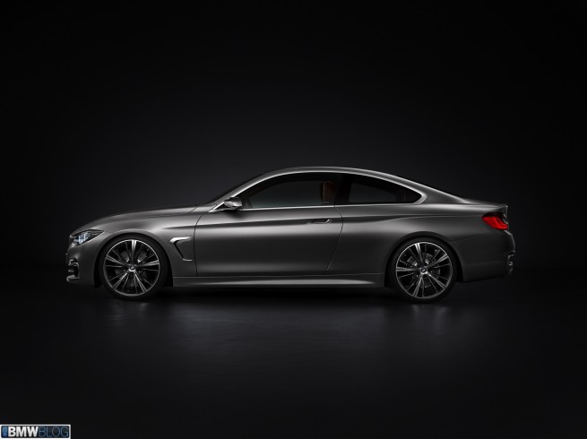
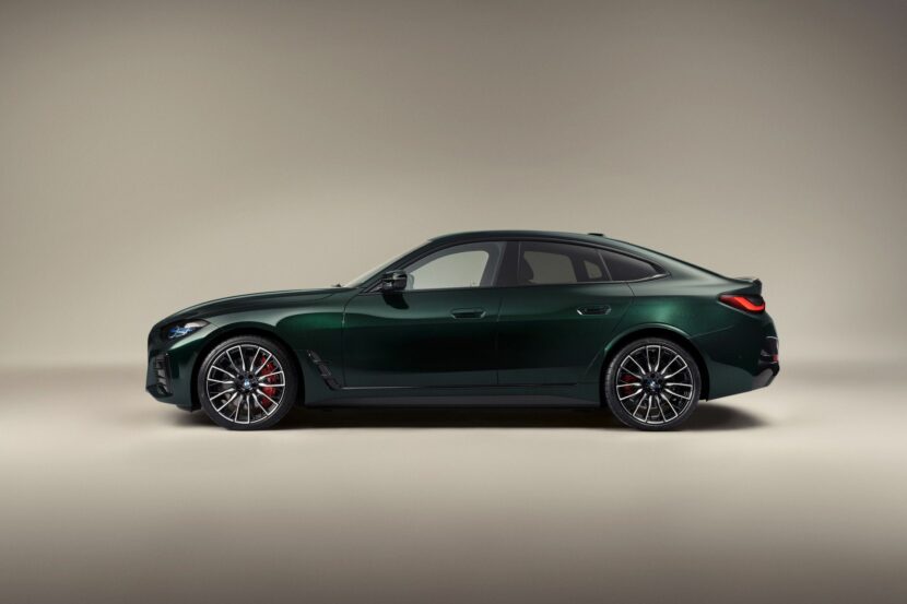
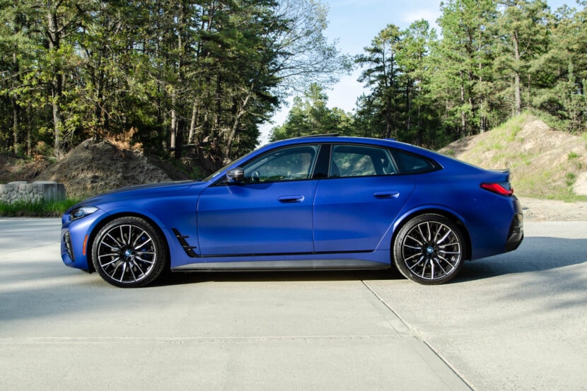
These sharp creases in the sheet metal contrast with smooth, flowing surfaces that look organic beside the tight, industrial edges. Note the gradual rounding of the mid-door from convex to concave top to bottom – then this flowing shape melds into a new, wide rear wheel arch, smooth as polished rock around its edges. The result of this mixed approach is a car that looks nearly bionic, a robot brought to life.
To the eyes of this beast: BMW’s traditional double-round headlamps have evolved nicely. They are no longer round but ‘C’ shaped, open to the inside of the headlight fixture. The inside C is continuous along the bottom edge into the kidney grill which it transects near the middle. This design approach exaggerates width, and helps the BMW S series look even wider than it is – though with physical widening of the body it’s not altogether an illusion.
My favorite design feature bar-none: the gorgeous air intakes in the lower front wing. Heavy emphasis has been put on the BMW 4 series’ air intakes – they stand out and look over-sized, perhaps fit for an M car. Discerning eyes will notice a resemblance of the air intake’s ‘C’ shaped inner aero element and the ‘C’ shape of the headlight’s LED rings.
New side mirrors are beautifully sculpted and can be admired as distinct objects. They have been aerodynamically honed to reduce drag and wind noise while directing airflow across the side window to clear precipitation as it falls. An upper wing element runs separate from the body of the mirror, and looks razor sharp.
New shark-gill side vents make an appearance on the 4 series – they are a first for BMW’s premier sport coupe and while we disliked them in early artists renderings – they are well executed on this car. Their two-tone colour finish looks sharp and adds to the visual spectacle as earrings do for Miss Knightley.
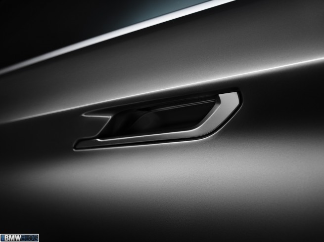
The door handles are now integrated into the metal prominence that runs along the belt line of the car. They are also well sculpted and a cool detail to look at and no doubt operate.
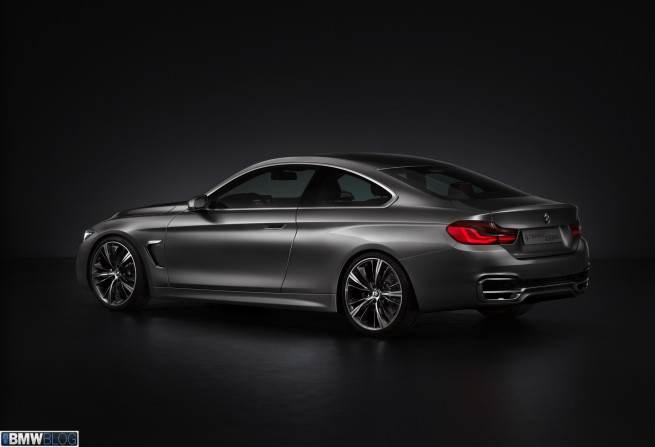
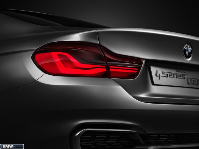
As usual, the belt line transects the rear tail lamp fixtures, lending a familiar shape to the rear three-quarter. That’s where the familiarity ends though, with sharp new tail lamps that bring BMW’s now traditional ‘L’ shape to a whole new futuristic look. The LEDs are shaped into wing-like elements within the tail light housing. They therefore have a 3-dimentional look, and are gorgeous from all angles.
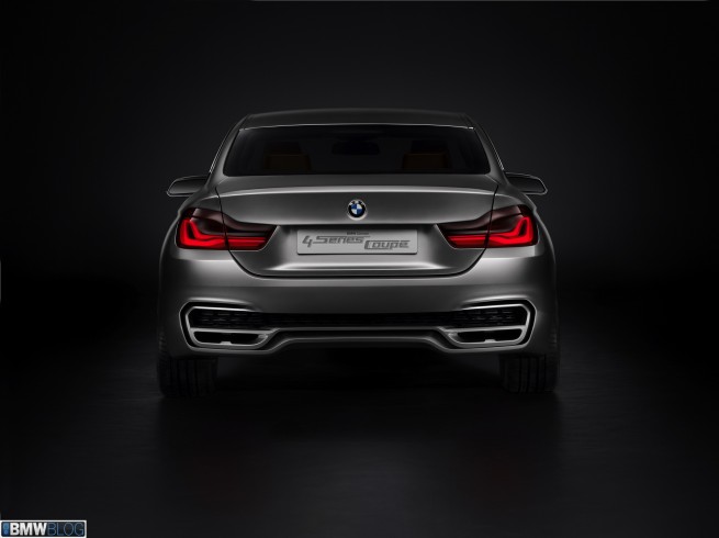
The rear bumper looks as though it has a massive air outlet fed by a huge underbody rear diffuser. Well, that’s how it looks – and we only wish it were the case. We’ll cross our fingers for the new M3 to feature such aero tech, but in this case – though no doubt purely an aesthetic exercise – the rear wing’s open section looks great.
The exhaust pipes exit through an integrated body piece that looks sharp and a bit mean. They will likely change in shape based on engine choice as in previous 3 series cars.
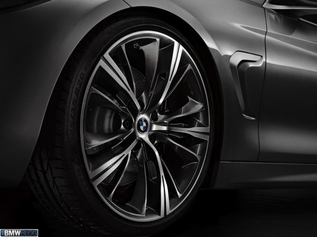
Finally, the wheels are epic, featuring 5 spokes that fan off into 4 individual blades – thus rendering the wheel 20 spoke, depending on how you look at it. The sharp blade-like spokes are consistent with the sharp winged theme of the car. We love them.
Overall we can say that this new 4 series is a triumphant victory in BMW design. It showcases just what BMW’s design houses are capable of and should silence any who claim the Germans have no passion for emotional design.
While this is technically a concept car, the production version should follow this design very closely. We can’t wait to drive the production version in the flesh.


