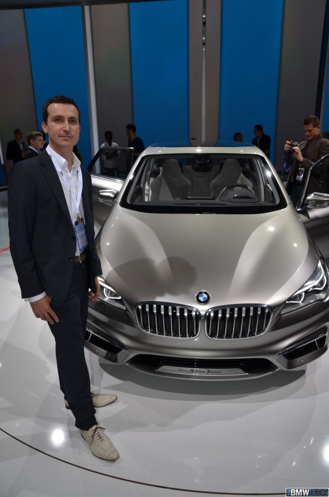
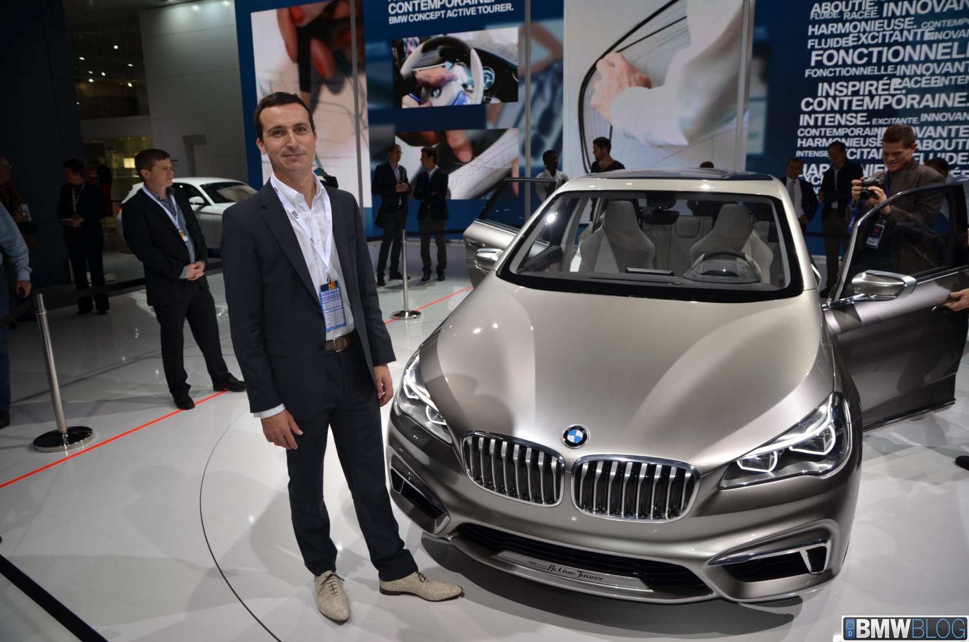
BMW’s first front-wheel drive vehicle made its world debut at the 2012 Paris Motor Show. To learn more about the challenges in designing a FWD vehicle while maintaining BMW’s core values, we sat down for an interview with Michael de Bono, the BMW exterior designer responsible for Concept Active Tourer.
The UK-born de Bono is known in the BMW world as the designer that also penned the beautiful F31 3 Series Touring. The young Brit Bono joined BMW in 2004, after graduating from Britain’s Transportation Design Department of Coventry University.
After working on various Rolls-Royce and BMW advanced design concepts, de Bono joined the production design team in 2007 and reports to head of BMW design, Karim Habib.
BMWBLOG: Give us a design overview of BMW’s first FWD car.
Michael de Bono: The front-wheel drive car in a segment like this – urban environment – has to be very compact with the minimum exterior footprint and maximum interior. A combination of both is quite challenging, and such a short car is also very tall. It’s unusual for us as BMW designers, but we found a way from the initial sketching – we looked at how we could get the best out of the car.
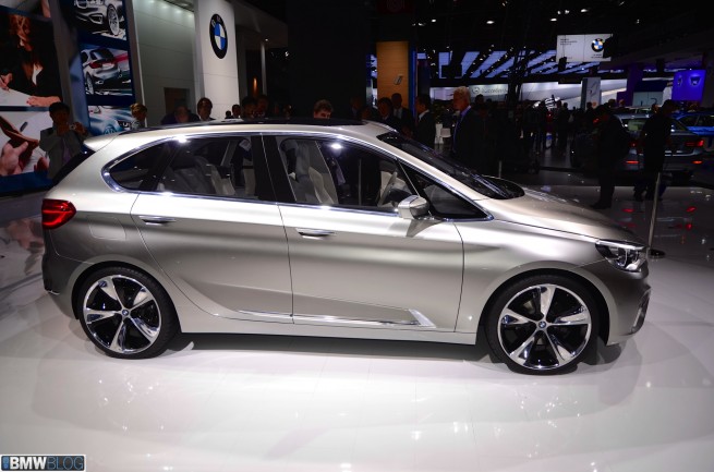
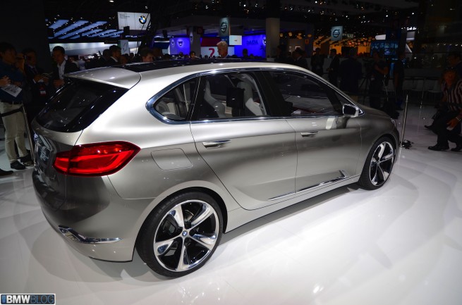
For me it was very important to find a unique type of agility. The 6 Series is a very stretched model, agility-based, speed-form-feeling, but this car is much more compact, agile, light on its feet. So it’s got to have very short overhangs, a lot of focus on the wheels, a very flying D-pillar at the end of the car, so it almost springs forward like it’s a sprinter ready to go.
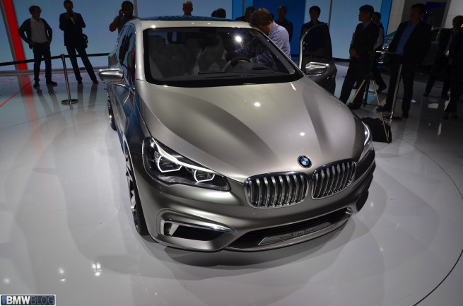
That was the agility, a kind of a sudden character that I wanted to bring to the car. Every BMW has its own character, so once we have the character, we can then look overall at how we bring that together, in terms of proportions, the surfacing of the car, and then the details. For example, quite a challenge was the hood, because normally, looking at the 3 Series which is stretched over lines, here they were almost vertical, because of the angle of the bonnet. If you look at the front, you have a totally different impression. We quickly found that we needed a lot more sculpture.
BMWBLOG: Please explain the look of concave and convex surfaces on the hood.
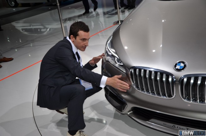
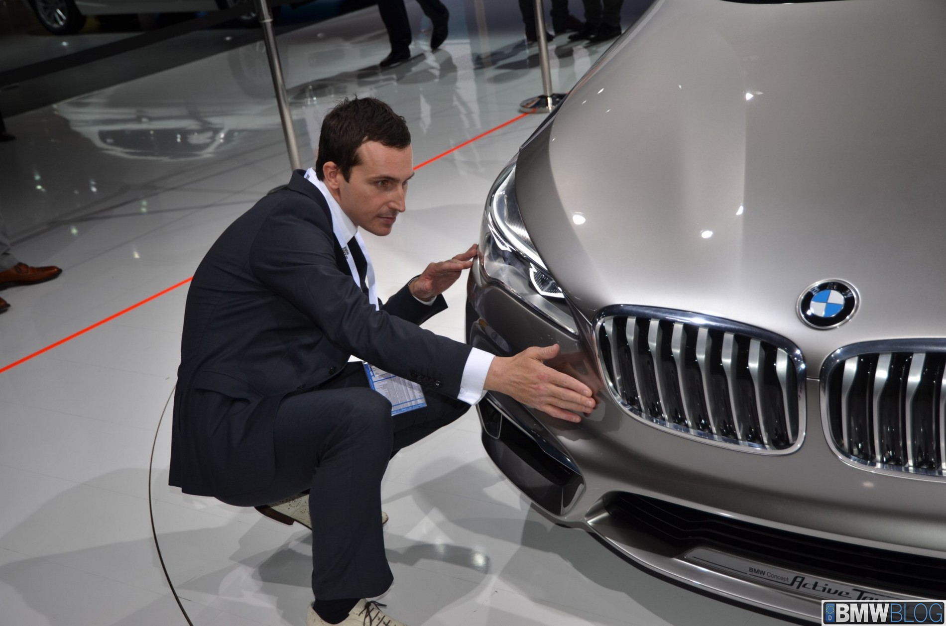
Michael de Bono It’s a very simple way of using two lines to create a lot of surface sculpture. By having these opposing lines I think it creates a lot of dynamics, a lot of interplay between light and shadow, without playing with concave/convex shapes. What we see here is more evolution of BMW design in terms of surfacing. There’s a lot of focus on the lines and the volumes, and how the volumes intersect, and how that could be a very dynamic, poetic expression. And then you have very precise lines, like those on the hood and the door. They really are sharp, precise lines that show engineering quality.
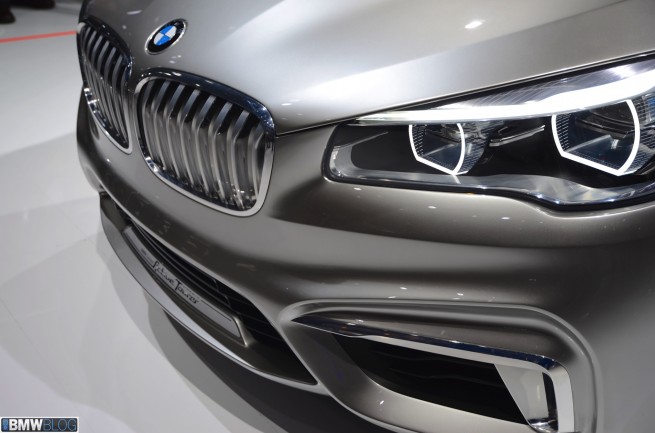
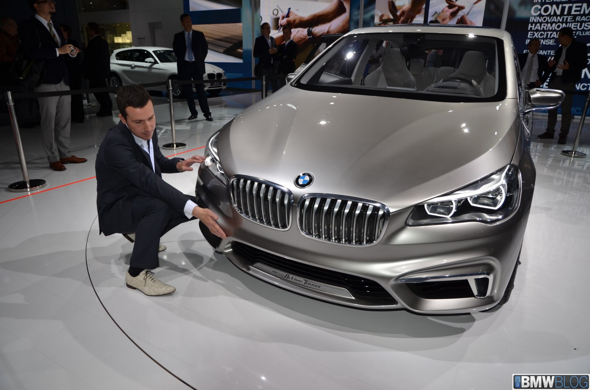
And then for me the problem was the face of the car. It is really a strong, iconic face. The kidneys are quite large; they help proportion the whole car, so it’s nicely balanced. Then you have the hype of the car, wrapping over the nose, then the headlights – typical BMW icon headlights – but set-back – so again, reinforce the rear, reducing the front overhang to really make it light.
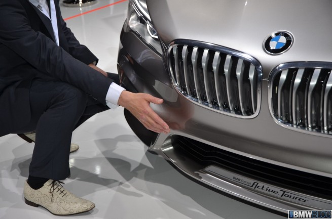
In the front and the lower part we have the air curtain. This piece is also on 1 Series and 3 Series today. This is perhaps another interpretation where we really showed the innovation behind in a very extrovert way.
On the side there is an air-breather. It’s the same approach of how we treat the sculpture of the details – you have the surfaces moving thick to thin rather than angling everything, giving a lot of edge. We can have something very horizontal below the belt line, very horizontal lines. They support this very stretched feeling; it’s not imbalanced and every element has its own functionality, whether it’s for aerodynamics or for ergonomics.
So we have here authentic parts, realistic. We’re looking at how we can bring the innovations that we have in-house into future products. So this is the first step.
BMWBLOG: What was your biggest design challenge on having a front-wheel drive on this car?
Michael de Bono: It’s very different impression that you get with a car like this. So the challenge is actually to find the proportions and bring the A pillar so far forward, angle it so sharply that you have a new dynamic where it’s one volume. We have a gesture from one volume.
On the classical BMW we have the hood stretching into the body-side and the greenhouse set back – where passengers seat – so the focus is on rear-wheel drive. Here we’re leaning forward; it’s a front wheel drive. So it takes time to find those proportions, this was a challenge.
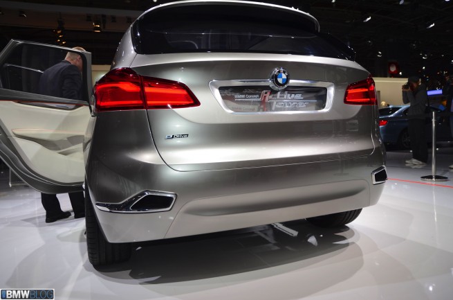
Then you have different body on the rear of the car, to find sculpture, graphics that divide up the volume of the car, so it still has a sporty personality. Those classic L-shaped lights are much more horizontal and then we have a very clean surface structure that actually helps with a very fresh light feel, and at the same time there is a lot of light and shadow. That helps wit the looks of the car, and also keeps it very agile.
So combining agility with sportiness and elegance and premium was the goal. To bring them together in one car, that was the tendency, to see the car from inside out.
BMWBLOG: Karim Habib says that rear-end design is impressive.
Michael de Bono The rear is as important as the front. It has this very horizontal “band of information” through the rear of the car. Horizontal, angled tail lights, L-form, but very new, sculptural, with a lot of depth, the premium feeling and surround around the number plates. Again the letters are actually floating, arrive from the surface, so you have a certain mystery, glamor or magic around the details, which invites you to look closer. It’s the same here, more than just function. I think that is very BMW.
We also have these aero edges in the body of the car, and the air flows from the edges, and the silhouette of the car, in terms of aerodynamics, is much smaller than the car itself. So we’ve got the aerodynamics of a totally different car. Even elements like the arrow lens on the side, on the valance, they also help direct the air flow behind the car to reduce turbulence behind the car.
Since this concept is a hybrid, we set exhaust a little higher, to break up volumes in new ways, find a new structure.
BMWBLOG: From the side we can see still the iconic Z-character line.
Michael de Bono: Still there, but different. Not so rich and very light surfaces underneath the shadow surface, it really helps press the car down on its wheels. So you have it almost like flowing elements in the middle of the car, which then creates a lot of sculpture over the wheels. It’s a very powerful tool we use at BMW to get lights over the wheels – muscles over the wheels – we have this contrast between light and shadow. And it’s gone away from just a little sort of fine crease, making it more generous, premium surfaces, evolving to more modern forms and angles where it has this strong and stable feeling.
It’s a small car but it has the presence of a larger car trough its face, the proportions and through the surfacing. You can give the car this elevated feel, even though it’s so short. It’s not just about the size of the bonnet, the size of the hood, but it’s also about the whole character, feeling of the car.
We can also see the belt-line which it’s quite long for a car in this segment This was inspired by classic BMWs like 2002, who had very large greenhouses but very cylinder body sides.
So there are a lot of BMW elements which we’ve incorporated but in a new way, with the Hofmeister Kink even faster than the pillar, which gives a certain excitement, a certain dynamic beyond if they were the parallel. But when it’s parallel, there’s no speed, aerodynamic. So this way we can introduce just a little bit more dynamics.
BMWBLOG: What’s your favorite design element on the car?
Michael de Bono It’s so hard to choose. I quite like the way the kidneys have been done. They fit into the sculpture of the car, it’s a very complex form to make it real as a kidney shape, because we’re wrapping over the nose of the car and get this first impression: “It’s a BMW.” This was crucial to us.
This is a BMW that does have presence, it is sporty and if you look into the detail in the kidneys, we have these glass elements between the blades, and the air flow around the blades, like an active kidney grille. So in that one element we can see a whole thinking about sculpture, sustainability, realistic design, social responsibility, about the sporty dynamic experience, so the whole spirit and character of the car is somewhat in the kidney.
BMWBLOG: The new 3 Series has the headlights flows into the kidney. Why not using the same design technique here?
Michael de Bono Here we wanted to set the lights back from the kidneys, to reduce the optical impression of the front overhang. The front overhangs are anyway very short, but we wanted to make the car light on its feet.
That’s the character of this car, agility, compared to other BMWs. So by setting the lights back and having the kidneys wrapping over, we have some Salvador-Dali-clock-type form. If you look on the 1 Series as well, there is also no connection to the kidney.
BMWBLOG: There are clearly three volumes on this car. A first for BMW.
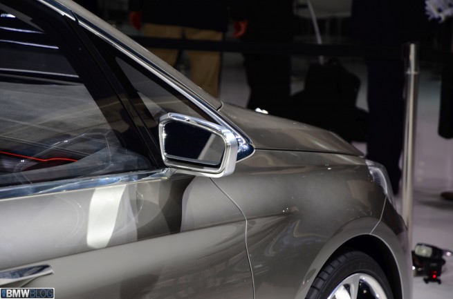
Michael de Bono: It’s also new for us. A lot of flying in the exterior, but a lot of space in interior, and a lot of light as well, a lot of visibility. Some cars in this segment that have an A-pillar, the design features a window in the corner and with this huge triangle – you can’t look around it, you can’t look through it. For us, to have a different approach, it’s kind of a win-win between function and form, because we have an A-pillar and we wanted a very light experience inside the car, and by splitting the A-pillar we could achieve that.
BMWBLOG: Thank you for your time, Michael!


