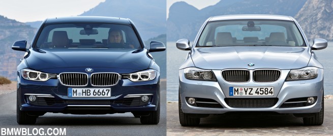
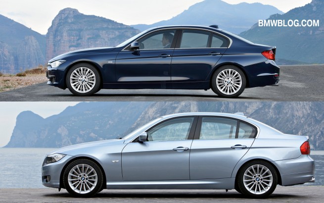
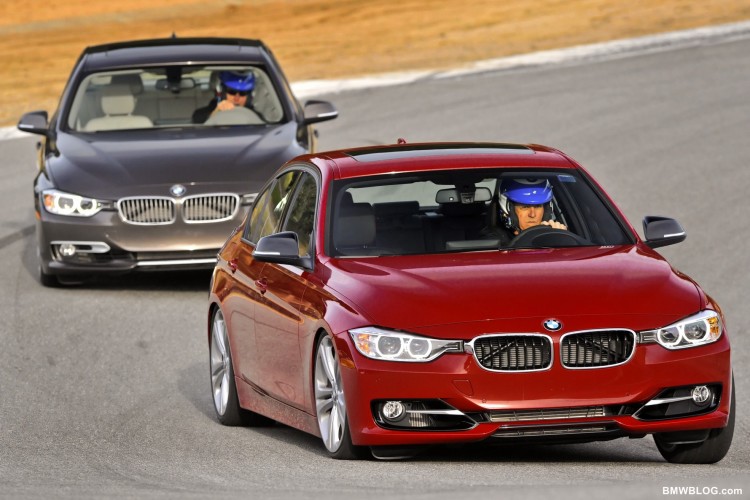
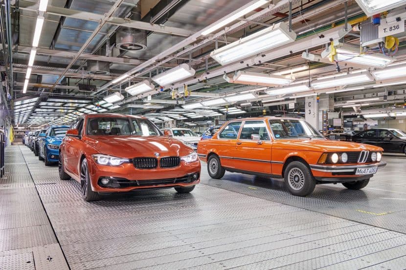
You have the old and the new, and the new is supposedly an improvement. The new 3 Series is obviously larger, more sophisticated and more powerful than its predecessor. But once you lay your eyes on it, is it better looking? Are you struck by its exterior design? How do you define an improvement in looks, especially when there is clear parity in theme, dimensions and functionality.
Before going any further, there is one indelible problem with the F30 and it has to do with an add-on: the front license plate housing for North American models is nonsense. And this is putting it nicely. Looking at a new Mineral Grey 328i without it and an older 335i with the more contoured plate housing tells the difference. BMW, please revise the design to follow just the plates and no excess also.
Now about the actual F30 exterior design. Remember the cousin that was slightly chunky before hitting that growth spurt, and the next time you saw him he had chiseled out, lighter, stronger and maybe even a little meaner? The E90 and F30 are exactly that; in comparison the E90 is a little chunky compared to a leaner, lighter but more muscular F30.
Read our review of 2012 BMW 328i
What’s more amazing is how this has been achieved.
Start at the front end. Well both have that menacing hood with four lines pointing the way to the twin-kidneys. But check carefully on the outside lines of the F30. There is a concavity that deftly slides into the fenders. Previous designers would have defined this as flaming or “Banglelized.” No more, this is “muscling”. Much in the way sculptors cut away until they have defined the perfect anatomical feature, the designer has created this perfect sculpted line that “lightens” the whole front end.
Muscling isn’t lost on just the F30 front end, compare the midline on both cars, just below the greenhouse. The F30 adds the same muscling, that concavity to a sweeping heretic line that runs away from the greenhouse and blends into the concavity of the hood. This line is a rebel by any design standard. Non-conforming, not parallel to the greenhouse, not blending into the fender but into the concavity of the hood. This is the lightest, most unique line on the car.
And this line has a sibling. The midline just below which marks the stance of the car, is also diverging from its heretic sibling. The midline uses the same concavity of form, but instead of leading the eye to a slab near the backend, it leads you to a lean haunch. The E90 appears almost stubby in comparison.
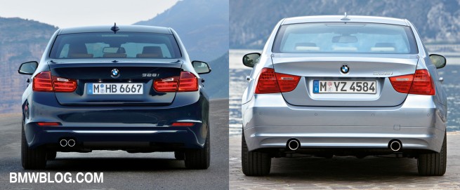
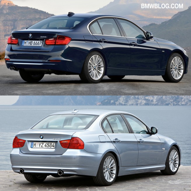
What about the back end? How has the duality of lightness and muscling been blended into what on the E90 appeared to be an after thought?
That heretic midline that draws your eye to the slight flare of the rear fender also draws you into a thematically tight rear end design. The subtle spoiler on the E90 is now even more pronounced on the F30. The tail lights are narrower and longer, a derivative design element from the F10 5 Series. A single groove outlines the rear diffuser which is nonexistent on the previous 3 Series. There are two marker lights at the bottom of the bumper cover with horizontal lines just above blending into the rear fenders. In short, the taller, broader backend of the F30 appears leaner than the rounder blunter end of the E90 sedan.
Some of our female readers maybe upset with all the talk of muscling and haunchiness, but rest assured that this car is as feminine as it is masculine. The elements of BMW design that have created so much masculinity up close, have created something light, fun and unique from a slight distance. The incredible lightness of the 2012 3 Series makes it almost feminine.
So maybe, just maybe this isn’t that cousin that leaned out and muscled up, but that most beautiful relative that blossomed from one family gathering to the next.
Remember her as you would the new F30.


