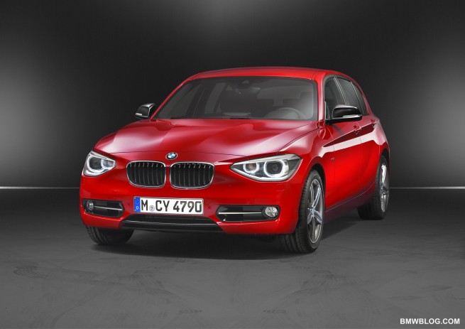
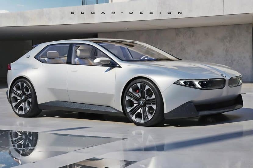
To open the proverbial can of worms, the styling of the new F20 is controversial (based on the volume of negative tweets seen after the embargo was broken on Friday). The flanks of the car seem to be following the F0x/F2x styling idioms (more on this later), but the nose and tail seem to be evoking the comments.
Exterior Design
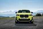
After looking at the Urban Line/Sport Line examples I find that the chrome vertical accents on what I presume to be the Urban Line car to be visually preferable to the shadowline grilles of the Sport Line (and why did BMW decide to use Sport Line, it’s a bit close to Audi’s S Line). But the area of the nose I’m puzzled by is the body colored gap between the grille and headlamps. I’m having to look at it a bit to see if the proportions make sense to my eye. Maybe it has to be seen in person.
One nice design detail in the nose is the use of a grille similar to the new 6er. It is vertical until a few centimeters before the top of the grille and then leans back toward the cowl. Again, the chrome grille will highlight this better than the black grille.
The tail of the hatchbacks seem to be a bit bland – not as much surface development as I’d like (and one of the things I do like about the tail of the E82 1er). But this car is wider, has a slightly longer wheelbase and a bit more overall length the E8x 1ers it replaces. So even though it’s the same height as the current 1er, it may look a bit less upright.
But let’s talk a bit about the common styling elements above and beyond the kidney grilles and Hofmeister kink of the F series cars. Previously, the E series 1er, 3er, 5er, 7er all had distinct side sculpting. That seems to have been resolved in the latest iteration of the 1er, 5er, and 7er. And I suspect you’ll see similar flanks on the F30 3er. What’s BMW up to? Don’t they remember the old saw, “the same sausage in different lengths”? I have a hunch (uninformed) that BMW is preparing the battle space for the arrival of the distinctly different BMW FWD and i models. I suspect they’re going to protect the core RWD products by making them immediately distinguishable visually.
Interior Design
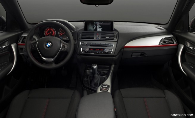
This is a step up in perceived quality from the current 1er. The first thing noticed is that the two main gauges are now round (as opposed to the current 1er), that ties them directly to the rest of BMW’s RWD model line.
There is a more three dimensional look to the IP with surfaces jutting out from others and the chrome trim that highlights the edges of the HVAC and audio controls adds a touch of elegance. It’s also nice to see the cruise control switches in the steering wheel.
The door pulse ‘twist’ echos the twist seen in the center stack of the 6er. And the big nav screen certainly looks much better than the current 1er’s. And color (other than orange) is being introduced into the gauges. This interior is much better looking than the current 1.
We can’t wait to get a chance to go through this car in person.
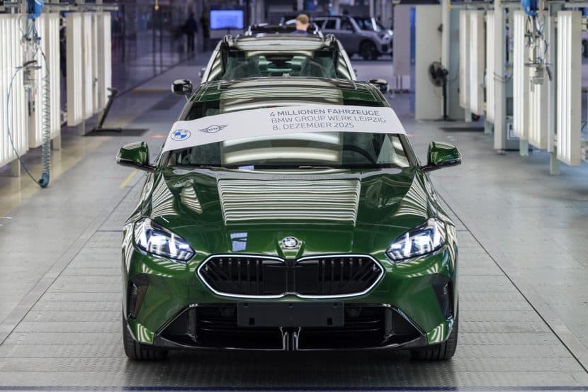
Update with an image by our reader Javier


