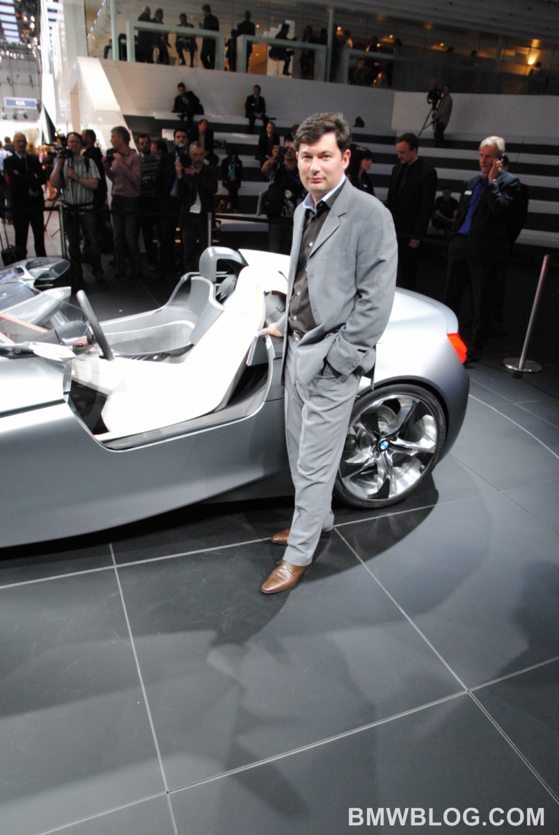
For the second year in a row, at the same Geneva Motor Show, BMWBLOG had the unique opportunity to interview Marc Girard, BMW’s Head of Interior Design. Girard has worked as a designer for the BMW Group for 17 years. From 2000 to 2002 he developed the interior design for the BMW 1 Series, the first vehicle of the brand to enter the compact segment.
Girard was head of Interior Design for the MINI brand from 2004 to 2006 and during his stay at MINI, he was responsible for the interior styling of the MINI Clubman. In 2006 he joined the BMW Interior Design team. In April 2009, he was appointed to lead the interior design at BMW Automobiles.
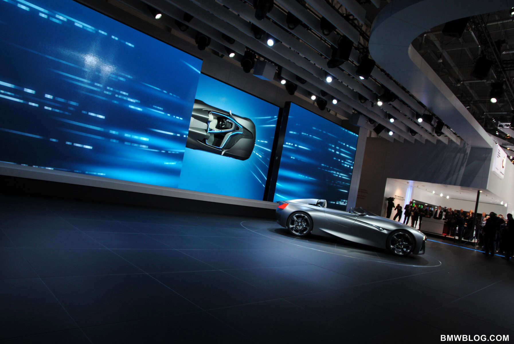
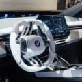
While the previous interview focused on the future of BMW interior design, the most recent conversation revolved around BMW’s newest and exciting Vision ConnectedDrive Concept. With his usual enthusiastic personality, Girard described the new concept for our readers.
 BMWBLOG: Marc, please describe to us the new BMW Vision ConnectedDrive Concept.
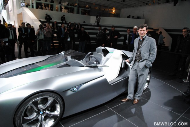
Marc Girard: BMW Vision Connected Drive is the team’s creation. It was a very exciting challenge, because the task of this car was to communicate what ConnectedDrive is, and this is a kind of a meta-concept. It’s an attempt for designers to translate a meta-concept into an object. So it was a tremendous challenge.
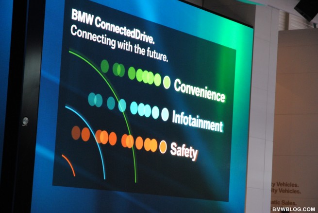
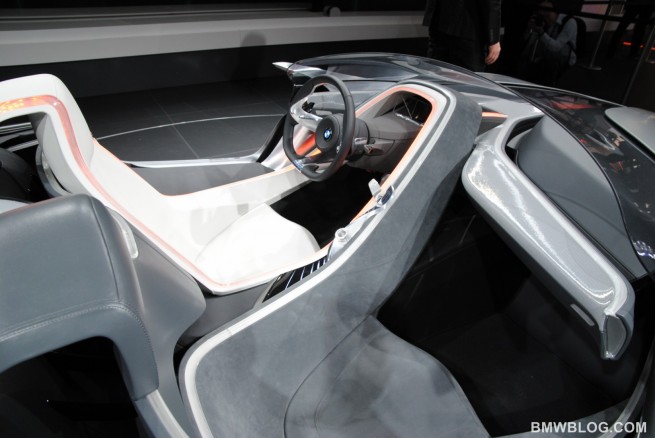
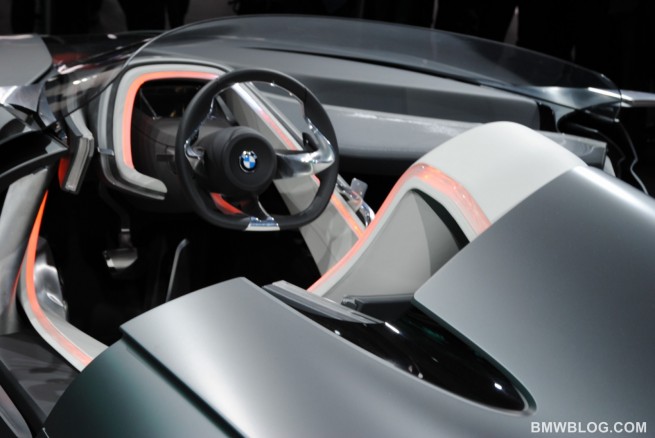
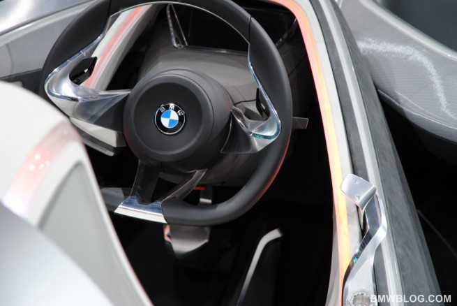
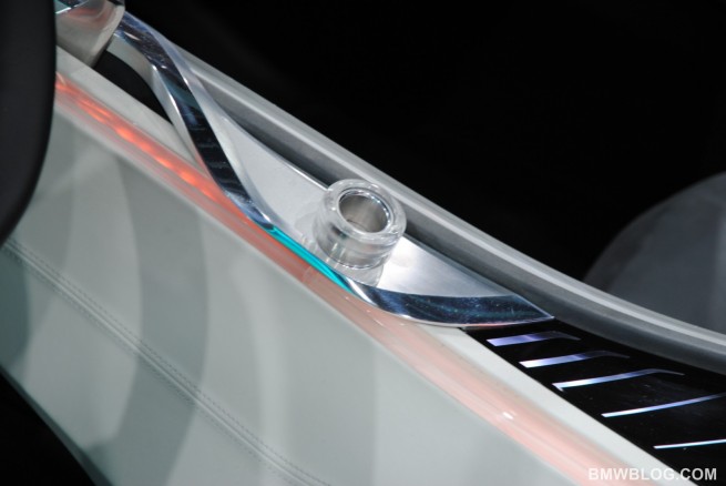
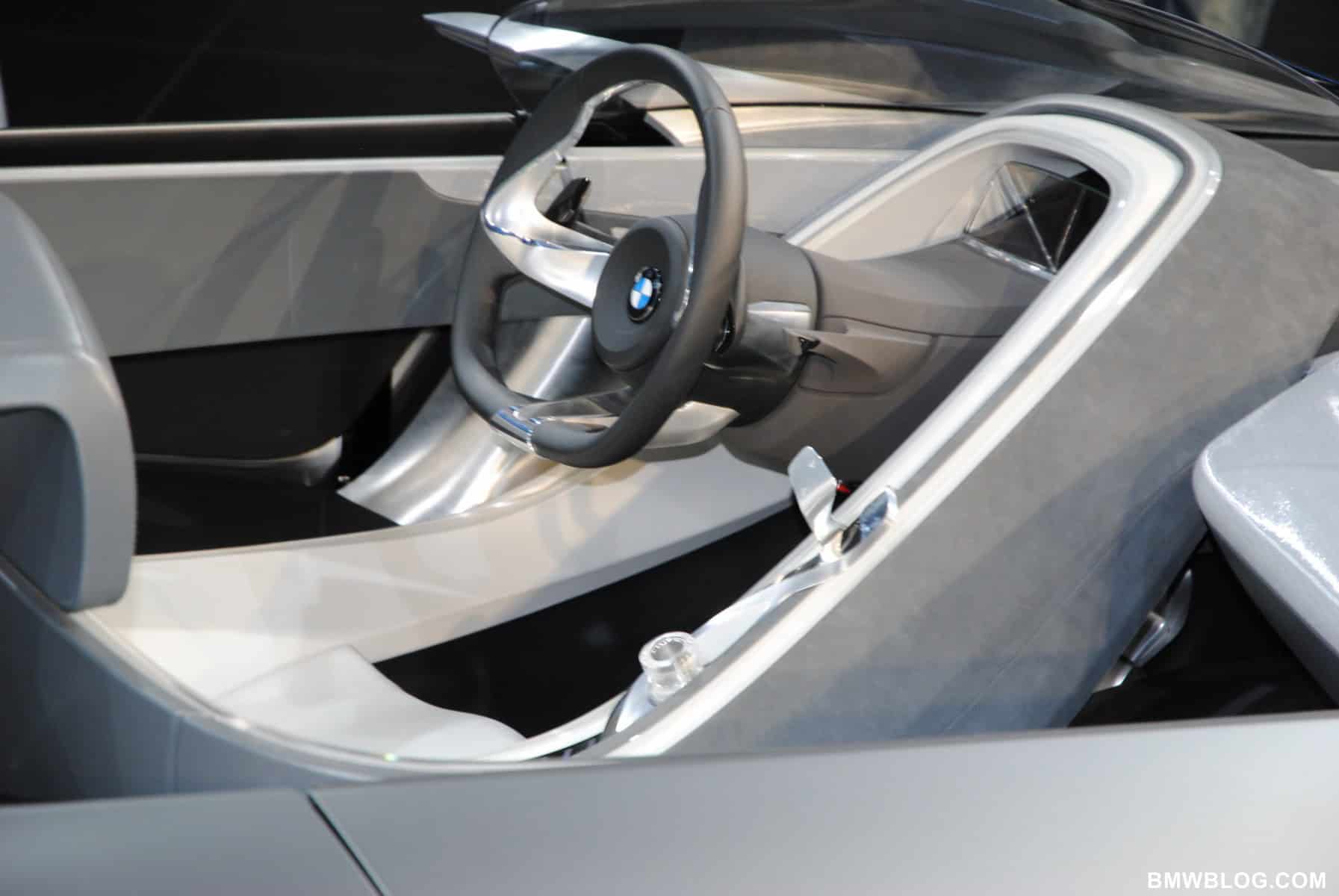
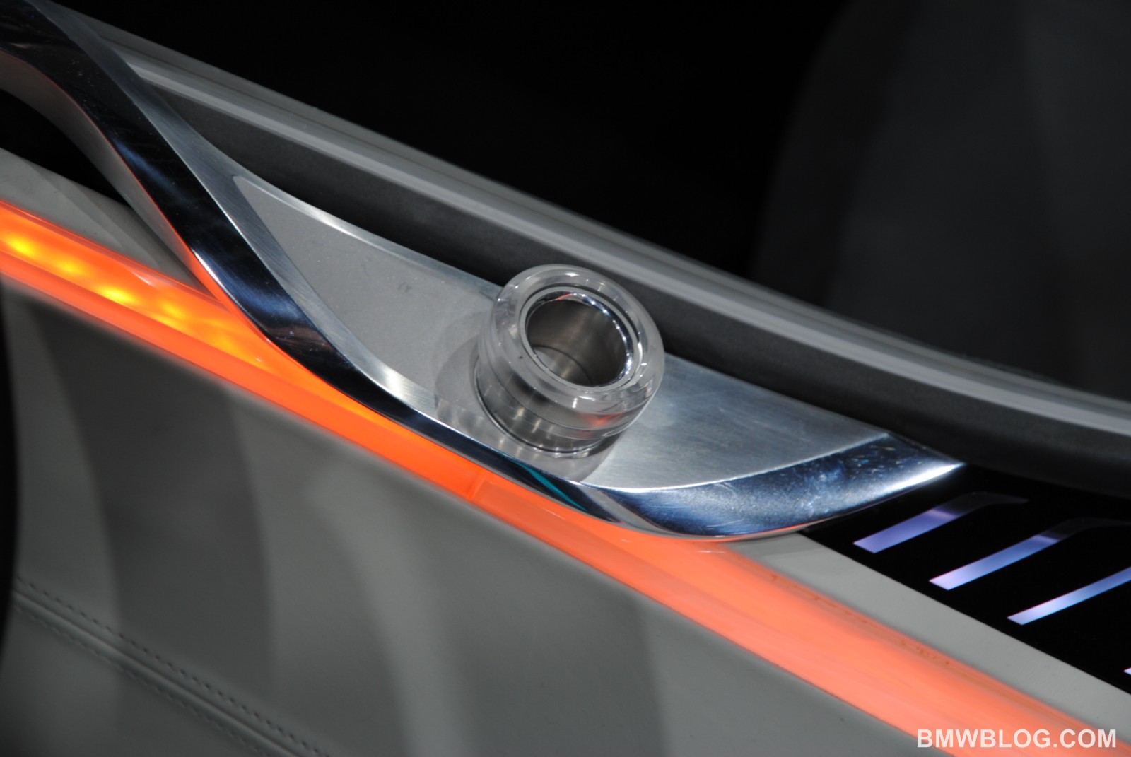
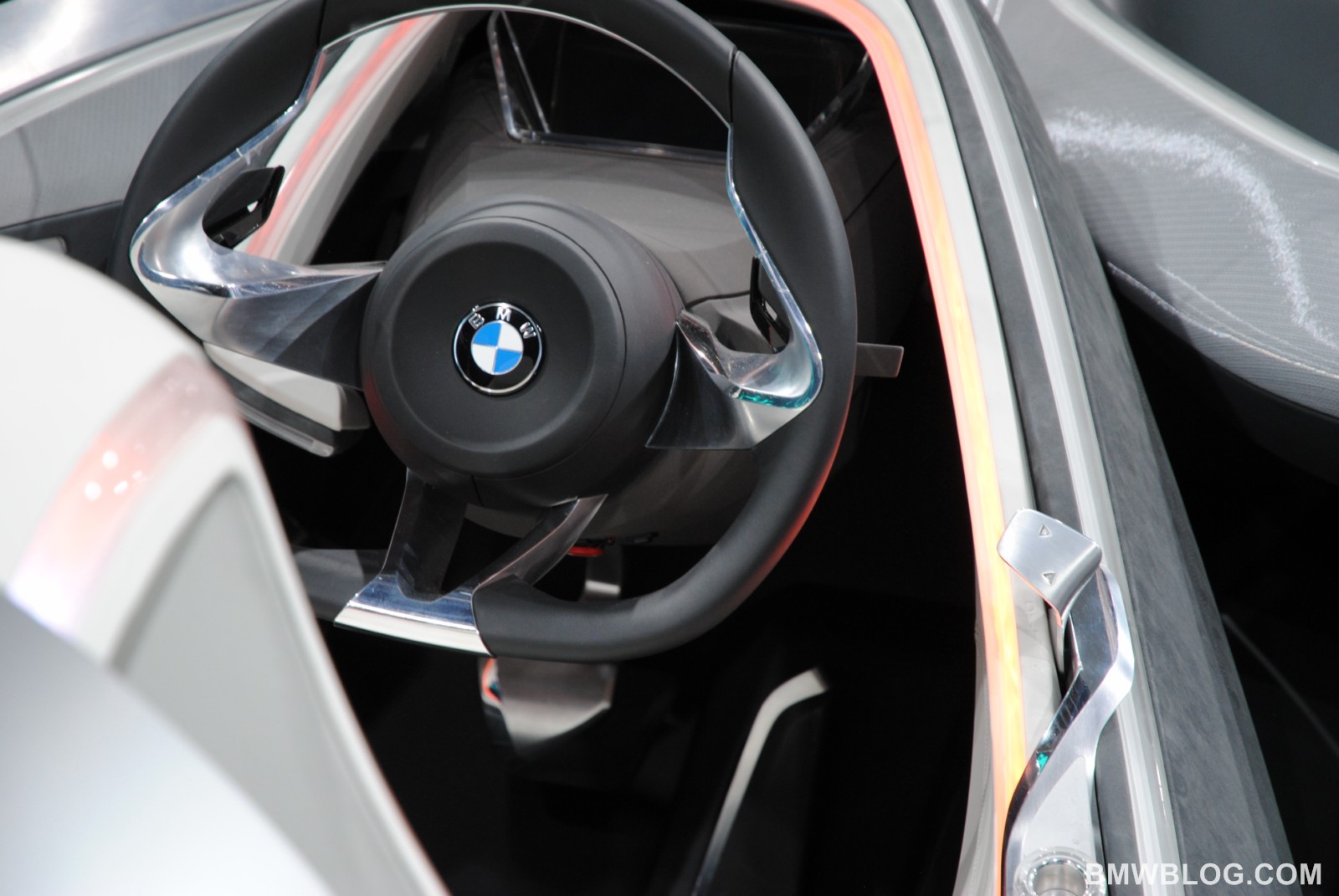
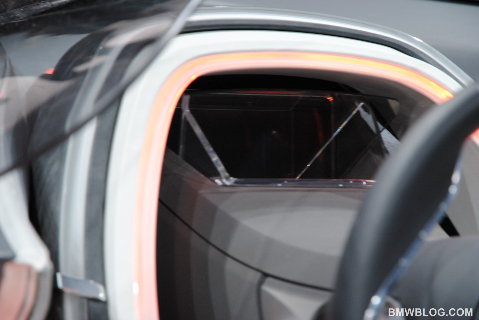
ConnectedDrive basically means three things: safety, infotainment, convenience. We said the car will be basically built on three layers, and each layer is embedding one of the concepts of ConnectedDrive. For example, safety has one layer which is all about driver orientation, and this layer is surrounded by orange lights, which has a lot to do with BMW’s typical user interface or the night. That’s why we said – one layer, extremely driver oriented, surrounded by an orange lighting.
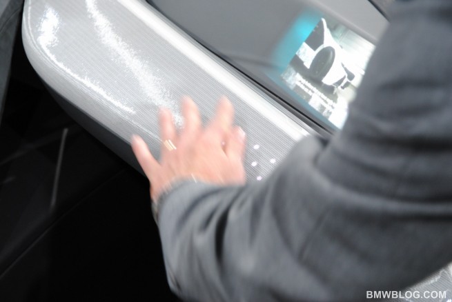
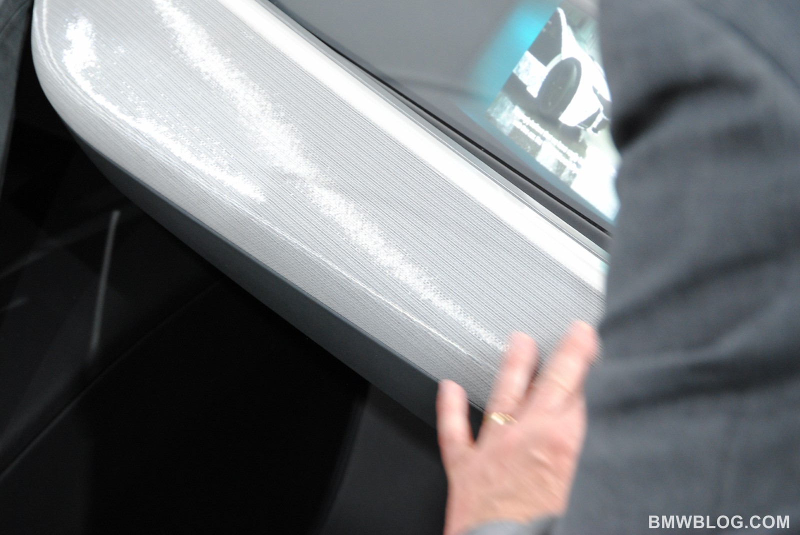
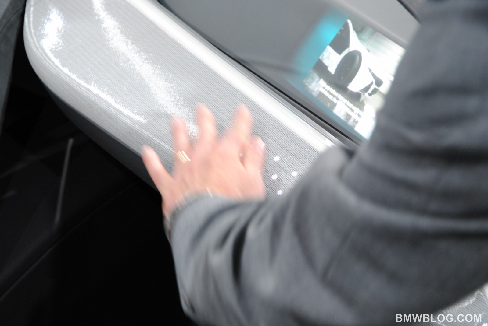
And we have the same philosophy with same items, same issues for infotainment – which is the second item of the BMW ConnectedDrive. For infotainment, we want to focus on the interaction between the driver and the passengers. We have a kind of a “Yin and Yang” situation with the driver and passenger, we have this gesture, which is basically coming from the driver and embracing the passenger together, and also surrounded by a blue light.
Then we have the convenience item which is the whole comfort issue that the car has, also surrounded by a light, this time green. We also wanted the complete color trim concept of the car to be very achromatic.
BMWBLOG: What else can you tell us about the layering design? It’s clearly following the same lines as the Vision EfficientDynamics Concept.
Marc Girard: Exactly. The goal was to communicate exactly what we said with Vision EfficientDynamics. ConnectedDrive is a Vision, it’s a fantastic emotional concept. But ConnectedDrive is something that we have in all our cars; we just put the things together and put it in an emotional way. It’s exactly the same approach. And in terms of design you can recognize the typical BMW items, in terms of interior design: driver orientation – this car is an homage, a tribute to driver orientation – also put into the color material concept, the driver is completely embedded within one material and one color, very strong asymmetry as well.
This is also a tribute to BMW interior design, we always have a very asymmetrical dashboard. Asymmetry is a very important concern for us at BMW design, and we took it one step further, making the the exterior design asymmetrical also. The glass is completely embedded into the hood; the cockpit graphic of the hood is also asymmetrical.
And then layering is something we capture from Vision EfficientDynamics, Why do we do layering? To emphasize the Vision Dynamics philosophy into design, this means subjective lightness. And we believe that by stacking the volume – instead of making big volume – but stacking into different places – and using space, negative space between those layers, it brings a lot of lightness.
You can see that in the car, you also see that from the top view, that these gestures, amplified by the layering aspects, are extremely dynamic but also extremely efficient, and bring out the lightness within.
BMWBLOG: Would you say that the car was designed from inside out?
Marc Girard: It’s almost more than inside-out, it was inside-out outside-in, and it was a complete symbiosis between exterior design, interior design and within interior design – symbiosis between geometry, user interface, technology and color material. What we say with ConnectedDrive is that it has to be relevant to the term “connected”.
BMWBLOG: So even the trims and colors were chosen to enhance the concept of lightness?
Marc Girard: Yes, that’s correct. And also enhancing the three layers. Each layer has its own materiality; you can see that the color of the leather on the driver’s seat is also different from the rest, but also the texture, semi-matte. The connection between driver and passenger is “Nurburg”, is completely matte, while the third layer is a glossy leather.
So we play with one color, but also with different textures. This is the contrast we have used. You can use contrast, it’s the designer’s best friend. You can use it as a color contrast, but you can also use it as a matte – glossy contrast.
BMWBLOG: How long did it take for the project to be completed?
Marc Girard: We completed the car – including the design – in basically four-five months. It was extremely short. This is a very intellectual approach to this car, we started in terms of philosophy, and the intellectual approach started right after the summer break. It took us a while to capture the philosophy, the meta-concept of this, to put it into an object.
We took a lot of time basically thinking what is the best, the perfect way to communicate ConnectedDrive into one object. It took us quite some time and it was a fantastic challenge because it’s almost more than project design.
With user interface, you can have some knobs, you can do a lot of things. You see, in this car there’s almost nothing, so it has purity, reduction, has a lot to do with aesthetics. And we have the opinion that next step of the user interface has a lot to do with gestures.
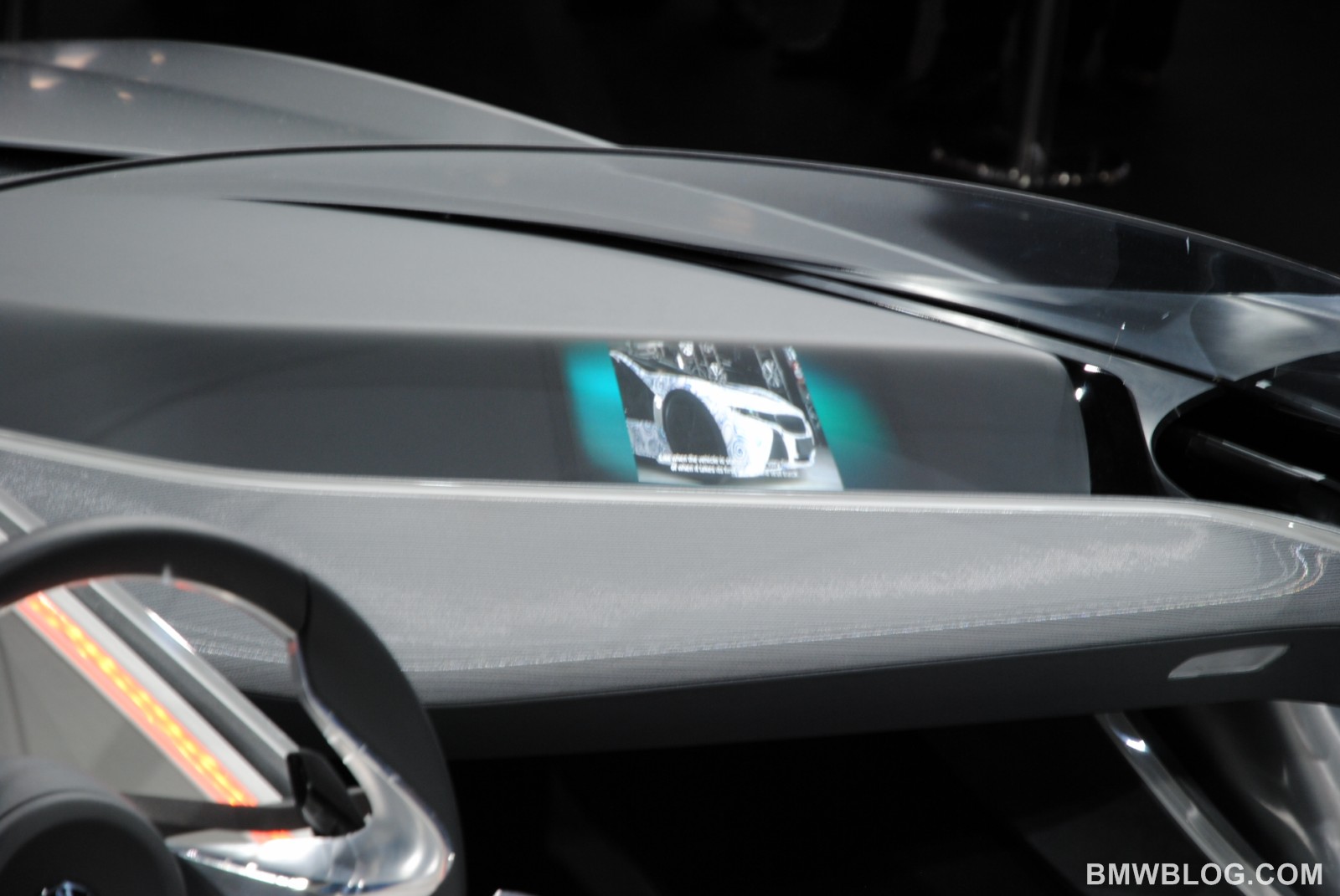
When the passenger is sitting in the car, we want him to basically share a lot with the driver. Driver orientation doesn’t mean for us that everything is dedicated to the driver and we don’t care about the passengers, so we want to basically bring the connection between driver and passenger as well. But we also want that the communication between the passenger and driver to appears in a very seamless approaches. There’s a piece of information which is basically captured on the passenger info display who could be, saying, “oh, that’s a nice museum, that’s a nice exhibition, we should drive there”, then “wait a minute, I will give you the course of navigation” and the information is basically swapped to the driver with a simple gesture and then this information comes into the driver cluster information.
BMWBLOG: So how does the driver deal with distractions?
Marc Girard: Actually we believe the contrary. Due to the fact that we have augmented reality in the Head-Up Display, you don’t really have to focus on some information in the mirror or some information behind the steering wheel. This means that you just have to stay focused on the driving and all the relevant information like the NaviLane or DangerCalling are basically coming straight in front of you.
So you won’t be distracted as a driver by looking in different direction, everything comes situation-related, in real time. That means you have less information, but structured information. Information is coming to the point where you really need it, when there’s a danger coming.
BMWBLOG: In my view, with a lot of the advanced technologies that we see these days, I feel like there is an information overload. Especially in new cars, you have a lot of information overload in front of your eyes, and as you said, not all of them are relevant or valuable. So is this the answer to the problem?
Marc Girard: There is one concern which is very important to us, the emotional browser. We need a browser in the car because actually ConnectedDrive does not mean that you get internet in the car and you get millions of information, you don’t need that as a driver. While as a passenger what you need is basically information which is fitted to you. The car knows you perfectly, it knows who you are, your favorite restaurants and your favorite exhibitions, and basically the car filters all this information by saying “out of 150 museums in this new city you’re visiting, there are two or three which are actually fitted to your needs and actually this one is the one we recommend”. And then you just have 150 museums to go through, but the emotional browser will select for you a couple of information which are very restricted but focused on structure. That’s the answer, this information overload is a fact and when you drive, you don’t want to be overload, you just want to drive.
BMWBLOG: What is the best showcase of interface in one of the production cars?
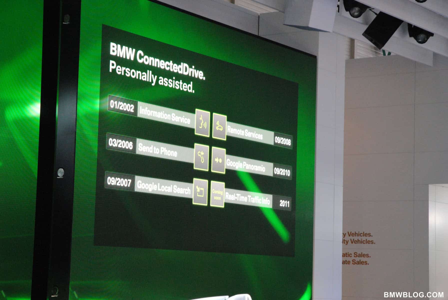
Marc Girard: I will give you some examples, for the safety, infotainment and convenience. Safety is definitely represented by the Night Vision, it’s something we have had for a couple of years already, which is a real tribute to active safety. An example for convenience is the Concierge service – in United States, when you need a restaurant or a hotel, or parking, you are basically helped by the Concierge at BMW ConnectedDrive. Also in terms of convenience, if you really want it and if you need it, you have Parking Assistance, where if the parking slot is big enough for your car, it parks by itself.
So basically we show the entire range from safety features, active safety feeatures to convenience – these are features that you can get in a 5 Series nowadays. Here we’re showcasing a glimpse into the future, the whole BMW ConnectedDrive app store that we have is also the next step – going in a seamless crossing, your personal device will be recognized in your car, your favorites which are on your personal device will be taken into consideration by the car, and then the whole seamless approach is actually a good thing.
BMWBLOG: How do you determine what works best for your needs in a car where there are so many systems, like you said: phone, iPods, iPhones, etc?
Marc Girard: We have to offer a complete range of functionalities because every customer is different. What we know is that the customer is really attracted to seamless approach. They don’t want to actively register, they expect that the car recognizes everything, what they like, what are their favorites, where they want to eat, whatsoever. This has to be seamless.
I think the future will have a lot to do with simplicity, with seamless, and this connectivity has to work in almost in a hidden way. You don’t want to push and say “connectivity”. It will have to happen by itself. We just to simplify the life of customers. I think that’s why we’re saying ConnectedDrive is a very emotional issue, we don’t want to list the 750 functionalities of ConnecteDrive, we want to show here that ConnectedDrive is cool, seamless, and simple, and it basically boosts the driving pleasure.
BMWBLOG: And now to switch back to interior design, when a customer takes a seat behind the wheel, what should he or she feel?
Marc Girard: I think it’s emotional reactivity because when you sit behind the wheel, the information you get is the one you need, and at the right time. The approach for the time being is simplifying, structuring the information you have. For the time being you have lots of information – you have info behind the steering wheel, in the middle-in the central information display, in the Head-Up Display. As a safety feature to offer the customers the best information, we are repeating some of them.
If you find the Head-Up convenient, that’s fine, but if you want to have this information in a cluster, you can have it as well. I think in the future this whole Head-Up Display will gain value and people will also feel confident that this display is very strong and very future-oriented, because for us it’s the best clue to boost driver orientation. There’s no better user interface than a Head-Up Display when you say driver-orientation, that’s the good thing about it.
Therefore we say in the future, it will be courageous enough to say “you have certain information that just appear on the Head-Up display and certain new information that just appears in the info cluster, and they don’t come in the same time, but in a different structure. A far away information appears maybe on the Head-up display, and when there’s a danger, present information is on the Head-Up display and suddenly comes first step towards you, with the 3D cluster. Those layers that we have here, there is a 3D information display underneath. It means that when a piece of information is very critical, this information goes towards you and says “wow, danger!” As the traffic light is broken or there’s a car coming out or crossing, we have a dynamic approach to user interface. That’s also something you want to boost in the future.
BMWBLOG: It’s been said for a long time that exterior design of BMWs drives customers to the brand and recently interior design has been received really well by everybody. So how do you manage this heavy responsibility? Keeping up with the exterior design and making sure that people in the car will feel the same emotional with the brand?
Marc Girard: To be honest, I don’t have a problem with that, I think the time you fall in love with a car has a lot to do with exterior design, but if you want to keep this love affair for a lot of years, then the interior design needs to fit, because when you get into the car, love at first sight can be good, but you leave the car from the inside. And if you are disappointed by the interior design, you will not fall in love with this car again.
So this love story has a lot to do with love at first sight- exterior design – and a long term love affair with the interior design. So that’s a combination of both.
BMWBLOG: What do you see as the future of BMW in interior design?
Marc Girard: The future has so many issues. First, we will keep our icons, like driver orientation, iDrive in a single console, subjects in lightness, just to boost the EfficientDynamics philosophy. Those are items that we will keep on renewing and reintegrating.
But there are two issues that for me are very important – the emotional way of user interface – getting away from a very on-screen, 2D design to a 3D emotional approach.
Second thing is lighting – I personally see light design as a 4th dimensional interior design, that you can define a contrast in absence of light with the colors choice. We can also boost driver orientation with the different light approach: safety, very extremely driver orientated, convenience, infotainment, just through light design gives you complete different approach to the geometry of the car.
So I think there’s a lot to do with light and it is something we are experiencing for the time being. And this car was a perfect clue to emotionalize the light design and make an experiment approach to it.
BMWBLOG: Marc, Thank you for your time.


