Second biggest premiere at the 2010 Paris Motor Show was the 2011 BMW X3. The second generation X3 joined the new 6 Series Coupe as the main attractions at the BMW stand. In the last few years, the compact SUV premium segment has been filled with compelling offerings from automakers, such as Audi and Mercedes. The two automakers created a highly competitive segment where BMW once was a leader.
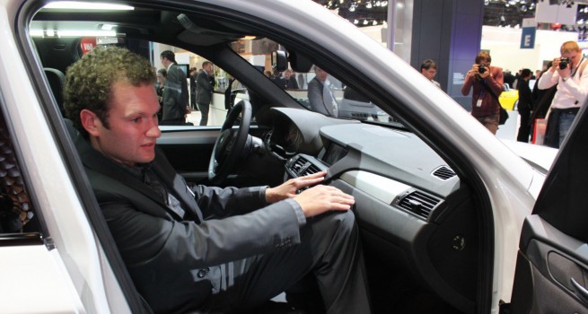
To restore its status and market share, BMW launches the second generation F25 X3 that bring an evolutionary exterior design and a totally revamped interior cabin. One of the main and biggest complaints from its customers revolved around the quality of the interior design, its materials and controls. The task to restore faith in BMW’s interior design fall on the shoulders of Ulrich Strohle. To learn more about the new X3 and its revamped interior cabin, BMWBLOG sat down with the young designer.
BMWBLOG: How would you describe in a few words the new BMW X3?
Ulrich Ströhle: It’s a car that fits perfectly for active people, family people.
BMWBLOG: The previous X3 received a lot of criticism for its interior design, quality of the materials. Some people felt that the parts were taken from other cars. What have you improved the most?
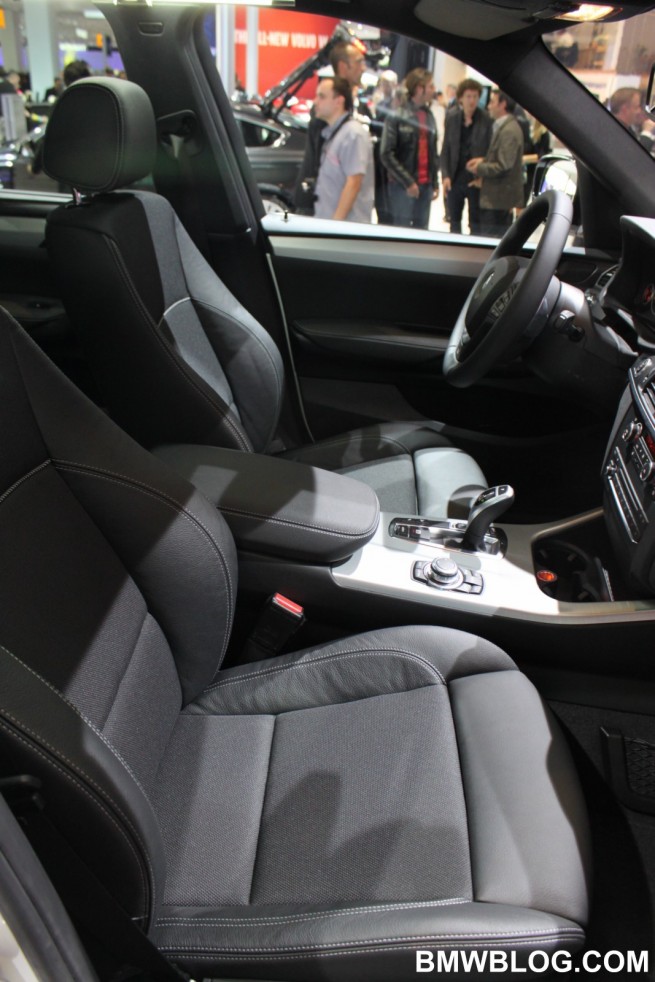
Ulrich Ströhle: We really wanted to do a nice job with this one, a nice car with emotional surfacing like organic shaping. Very-high quality materials were used and we tried to handle the materials as they wanted to be. For example, we used the wood as it is. The wood, leather and armrest stand for themselves, so we tried to have authentic materials.
BMWBLOG: Driver orientation is back. Is this something that BMW will try to push forward for interior designs?
Ulrich Ströhle: I hope that we have never lost driver orientation. Driver orientation is our history, it’s where we come from, and for BMW it is so typical to have driver orientation. In this car, it’s geometrically emphasized, and for me the car should be oriented to the driver, and this can be designed in many ways. With the new X3, this is the way to go.
BMWBLOG: In designing the interior of the X3, what steps did you take to maximize interior capacity, while retaining comfort?
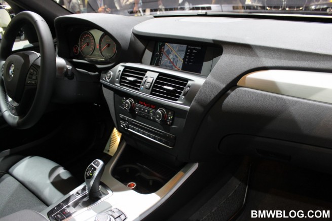
Ulrich Ströhle: Well, the car has more space, that’s physics. What we did in design is that we tried to use the angles and the lines running around, to get a visual feeling of having more space. For example, the line running through the dashboard, the horizontal line, also the wrap around theme, the command position interior panel, which has an angle the way you look at it, all these parts open the view of the interior to the outside and create a larger space. Again, a design theme to create as much space possible for your feet , for your arms, and then really tried to have the nice, organic design while creating a lot of space.
BMWBLOG: What functionality were meant to be a key point in this car?
Ulrich Ströhle: I think functionality itself. This was one of the key points for me. As long as it’s a BMW, I think form is important. Emotional design is important. But as long as it’s an X car, I think functionality is just as equally important, and I think the combination is a perfect match. In general, it’s pleasant to have a design with the maximum functionality.
BMWBLOG: And while you were designing the car, was there any guidance that you received making sure that you satisfy both European and US customers?
Ulrich Ströhle: If our customer is looking for something he didn’t get yet, that’s our guidance. Because we want to make the perfect car for the customers. And for example cup-holders came from the US requests, but the Europeans say: “cup-holders?, Well, then we have to use them if they’re there”. So we tried to pull out the best in everything and tried to get it in the car.
BMWBLOG: Are there any specific materials that were used ? Anything that was particular to this model?
Ulrich Ströhle: What we used here is this new layered veneer , which is cut the other way so we can get the layered veneer feeling. Therefore, the wood itself needs special handling. I think it’s kind of a premiere in an X car. Another specific material used in the new X3 is the fabric on the seats.
BMWBLOG: What’s your most favorite interior part in the X3?
Ulrich Ströhle: The view when looked at the design straight-ahead, somewhat angled from the top. The image I saw was like having ice breaking on the water. And it breaks up and something inside the water is shining through, breaking up and showing nice aluminum or nice wood. This view shows you the organic feeling, the horizontal with the vertical play, plus this breaking.
BMWBLOG: The display is 8.8 inches, so the screen is smaller than in an X5. This is a smaller car from the basics, and so a lot of details need to be scaled down, because the car is not a 5 Series or an X5. As a designer, how do you implement such things?
Ulrich Ströhle: We have to put this car in the line-up between X1 and X5. The components used fit really well in the car. For example, we have same sized instruments as in a 5 Series or 7 Series. Each of the X cars has its own particular materials used. X1 is a little bit fresher, even sportier than this one, while the X5 has an almost 7-Series luxurious look. And this one stands for flexibility, for activity. As I said, great car for active people, for family people. So the “ingredients”, as I call them, have to fit together in the car.
BMWBLOG: What do you think sets apart the X3 from the competition, as far as interior design?
Ulrich Ströhle: I think that our biggest advantage with the X3 was that we were the first ones making a car of this size and created somehow a niche where others followed us. I think that’s a big advantage if you’re the first one. And we’ve had it for such a long period of time before everybody launched their models.
BMWBLOG: What exterior influences can be seen in your design? What inspires you?
Ulrich Ströhle: Everything that deals with design – art, music, but most of the times, nature inspires me. On the new X3, my inspiration comes from nature also, like a shell-breaking through, creating nice surfacing where you can see the depths.
BMWBLOG: Looking back in time, which BMW has your favorite interior design?
Ulrich Ströhle: I like the Z8. The Z8 interior in red.
BMWBLOG: Which car do you currently drive?
Ulrich Ströhle: 1 Series.
BMWBLOG: Can you summarize for us what is new and improved with the X3?
Ulrich Ströhle: What is new is the 8-speed automatic gearbox, the 8.8 inch display which increased a lot in size and has a high resolution. I think it’s one of the highest resolutions in the whole car line-up. Also, the EfficientDynamics system with automatic Start-Stop. In this one, it is a premiere to have altogether a Start-Stop and the automatically gearshift. Everything that you might want from other BMWs, we put it together in this one so it fits nicely in the line-up.
Thank you for your time!


