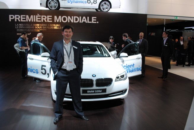
At the Geneva Motor Show, BMWBLOG had the opportunity to sit down with BMW’s Head of Interior Design, Marc Girard.
Girard has worked as a designer for the BMW Group for 16 years now and in April 2009, he took the team leader position at Interior Design BMW Automobiles.
In March 1993, after completion of training and studies in Paris and in the USA, Marc Girard joined BMW, where during the following years he assumed responsibility, inter alia, as project manager in the lifestyle, prototypes and advanced design sectors, both for exterior and interior design. From 2000 to 2002 he developed the interior design for the BMW 1 Series, the first vehicle of the brand to enter the compact segment.
Following this, Marc Girad became a member of the team of designers responsible for the development of the second-generation MINI. Marc Girard was head of Interior Design for the MINI brand from 2004 to 2006 and during his stay at MINI, he was responsible for the interior styling of the MINI Clubman. In 2006 he joined the BMW Interior Design team.
With almost a year in his new role, we let the 39-year-old French national chief interior design tell us a little about what’s happening with BMW’s new interior design language and also what the future might bring for BMW.
BB: Aside from the new 7 Series and the 5 GT, are there any design cues that came from other BMW models? Have they served as an inspiration for the current interior design language?
MG: For sure. If there is one thing that you can find in any BMW new model is the driver orientation; in fact, it’s absolutely a DNA approach to the interior, this is something we see with the new BMW model we get, and this is something we will always see.
BB: Is it fair to say that the new 5 Series interior offers an even more driver oriented position than in the 7 Series or the 5 GT – is this just another way of connecting the driver to the car?
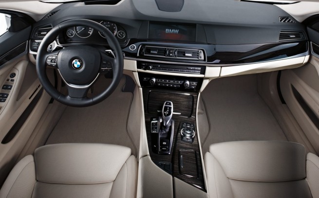
MG: Driver orientation is a means of sportivity. The 7 Series is very sporty, very status. The 5 Series is a business machine, more sporty in the appearance than the 7 Series. If you take a closer look, the 7 Series is driver oriented on the dashboard, but the middle console is basically symmetrical. In the 5 Series , the dashboard is tilted even more and the middle console is also tilted to the driver – so you feel more driver-orientation in the 5 Series; you take that as an assumption and you can imagine how the 3 Series will be even more driver oriented than this one.
The Z4 has basically the maximum driver orientation that you can get.
BB: Would you say that the Z4 represents the beginning of the new BMW interior design approach? It seems that when the Z4 came out, the things shifted to a new design style.
MG: I think the design language at BMW is quite evolutive, we have evolutions and revolutions. This always has been movement in the design language that we have and we always want to keep a DNA approach driver orientation: horizontality, lightness, modern approach.
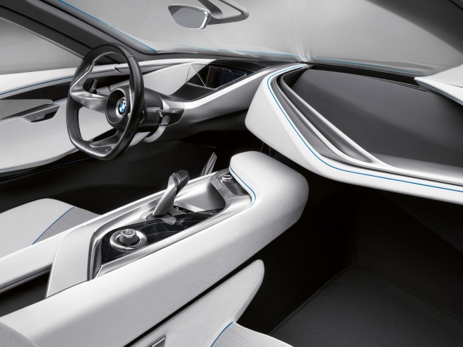
You can see all those DNAs quite clearly in the Vision Efficient Dynamics – the show car that we have shown in Frankfurt – all those DNAs are brought together and the BMW design strategy is very clear.
BB: And from what I understand, the Vision EfficientDynamics’ interior was a layering design.
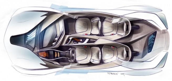
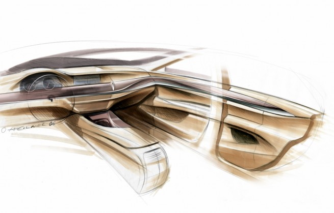
MG: Essentially VisionEfficientDynamics had a layering approach inside and a layering approach outside, and the goal of this layering design is to actually enhance this light effect that we want to combine with EfficientDynamics. EfficientDynamics has a lot to do with aerodynamics and our goal with the interior design was to enhance this spirit/philosophy by doing a light interior.
Layering gives us the possibility to basically cancel some volumes, to work with the so-called negative space – which means out of the complete closed volume, you just slice the whole volume – make basically a layer up, layer middle, layer down, and all the spaces that are within the layers are basically space, which embodies lightness.
This is the whole philosophy about layering.
And of course horizontality is a very big issue for interior design at BMW and this really pushes this horizontality to a maximum.
BB: From a design point of view, is it more challenging to go with a layering approach rather than the “traditional” design?
MG: Yes, of course, because layering is a completely new design language; when we do a new design language, we always have to pay closer attention – it’s a new design language, new philosophy, but still BMW…
So essentially, we have to take our BMW design icons and transform them and bring a certain kind of modernity in them, and layering is such a challenge.
BB: Without getting into specific future products, should we expect to see layering design in a production model in the future?
MG: I can already say that the effect that we’re achieving with layering – within this lightness feeling – is something we will see into future products.
BB: Does layering design require special materials?
MG: The question asked could be: is layering challenging?
Yes, it is.
In my personal opinion, the technology, how the interiors will be built in the future, will have a major impact on the aesthetics of the interior – layering implements new kinds of technologies. Layering is not something you can do with the technologies you have nowadays – having basically one complete closed volume, we have to find new ways and Vision Concept is showing that all those bands which are flowing together, made with different parts and new technology, will definitely bring new aesthetics.
And also the other way around, new aesthetics is what we’re aiming fo. We will have to implement it in new technologies, so it’s a back and forth situation. It’s very challenging, but this is what we stand for.
BB: BMW drivers have always been known first for enjoying their cars’ dynamics and driving experience. Recently we have seen more people requesting an improved, more luxurious interior design. Is this a trend that BMW has noticed as well? These days, it seems that a lot of consumers bring Audi’s interior design into a comparison with BMW.
MG: My personal opinion is that in the future interior design will be more important. I think the joy of driving actually goes through the way the interior is, because the interior is actually the interface between the man and the machine. So the materials you see and you touch, basically create a link between the man and the car.
The driving joy has to go through the interior… enjoying the materials… it is not a direct thought that people might have have: “I enjoy the exterior more than the interior, or less” – you actually have to bring it into a combination.
Vision Concept is a good example of how you can merge exterior design and interior design to make one single entity.
One more example – when you consider the 5 Series GT, it was a very kind of architected approach to this car, because we started defining the inside of the car and then the outside. There are signs that people are looking for very authentic products and in the future I think that everything will come even closer: exterior design, interior design, materials, technology, user interface, everything has to come so close together and form physically one single product, very authentic.
BB: Have you seen a high success rate with the 5 Series GT?
MG: Yes. We’re seeing more customers than expected; it is a niche product, not a mass production car, a very specific car for a very specific niche. Within this niche, it works pretty good. It is a good sign that when we go for a new product/concept, people are reacting positively to new approaches to the market.
BB: Let’s talk a little bit about the new 5 Series. Were there any special materials used in new model? Were they more specific to this car?
MG: We have specific colors for the car; in terms of materials, we’re in same range as the 7 Series. We have very exciting extras in the 5 Series, like on the 7, for example the ceramic application on the knobs and on the iDrive. I personally love this material, at a hand touch it feels so valuable, very cold and deep. This goes back to what I was saying before: the interface between the driver and the machine. Ceramic application is something I really enjoy, something we are the first ones to offer.
BB: What about a 5 Series Individual? Will it take the luxury to a new level by using more exclusive materials?
MG: I think we will designate the Individual 5 especially for the business limousine approach. The 7 Series is extremely luxurious, more status-oriented, while the 5 Series is more business oriented – you will see this approach in the Individual program that we are fitting it perfectly to the car.
BB: With such radical cut lines made throughout the interior of the E60, what was the reasoning from toning back design at this point? The E60 had a radical approach, while with the new 5 Series you tone down on the Avantgarde and the wow factor, but you’re still maintaining a high level of luxury.
MG: Tough question, but I can answer this; as I’ve said before, revolution-evolution-revolution-evolution; we have a cyclic process in the design development. As you can see, this is more evolution. Nevertheless, I think we have chosen an outstanding design proposal for this car, very elegant, very luxurious, it fits the market and product requirements perfectly.
There is one thing that is very specific to this car: When you analyze the E60 interior, the 5 Series was very crispy: extremely precise and sharp, all the surfaces were super tense, almost very very flat.….this was more machine than man.
While this interior of the new 5 Series is more man than machine. All the surfaces have more “throne”, more muscle. They are chiseled surfaces. That’s the main difference in terms of interior design. Some people were saying that the E60 had some kind of architected approach, very sharp, very precise, a little bit cold. This one is more fully embedded muscle body language, a human touch approach that we have seen in the 7 Series for example, and the forthcoming cars will have a similar approach.
I think the reactions to this car are amazingly positive – the people are very happy. The reason is that when you use such a body language design, automatically you are almost addicted, you have an appeal to this surface. When it’s more machine, you as a man or a woman, basically get a bit rejected by this kind of surfaces, that’s why this interior is extremely modern, but with this approach of human touch, it appeals to people automatically as being more welcoming.
But NOT in a cozy way, cause in the end, the 5 Series is a sporty limousine. Essentially, this form language is getting closer to the people sitting in the car. That’s the interface issues that the interiors still have.
BB: What steps were taken with the interior design to ensure that both functionality and simplicity were left intact?
MG: There is one statement that I always make: it’s form over function. And that’s our main goal as designers, to make stylish cars. Eventually, our ultimate goal is that people sitting in the car can drive the vehicle in a very efficient way, sportive way, safe way, but to use all functionality the car has to offer. And this also basically has to come altogether.
BB: In a recent article of ours, we mentioned, based on a piece of information from BMW, that there is a great part of materials shared between the 7 Series and the 5 Series. How is that benefiting the 5 Series?
MG: We have a backbone approach – basically we develop one platform – on 5 and 7 Series and fit it on the 5 GT as well. Of course it benefits us from a cost perspective, but it is also a win-win situation, because when we do more parts, we save costs, so we can reinvest these gains in some specific, good features.
That’s why all those cars are driving like “crazy”, they are perfect in handling because we invested more in the technology.
BB: How do you see interior design in 5 to 10 years?
MG: To answer your question, I made a car for that – the VED, Vision EfficientDynamics. This is a senior design ten years from now. This car is basically an M3 for 2020. All the things that are in this car represent for me a positive approach of how the future could be.
One thing is user interface – big point.
Interface, 3D, reduced focus, structured information….For the time being we have an incredible amount of information everywhere. In the future, all this information will have to be layered, structured. I think people are suffering from this muchness of information. We have to reduce the amount of information – you just get information only when it’s necessary.
The big issue is user interface; the second thing is the technology, system mobility and materials. System mobility and materials, technology and user interface – these elements will definitely have an impact on how the car will look like.
Vision Concept would have not looked like that, without new technologies and new interface being implemented.
BB: Was it unusual for Mario and Jochen to design the VED in such a short period of time? (Mario Majdandzic, Design Exterior, Jochen Paesen, Design Interior). I think it was 7 months from beginning till Frankfurt Auto Show.
MG: Oh, it’s normal for a show car. Actually that’s the baseline – you cannot make it quicker than that, with the implementation of the features. The whole team did a fantastic job. Designing the car was pretty easy because we had a very short amount of time. And this sometimes is good since you have to come to a point.
It was super-focused – M3 of the 2020. It’s the dream of any designer – you came to the point where you have the sketch, and then you design the car just like that, with no restriction. I think the big challenge was to build the car so it would look like the sketch. This was amazing. I still cannot believe that after seeing the car at the show, and seeing the pictures.. and I am thinking “Oh My God”, this really exists.
BB: How was your transition from MINI to BMW? Was it challenging?
MG: Two worlds. It’s so exciting, it’s like you’re dealing with two worlds. It’s like having two worlds, two planets, two companies living into one field. That is what makes the BMW Group so exciting. The philosophy and personalities of each brand is so strong, and completely set apart, and both are super strong, super exciting, and both emotional. It’s all about passion.
MINI is absolute passion, while BMW is drivetrains…..
BB: What is your favorite interior design? You can go back 30 years if you want to.
MG: The interior designs I like most are the ones that ought to come.
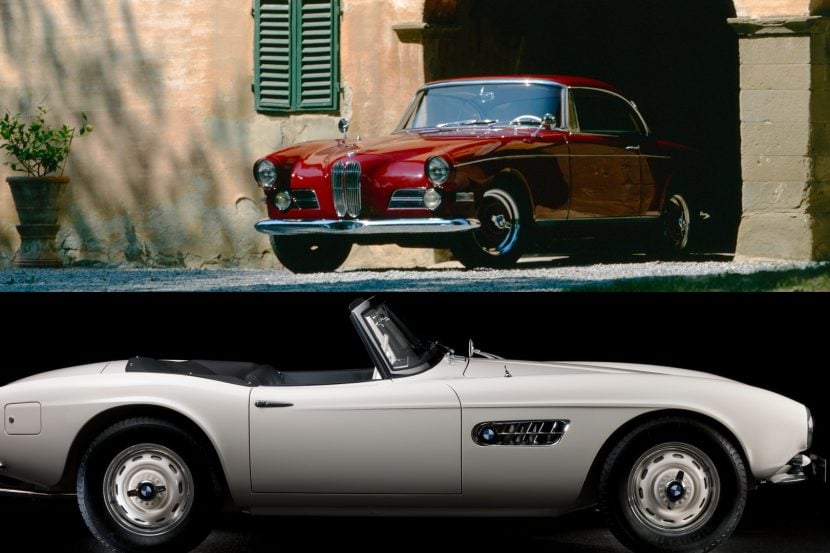
But the one I love is the 507. That’s a classic.
BB: CS Concept had a great design too, and hopefully we will see that in the future.
BB: In a previous interview with Adrian von Hooydonk, he mentioned that for some customers it can take them years to discover special design cues on their cars – like for example on the 7 Series – the tail light that has that little aerodynamic element. Is there anything that will stand out in the 5 Series? Something that makes the customer say “Ah, wow, I didn’t know that it had this”?
MG: (pointing at the design lines on the front panel) – This is exactly what I meant with the human touch – all those shapes, the flow, all the surfaces that otherwise on the E60 were very tense.
To answer your question, I think that people will see it at a first glance, especially with the aluminum finishes, but what is amazing about this line here is that it flows into this another line, which runs particularly into this another line: the whole thing starts here on the console and continues on the entire side of the car, on the door, everything flows. You have a complete flow. This is something that has in common with the Vision, this one big gesture – super strength.
The 7 Series is completely symmetrical, very quiet, and very status-oriented. You have a tilted center stacked to the driver. Tilted center to the driver enhances driver orientation. The middle console in terms of strategy for us is a tuner to diminish or enhance driver orientation because we cannot tilt this at 30 degrees, since we also have to pay attention to the passenger as well. We make cars for the drivers, but we shouldn’t take the passengers out of the way. As a passenger, it’s not nice sitting in such a restricted medium – they feel disconnected. This is a challenge to have driver orientation, but also all the people sitting in the car should feel comfortable.
BB: Marc, thank you for your time and for the great chat as always!


