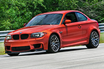
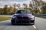
The BMW 135i Coupe redesigning project has been one of the most exciting episodes in our “Be A Designer” series. With a lot of enthusiasts behind this model, we were positive that the input will be numerous, but valuable at the same time.
Our rendering artist, Andrei, had to sort out some of the comments and choose the best design elements in order to re-draw the 1er Coupe. While many of you might have wanted to see an M1 replica, the truth is that the 135i Coupe was designed as a performance car, but not in the M class, so we decided to stay on the same course.
Beside the excitement of redrawing an existing BMW model, these episodes in the ” Be A Designer” series are all about bringing the community together and sharing constructive ideas. As you can see from the renderings below, the redesigned Coupe keeps a realistic look rather than a prototype-like vehicle. Truth is that the 135i Coupe design is already appreciated by the BMW community and many of you believe that only minor changes are needed.
While some changes are subtle, the overall look of the car has become more aggressive and imposing, and the carbon fiber rook and new wheels, are just the icing on the cake.
We hope you enjoy working with us again and we would like to thank you again for your input and most important, for being part of the BMWBLOG community.
Last but not least, we would like to take a second a thank our sponsor Classic BMW, Ohio who keeps supporting us and our crazy innovative projects.
Project sponsored by Classic BMW, Ohio
High Resolution Photos
Matt Montgomery
- Headlights need to continue along the line of the hood, same width, just not turned down at an angle
- Kidney grilles should each be wider, filling out the space between the headlights
- Front skirt would look great with a carbon fiber diffuser as would the rear. Also carbon out the side mirrors and the antenna fin
- Mirror the double exhaust on the right side for a quad exhaust look.
- shrink the taillights north to south so they wrap around the car with more of a ‘widescreen’ format.
- Strap on some CSL type 19′ wheels in carbon fiber
- take the car’s paint to Marrakesh Brown Metallic as seen on the new x1
- Remove the 135i badge
AiRit
- the headlights I would like it to be slimmer and more aggressive. And I might want the kidney grilles to be a bit bigger.
Michael
- quad square exhausts
- the headlights need to be slimmer & more streamlined for a more aggressive look
Bryce
- Quad Exhaust
- Add the headlights from the 2010 3-series rendering, they look slimmer and more aggressive IMHO.
- Black Carbon-Fiber Roof
- Interlagos Blue
- Add the CS slivers on the side intakes of the front spoiler. I like the current front spoiler though and wouldn’t change it, just add the sliver things.
- Idea: Would the Z4 grill and tail-lights fit?
- Arrow crease on the front hood
- Cooler mirrors (the current ones look pretty lame)
- Slim the taillights to make them look aggressive
- adding some muscle to the fenders, we might as well do the same thing here!
Daniel
- http://www.motorsport24.de/blog/135i-tuning/135i-tuning-das-ultimative-motorsport-fahrzeug
Victor
- symmetric double exhaust
- gill ventilation on the left and right sides near doors.
Shonguiz
- headlights – the two circles should be bigger and more spaced to use the whole headlights inner surface, while the blank-turning signal area should be stripped down.
- Make the whole front cut much more upright and clean
- The grill should be incorporated to the hood.
klier
- Add larger grille with shark nose effect, maybe sqare-ish Angel Eyes without the plastic cover in front of the headlights, like the old school Bimmers..
- The car only need more aggressive headlights other than that its perfect.
jocamryn
- The sagging line over the body panel looks too loose, tighten it up. and lower the upper crease some.
- Light lines/Bars on the rear tails (a-la the 3er and the 7er)
Mike Messer
- I would like to see the e39 m5/e46 m3 side mirrors to get rid of the crease in mirrors.
- A very slight “eyebrow” for the lights.
- Black “Shadow” line trim for around the windows and kidney grills.
- 6000k angel eyes.
- Get rid of the horizontal line in the intake for the front fender, replace with the black mesh found in the “center intake” on the fender.
- The center tail/brake light should be placed in the top center of the rear wind shield (where it belongs)
- Make the front portion of line above the side skirt angled slightly more down instead of up, for a more aggressive feel.
Giom
- more aggressive headlights. Nothing borrowed from other BMWs
- a lower roof line – just slightly. It should accentuate the sporty stance
Sheikh
- Aggressive front lights (as the e90 335i)
- LED lights on tail-lights
- 135i Performance Rims
- Carbonfiber roof as the m3
Max
- more aggressive headlights, taillights from CS and a lil bit lower roof at the end of the car
Mauro Corti
- More aggressive tail LED lights, newer front lights (3er restyling / 7er / 5er GT), larger kidneys like z4’s ones.
Jorge
- Slimmer headlights (to give it less of a big eyed look), grill tilted from the top outer more like the 80’s style BMW’s. the rear windshield should flow more into the trunk instead of the more angeled look.
Alex
- Slimmer sharper headlight from 3er coupe
- Lower edgier roof line to create a super car stance.
SterlingCooper
- It could use a more elegant roofline. Rear seats are kind of a joe anyway, so may as well make the rear window slope a bit more, like a 3 series. Loose the bubble top.


