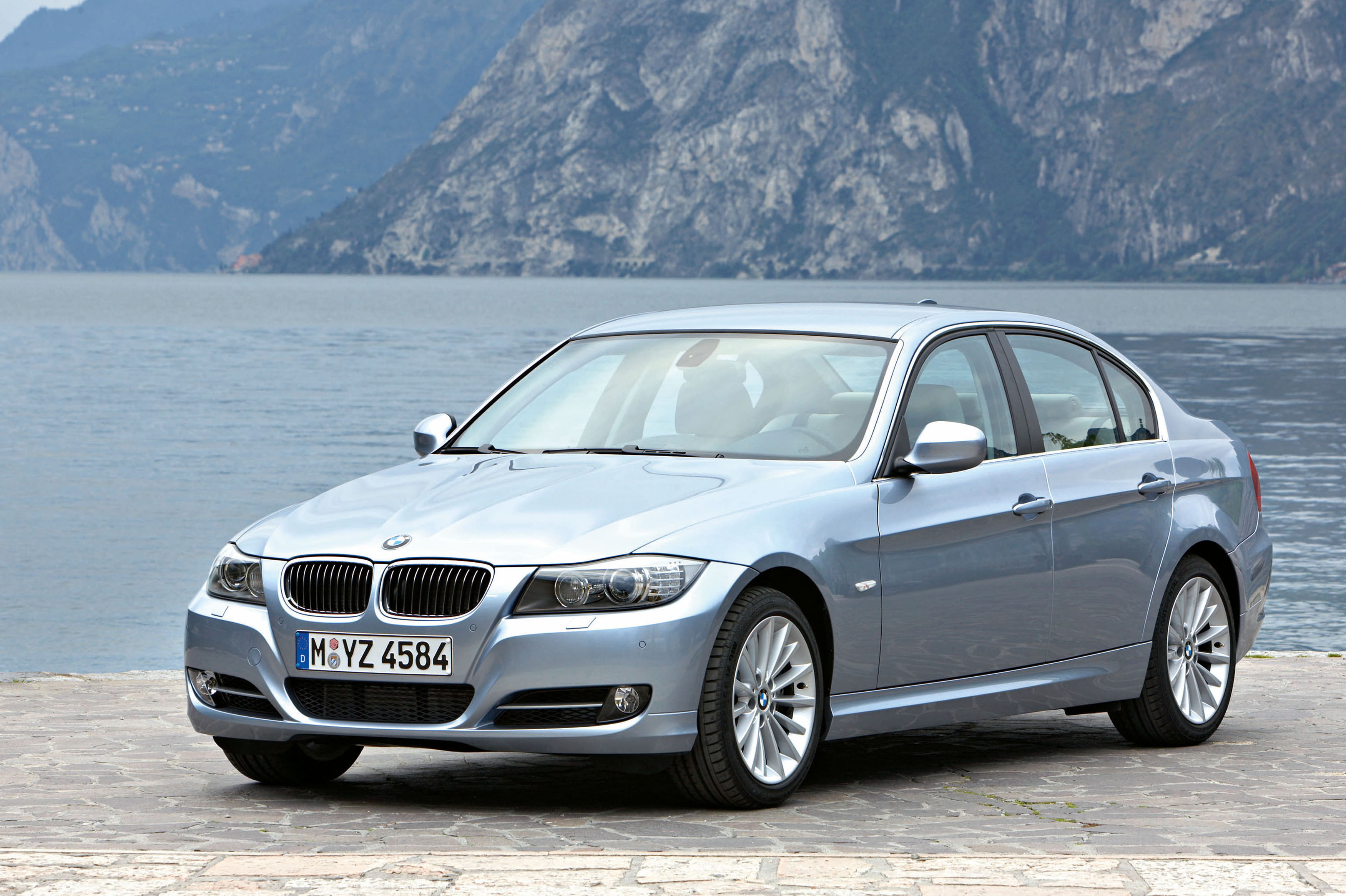
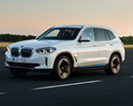
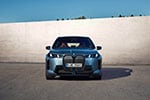
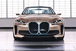
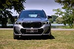
Over a week ago, we launched one of the most unique and interesting projects involving the BMW community. We decided to give you, our readers, a chance to express your opinion on the design lines of the current BMW 3 Series sedan. Your ideas and suggestions would have formed the base of future graphic renderings which will showcase the 3 Series just the way you wanted to.
We have always valued your input, comments, suggestions and this was a way for us to repay you and allow you to become more involved with our blog. To make this even more interesting, we teamed up with Automarket.ro, which presented the same challenges to their readers. A question has arisen from the beginning: will people across the globe share the same design opinions and passion for BMW?
Well, today we have our answer and thanks to the hard work of rendering artist Andrei Arvavarii, who had to scan through the tens of comments to find the most common requested design elements, we are able to bring you not one, but two different versions of the current BMW 3 Series Sedan.

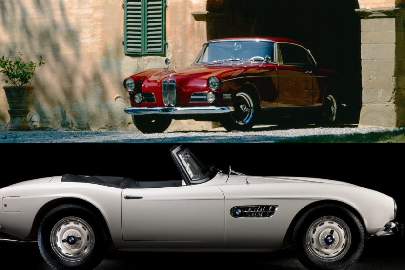
As you can see, one version of the front-end is a bit closer to the reality, but the second one brings out a lot of the M1 Hommage elements and it’s rather quite interesting. Now let’s see what the Automarket readers came up with: Be A Designer for Automarket
This has been a fun project and judging by the positive reactions we’ve had, we will continue it in just a few weeks. Of course, many of you might wonder which model will we be choosing next and so far, our thoughts gear towards the new BMW 7 Series, a model that has been slightly criticized when it came out, but started to grow on everyone lately.
We would like to thank you everyone for the comments and we hope you enjoyed this as much as we did.
This project has been exclusively sponsored by Classic BMW, Ohio.
AutoCritical
- Have more of a light catching feature on the lower half of the body side.
- I was looking at the X1, and my favorite ‘feature’ in its design is how the crease around the DLO (seen at the C-Pillar) suggests the connection, under the belt line, to the lower light catcher at the base of the doors.
Mauro Corti, bm3rmy, Vaybach Khan, AiRi, Lariv
- taillights- changed like 3er coupe
Mauro Corti, bm3rmy, Lariv, Paul
- More integrated door mirrors.
Mauro Corti
- the car is too narrow and high in the back, I’d like it a lillte more like audi a4, lower and larger
bm3rmy
- front bumper- in the middle looks like passat, change that, make it to look that the car has some muscle.
- front lights – I would like to be more aggressive – to bi a little bit inside of the front bumper and to have a kinetic look with some new innovative features like audi but not like waves.
Vaybach Khan
- maybe a little more coupe side windows..with a longer trunk aiming to the ground…
- the front end and grill i would like to be profiled in opposite way then current, like e24 perhaps..with big grills
Lariv
- New alloy wheels
Lance
- Sportier bumper like the M3 Coupe, but more solid – not just fins.
- Headlights – must use white LED fed corona rings like the 5GT with chrome eyelids – not this white transparent colour of ice-cream tubs.
- Grille – larger and widerlike the Z4 in silver with chrome surrounds. Shape must be changed to a trapezium that is indented – not a flat nose.
- The bumper edges around the wheel is too sharp, there must be a more E36 type of premium look.
- The rear bumper must be more muscular and sporty.
- And that rear wheel arch bulge like the ones on the CS please
Moncho
- M1 concept front-end lights
Giom
- Widen the kidney grills slightly so they’re closer to the edging, and maybe enhance the chrome surrounds… ie, make it a little thicker.
- The windowsill line, raise that by not even an inch. This is to decrease the side window area, creating a more coupe like proportion.
Paul
- try to use an orange light rod like those used for the halo lights. I always liked the constant orange rod on the 5ser and it was a shame it just wasnt used for the repeater
- Also, there´s just to much going on on that back bumper…needs to be more clean with less lines
- and the front bonnet always looks like its open and it needs to be straight instead of having all those grooves that fit the kidneys, that need to be maybe bigger but for sure thicker – try the m3 i like the way they are slightly “in” the bumper if you now what i mean.
- also the chrome surroundings on the windows are a bit out of date…i am sure bmw already working on this as the new 7 and GT have them thicker.
- Also ditch those fog lights..they are just so 90´s with that glass housing…dont go audis way as fiat and merc have but instead of the boring LED´s try to use a rod or something like the new RR has.
Edox
- Front apron of the 135i coupé


